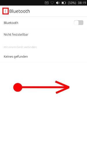
swipe to go back
-
@Krille I don't think that every idea, which pops up has to implemented immediately. Furthermore, I imagine there are other issue which have priority, but maybe in 1 or 6 months you get an idea how it could be done.
In my personal opinion having some gestures like that would be nice or the least wouldn't harm.
Maybe that's something ubports shouldn't care about. One of the best apps SailfishOS has is the patchmanager. This way the community can write and install patches/tweaks which modifies the UI etc... I don't know if that's possible at UT, but it could be an option as well how users could adjust the UI to their needs.
-
@kugiigi Thx!
 I will look into that tomorrow!
 -
@dobey said in swipe to go back:
For example,
Esckey should perform cancel or go back action.Esc already goes back now
-
@kugiigi I only can test Palitan, because I don't have Facebook. I don't understand what you mean. If I go to the settings I have to press the "back" button as well or do you mean the list (favorites, convert, full view) on the bottom?
What if you press the screen, hold it a second and then you swipe to the right to go "back"? Morph Browser works similar to that.
There also could be a little swipe from the down-right corner. -
@makeixo The buttons in the header are still available for tapping or clicking but you can also swipe from the bottom to trigger those buttons depending on which side you swipe from. It's not a replacement per se but more of an alternate way of navigating especially useful for touchscreens and phones

-
@kugiigi Ah, yes now I get it. Nice! It's a great app by the way.
Maybe you could swipe in from one area of the bottom or right edge some little navigation buttons "back" "to the top" or something like it.

-
@makeixo As your mock-up shows, floating buttons like this tend to be problematic as they cover up content in the application. Also, as the list items can be swiped right and left for accessing actions, and swipe from right edge is for switching apps, such a swipe might be problematic in general.
IMO, it would be better to find a more responsive design solution to this difficult problem.
-
@dobey I wouldnt be that worried about that it covers up some parts, because you just swipe them in if you need them and after that they vanish.
Where I do agree is, there is most likely a better way to integrate it.
-
@makeixo What about a double swipe? Or a two finger swipe?
-
I once had in my android phone some swipe bar on bottom where I could do following..
-swipe right I could get back
-swipe left to access currently running apps
-swipe up to get home screenI had bottom bar disabled and this tiny bar on very bottom of the screen. Worked beautifully.
Maybe something like this could work UT also.
-
I think this is mostly a promblem of app design. 60% of my back button usage on an Android device is to switch the previous app, and this is handled fine with a quick flick from the right in UT. The rest is mostly use as a navigation aid, especially navigating backwards in the browser history. I would rather Morph (and other apps) move the navigation bar to the bottom edge, than add complicated gestures to the screen edges.
Really the example of Pebusk is a good one because the simple fact is we have only 4 screen edges
top: indicators
left: app drawer and dock
right: app spread
leaving the bottom edge for apps.
Holding a phone one handed the bottom half is far more accessible to your thumb than the top half, so that's where important contextual actions should live.
If all apps moved the top bar away from the indicators (where there is accidental interference between the two) and simply to the bottom edge, UT would be better off for it.
-
@Giiba I totally agree, it is a matter of app design.
Because depending how complex and app is some solution might be interesting or completely stupid.
So it should be up to the developer to create a good user experience.As for the system it already provides a very good experience with those gestures.
Trying to add a single way of doing apps with a single look'n'feel is restrictive and against what I consider free software should be.The debate is still very interesting and I may use some of ideas that popped up here

-
@AppLee I would agree that we don't want to force the UI of apps into any sort of cookie cutter form, but I think leaving one edge for app use and encouraging use of that edge in apps is a good path.
For my examole of Morph, I would love for there to be an app option to move the top bar to the bottom. In Pebusk, I think the design works great. However try out uText and it's swipe from left options menu, and you can see why apps should use the bottom edge (nothing against uText, I love the app).
-
@Giiba I agree on that,
Bottom edge is a nice feature, easy to implement and I use it all the time.
When I happen to use another OS I always try swipe from bottom to access options or hidden features. -
@marlboro50 It's not up to me to decide. I don't have the knowledge what's can possibly be implemented either but putting ideas on the table is - in my opinion - not bad
-
@Giiba said in swipe to go back:
Really the example of Pebusk is a good one because the simple fact is we have only 4 screen edges
There are only 4 screen edges but maybe one screen edge can provide more action than just one.
On my SFOS device I can access the quick settings or close an app both from the top edge. I don't know if that would possible on UT as well. I just want to mention that there is maybe still space to implement things.
-
So I think this issue isn't specific to the "back" function as I don't think it will ever come to UT or even make sense to have it. At the moment, all edges are already reserved for the system except the bottom edge. We maybe can start from that be we need something that is convergent. My implementation in Palitan/Pesbuk works great for me but having it in every app means that all other bottom edge gestures has to be removed i.e. Morph browser.
This is definitely a difficult issue to resolve although it's not really a very urgent one.
-
@makeixo I'm curious what gestures SFOS uses? As I see it there is really only 3 easy gestures per edge: quick flick, and long drag (perpendicular to edge), and sliding along the edge (parallel to edge). Currently only the indicator edge implements a parallel action.
I missed the 'back' button when I moved from Android, but these days I find it awkward when I use an Android device that the back button does inconsistent things... sometimes it move back in an app, sometimes it closes an app, sometimes it switches apps. My point would be that I like how UT has separated the concerns the 'back' button provides. App switching is on an edge, and induvidual apps are left to determine where and what a back functionality does (many don't even need it).
A global back gesture would have the same problem, what back action should be implemented in a given situation? Is this up to Unity8 or the app in question? If it is on the app, what happens if the app doesn't implement an action?
Thinking further about my example of Morph, the 2 basic gestures on the bottom edge would work, and could be just like the new app drawer coming in the next OTA; a short flick could show the address bar and a long drag could switch to the tab view. And all functionality would be maintaned with an easier to reach 'back' action.
If I was able to (and who knows, I might learn) I would add a parallel action to the right edge, so that sliding a finger up and down the edge would simulate a scroll wheel.
-
@Giiba You swipe to the left/right to go forwards/backwards. In SFOS that is very consistent to the UI.
I never have used an Android device as daily driver, therefore I dont miss the "back" button of Android. I think I wasnt the one who has brought up Android. I neighter have liked the navigation of Android nor I think it is somehow a good example.
Nevertheless I think having the option to navigate through the OS with just one hand could be a nice feature. I personally would prefer a global gesture. If a dev doesnt hook up his app to this feature, nothing happens. I dont think thats a problem. In SFOS not every app is consistant to the UI, but most of them are because its a consistant UI gesture. -
I have no idea if its possible to implement this EMUI Back feature but I really do like it and maybe it could work on UT as well.
