The State Of Ubuntu Touch.
-
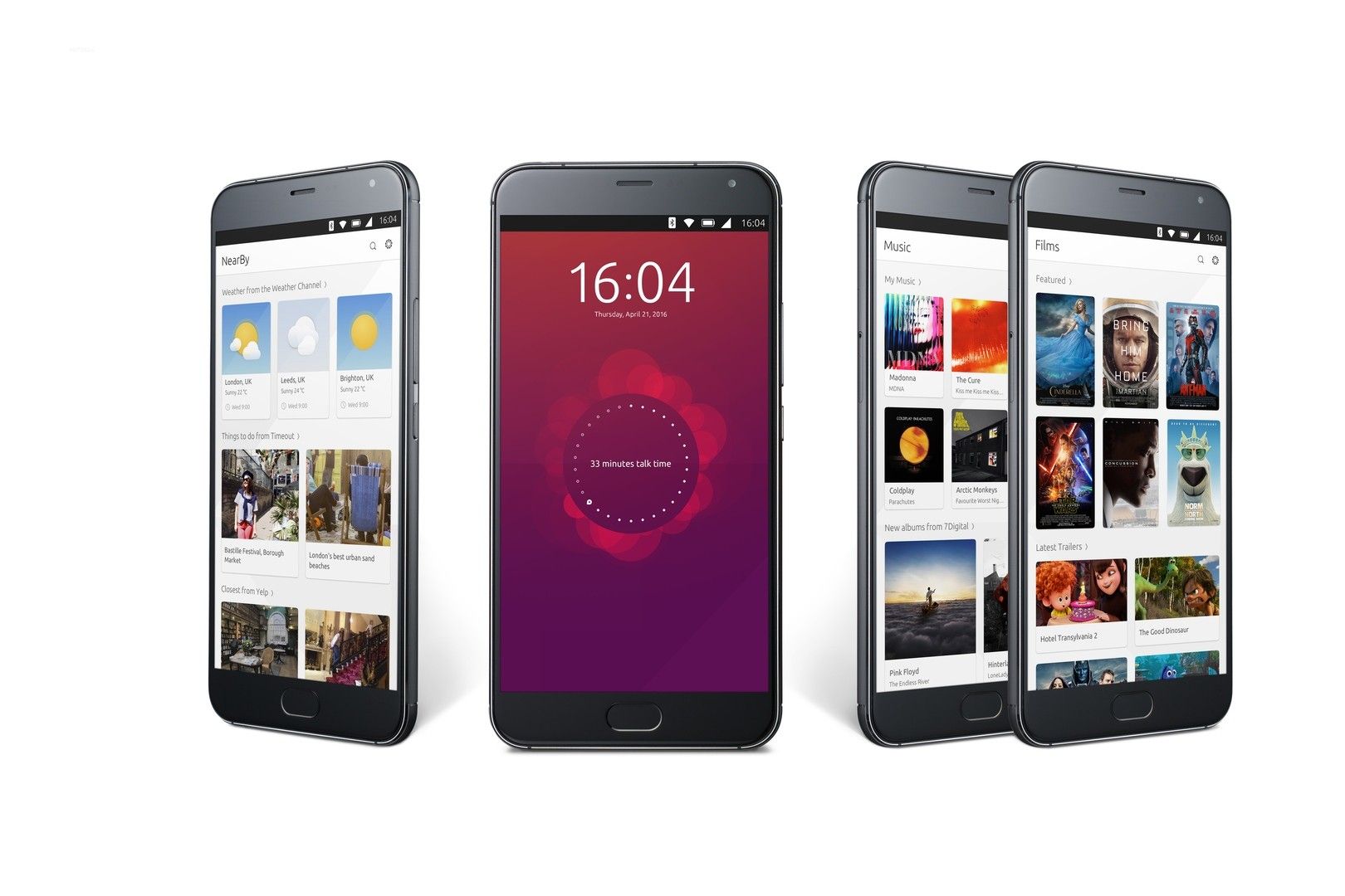
As long as evolution is great much of the work as been done but as far as design, amazing scopes. take a look at this.
[https://www.youtube.com/watch?v=CsDFMIphtZk]

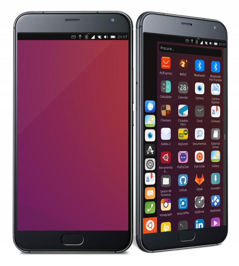
But wait where's the scopes? And the dash?And what's that just a empty wallpaper?!?
This is my personal opinion the new version of unity 8 leaves a big hole in the OS. First we leave support for scopes, and then we have no dash panel, everytime e start my phone only thing i wave is a wallpaper.
I dislike this version of unity.
All the evolution of the system comes to this feel of emptiness.

We made o lot of progress, but also left a loft of soul behind.

Again this is my own opinion does not reflect the user general opinion, but i know some of you also miss that.
-
I think the redesigned (unimplemented) scopes looked good but sadly, scopes doesn't work good.
Personally, I like the app drawer. It's only the start and we'll surely see improvements and new stuffs moving forward
-
I switched over to dev channel when the edge channel was merged, and at first I felt that emptiness you speak of. The new Unity8 is a continued evolution of the UT interface, and does feel different.
I felt this same sense of something missing when I first switched to UT from the android back/home/recents interface. I kept reaching for those functions, despite them being missing; like drivinging an automatic after a long time in a manual shift car.
However in time I have forgotten the Android way, as the UT ui is extremely well designed and really those buttons are not necessary. The same is now happening with the new scope-less ui. I imagine some will miss the old way, but I have quickly forgotten about the scopes system and no longer miss it.
I think the only time I feel the emptiness now is after installing an update and rebooting the phone. For a new user to the UT experience I could see this being cold as well as empty feeling. But having used the new Unity for a short while now, I find the idea of a desktop cluttered, and the lack of a home screen as a convenience.
-
I think the new Unity makes the background clear, I can finally have a family photo there, a great landscape, an eagle, a beach.
To that background you can add things, shortcuts, documents, notes, those quick view things and you can grab them quickly,
Widgets can also be added. more options for UtThat could be future stuff, we're at a different point now.
Greetings...
-
In my opinion, the empty desktop should be used for something.
What is the use of an big empty space?
If people don't like to use it and love emptiness, it's ok. But fore those like to use the space for getting some information should be able to do it.
The only thing you can use right now is a static desktop image. -
The only time you can even access the 'desktop' is after a fresh boot, or by closing all open apps. Putting anything there would make using it inconvenient.
-
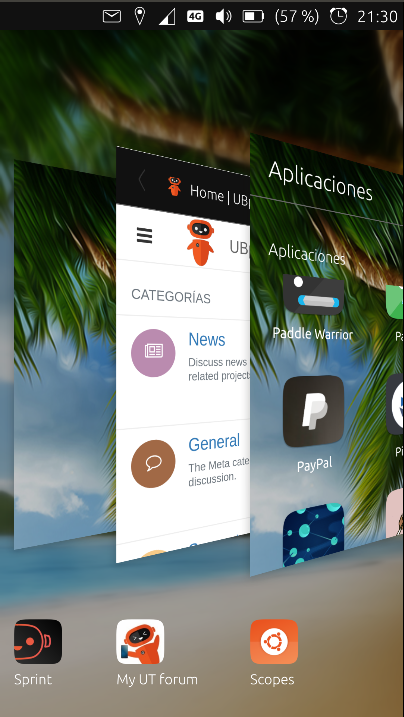
@Giiba a solution that makes the desktop move like open apps, as the screen of apps is right now, is called SCOPES
if there are no applications the desktop stays in the wallpaper.
if you want to put apps on the wallpaper now you can use Sprint and you don't have an empty wallpaper.
Greetings...
-
I am speaking of the current development channel releases as far as ui. I remember the scopes thing, but always found it annoying and find it awkward when I switch back to stable.
I won't claim the new Unity is perfect, but I feel it is a solid step forward for the OS. I think the new indicator addons showing up in the open store is a way for scopes to be brought back in a just as accessible way, but being optional.
My point would be that people (in general) should give the changes a try with a clear mind, yes it is different, but I think it is an improvement in many ways.
-
I didn't like scopes, I'm happy it's gone. In time the empty space can be used for widgets and shortcuts etc.
-
I don't like scopes and never used them.
I want a desktop with only my favorite picture(s).
I'd be very happy if the background image could be a slideshow, switching every 10 or 15 minutes (for example)
It's exactly what I have for my Desktop PC with Cinnamon. No garbage on the screen and powerful menus
BR
Pulsar33 -
@Pulsar33 Please make a feature request on our tracker for the slideshow. Its a nice idea, and independent of whatever we have in the foreground

-
Hi @rubencarneiro, please also see the previous discussion about this topic: https://forums.ubports.com/topic/2579/i-wanna-go-home
-
@Flohack said in The State Of Ubuntu Touch.:
Please make a feature request on our tracker for the slideshow.Fine ! I'll do the request ASAP

BR
Pulsar33 -
-
@Pulsar33 Please use Github here: https://github.com/ubports/ubuntu-touch/issues and press "New issue"
-
@Flohack Gif background ?
Or too energy-consuming ? -
@domubpkm The format does not matter as long as its not animated LOL
-
 I like to use the OpenSource app Variety on my desktop....
 -
@Flohack Can you clarify, please?
We don't need background animation because they wouldn't work or because they shouldn't for other reasons?
Because i know gif format can or should work in Gallery even if the work isn't finished.
See https://gitlab.com/StefWe/gallery-app/-/jobs/424388885/artifacts/browse/build/arm-linux-gnueabihf/app/ and try -
@domubpkm Well to have an animated background we need a worker process that is actually doing the animation. That means adding new stuff to unity8, making a communication pipe to start/stop it etc. Thats more effort than just adding a png/jpg there. So for the first iteration of the feature, lets keep it static
