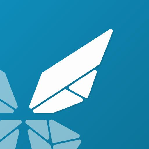
Morph Icon Proposal
-
@CiberSheep i like it a lot, I think a butterfly flying through the web works.
I think theres a bit to much blue space, but I think just having a fold alighned with the wing would fix that.
I really like this new icon.
-
I like the concept. Morph heralds the emerging convergent web browsing experience, just like a caterpillar 'morphs' into a butterfly.
But I was also concerned that it doesn't shout 'web browser' to newcomers, similar to how Dekko (the name) doesn't shout 'email client' and new users have had a hard time finding it in the Open Store.
Of course Morph has the advantage of being preinstalled and pinned to the launcher out of the box. But I agree with @3T_Ed that the addition of a subtle, more recognizable www-icon might aid recognition.
On the other hand, the browser that broke the naming convention and has a power-ball icon has been hugely successful. So ...
-
I dont fully ageew with everyones assesment of browser icons.
Many just have a globe and something wrapped around it, such as firefox, sure.
However, internet explorer is just a yellow stripe around a e, the new one is just like a wave of water with a bit of green, chrome is 3 colours around a blue dot, safari is a compass, opera is just a O, brave is just a lion.
For some reason, we all have this idea that a web-browser is something around a globe, but other than firefox, none of the big players use that.
I dont think anyone looks at safari or brave and thinks instinctually “thats a web browser” but every apple user has figured it out.
I think being different is fine because everyones different, and there isnt a standard, if yiu randomly picked up an iPhone, or an android device, and never saw the safari or chrome icon before, youd have no idea which app is suppose to be the web browser.
-
@PhoenixLandPirat I had that problem when I was forced to use an Iphone at work. That was the first time I ever used a product from Apple. I've been using Android and after that UT. I had a little problem to find the web browser
 , a compass? A compass on a phone is a compass not a web browser.
 -
Thank you all for your feedback

Another planet, another time, another universe!
-
@CiberSheep Just a thought, maybe you could somehow add the 3 w:s inside the filled wing? Or anywhere else inside the icon.
-
@CiberSheep
I love the design, I sense the "morph" theme here with the butterfly.At first I shared the vision that it's not screaming web browser.
But then I thought about other browsers and thought : that's not a requirementAnd I think it's labelled "browser" in the app drawer, isn't it ?
In addition, I'd say that like @PhoenixLandPirat I'll add a fold aligned with some wing lines, that's something I like very much in UT icons and it will "fill up" the space
-
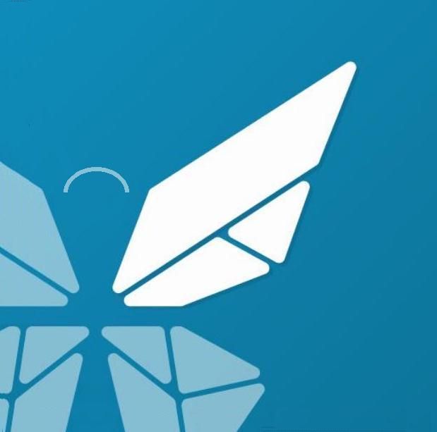
Keep feeling it needs to move slightly up and to the right. I keep focusing on the wing, which turns into a stylised compass pointer which is very clever. Thanks again for all your work on this and other projects.
-
I believe the placement is right on, but to follow up on your compass hunch, I reckon there could be some sort of compass background where the top of the wing acts as a pointer. Then it would be perfect, because it would accurately suggest navigation wouldn't it ?
-
Hi everyone, I love the logo presented by @Cibersheep, it's original and I think it would represent well the Morph Browser. I also agree with Lakotaubp's opinion and I have made a small modification to the logo.
I hope you like it,
greetings...
Hello! It looks like you're interested in this conversation, but you don't have an account yet.
Getting fed up of having to scroll through the same posts each visit? When you register for an account, you'll always come back to exactly where you were before, and choose to be notified of new replies (either via email, or push notification). You'll also be able to save bookmarks and upvote posts to show your appreciation to other community members.
With your input, this post could be even better 💗
Register Login