Improve system settings disk usage analyzer
-
IMHO, the numbers have more value.
But you sold me the bar too.Well, yeah, of course numbers have more value and we should put them somewhere but I don't think the list is where they fit best...
Maybe you can put the text on top of the color bar but I'm not sure it will be easy to read though.
Well, if we use dark colors for the bar and white text they should be readable quite well... I already tried this for the header/legend but it stretches the text with the current implementation

Another option is to keep a smaller bar on top or at the bottom of the numbers.
Yeah, can be an option. It will require some time to align properly the labels on top of the bars: I'd align each label with the center of the corresponding colored rectangle, but I'd need to deal edge cases like when 2 rectangles one next to the other are really small...
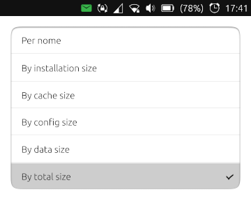
Different sorting options can be very useful ; the drop down menu is simple to use and does not take too much space, so I like it this way.
Next thing on my todo list

Edit: The idea of a fixed number of pixel/byte seems to me not really intuitive and it could lead to problems with larger sizes or being hard to read for small values.
I prefer the ratio cache, config, app and data over total app size.The graphic effects is really cool, but yes there are some issues when app sizes get too different...
One thing I thought (but could be another overkill) is the chance to sort of "hide" some of the biggest apps so that the proportion for the bars is calculated against an app that has a more "normal" value. Like don't consider neverball and doc viewer and use as 'the biggest' app teleports or dekko, or an even smaller app like nymea.
This could be helpful if you're analyzing the space and you want to keep those big apps but you can't clean space with them because it's all installation size or because you already cleaned space from them and you can't clean space anymore, and you want then to analyze smaller apps with a readable bar, not with a bar that's taking few pixels on the screen... -
@mymike said in Improve system settings disk usage analyzer:
One thing I thought (but could be another overkill)
 Better is the ennemy of good
 It will require some time to align properly the labels on top of the bars
According to me there is no need to align, it will cause more trouble than it will help.
Just keep the same order and it will be fine.For your streching problem, just use the color bar as a background like for a simple button (you can find simple examples in beginners tutorial for QML).
If you have your code available somewhere, you can share it and I can have a look.Thanks again for the good work.
-
According to me there is no need to align, it will cause more trouble than it will help.
Just keep the same order and it will be fine.Yeah, it'll be enough.
For your streching problem, just use the color bar as a background like for a simple button (you can find simple examples in beginners tutorial for QML).
The issue is that I wanted to align the labels but the whole bar is took from a ShaderEffectSource to put it inside a
UbuntuShape... If we decided to not align the labels, then I think putting them iside the bar isn't an option anymore because then the cache label can be found over the data rectangle...If you have your code available somewhere, you can share it and I can have a look.
The source code is at github.com/mymike00/system-settings/tree/xenial_-_better-disk-usage
Thanks again for the good work.
It's a pleasure improving Ubuntu Touch for me

-
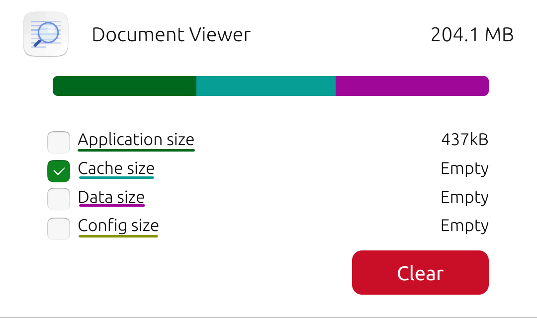
I added more sorting options
The value on the right of the app now reflects the order chosen: order by cache will display the cache size.
Here I'm a bit unsure about bars... Should I show them normally? This doesn't feel good as down the list apps can have a wider installed size bar than the upper ones
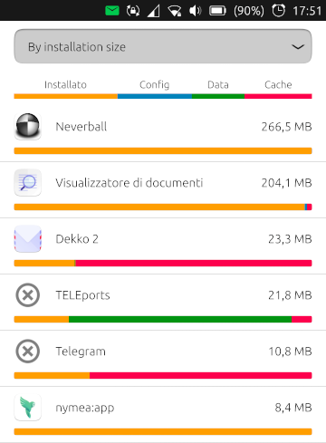
Should I show only the value chosen, with the proportion to the first app in that order? That'd way better! Should I just hide them? Maybe they doesn't add a significant value... -
@mymike Hi, great work,
I like the bars, but they look a bit too colored in the UT UI, maybe we should display just one bar at time.I have a prototype at:
https://www.figma.com/file/JuuTo9riDeza5zAl0VXLxl/Memory-management?node-id=491%3A1 -
@mymike Hi, great work,
thanks!
I like the bars, but they look a bit too colored in the UT UI,
Yeah, colors still needs to be adjusted, and I'm not that good at it...
maybe we should display just one bar at time.
When ordering by a specific size the plan is to show only one bar, but when ordering by name o total size used by the app I was thinking to show the different colors, so that at first glance you see what takes space on your phone...
I have a prototype at:
https://www.figma.com/file/JuuTo9riDeza5zAl0VXLxl/Memory-management?node-id=491%3A1I can't see it, it asks me for registration...
-
@mymike I've forgot to set it public, now it should work
-
I have a prototype at:
https://www.figma.com/file/JuuTo9riDeza5zAl0VXLxl/Memory-management?node-id=491%3A1Woah, that's pretty cool, indeed!
I was thinking of a popup to clear, but the expandable ListItem looks awesome!
I'm unsure on how to make the user selecting what he wants to clear: I was thinking check boxes like in UTTT, but in your mockup there are already the colored rectangles and them next to each other won't look good... Making rectangles checkable (or coloring check boxes :winking_face_with_tongue: ) could be an option but I doubt it will be intuitive for users... What about a thick colored underline and the check box in the place of the rectangles?
Also I'd still leave the bars visible even when the ListItem is collapsed
-
@mymike said in Improve system settings disk usage analyzer:
Also I'd still leave the bars visible even when the ListItem is collapsed
Maybe a collapsed bar? I've updated the link
@mymike said in Improve system settings disk usage analyzer:
I'm unsure on how to make the user selecting what he wants to clear
I'll have a look at it, I think underlined text doesn't follow the UT design guidelines
-
Maybe a collapsed bar? I've updated the link
Cool
I'll have a look at it, I think underlined text doesn't follow the UT design guidelines
Yeah, I agree... Thanks for the help :smiling_face_with_heart-eyes:
-
@Capsia
Thanks, I also love the last option with colored check boxes and the expandable list. -
Perhaps same behavior as UTTT, a popup that asks the user which to delete.
-
Perhaps same behavior as UTTT, a popup that asks the user which to delete.
Well, that would add too many steps imho: tap on app to expand, tap clear button and popup opens, then select and press clear, plus an additional warning dialog (it may be needed)...
Even if you put the clear button in the collapsed ListItem you may want too see the numbers before deciding to clear. And to do see the number you would either expand the ListItem (the button in the collapsed ListItem becomes useless) or press the clear button and see the numbers in the popup; but then you may decide you don't have to clear files for that app and to go to another app you have to close the popup, while with ListItem you can just scroll down and expand another one...Sorry for the long reply, I'm not really aware of how much I'm writing while I'm focused on an thought. That seemed so straightforward in my mind! :grinning_face_with_sweat:
-
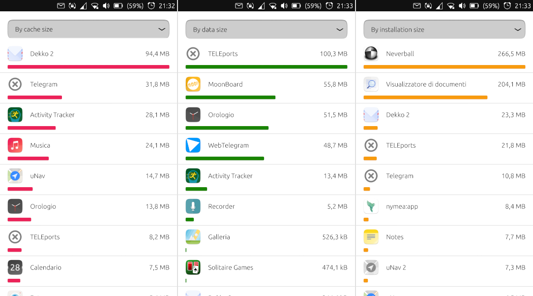
BTW, sorting by a single value has proportional bars. I have to say that's pretty cool!
Maybe the space could be optimized by putting the bar on the side of the app iconAnd yeah, I have to say that the first apps taking way more space that all the others makes the bars on smaller apps quite useless...
-
@mymike Hi, I've added delete process to the design:
https://www.figma.com/file/JuuTo9riDeza5zAl0VXLxl/Memory-management
What do you think?
-
@Capsia said in Improve system settings disk usage analyzer:
@mymike Hi, I've added delete process to the design:
https://www.figma.com/file/JuuTo9riDeza5zAl0VXLxl/Memory-management
What do you think?
Yeah, that's similar to what @kugiigi proposed, but without the popup: you need an additional tap before you are able to clear the space...
What about putting the bars under each label? This way check boxes can be places instead of colored boxes
-
@mymike said in Improve system settings disk usage analyzer:
What about putting the bars under each label? This way check boxes can be places instead of colored boxes
Looks great

-
Just a quick comment on the problem of short bars on relative graphs: Is this really a problem? When opening this setting I guess most users are interested in what is taking up space on their system, and the very short relative graphs is a great indication that "it's not this".
At least for me, that's much more valuable than the technical details about each app. And the graphs are a great way of making it clear, while the difference between 100 mb and 100 kb when written out is hard to grasp for most (non-tech) people.
")
-
Cool. Just came across this thread. I do love to see that this part of system settings is being thougth of. I do very much like the ideas.
Just a quick comment on the last design: As @mymike already said, I too think it does not need to be a two step action. The clear button could be set inactive if no check box is checked.
And I guess the numbers only do not match because it is a mockup? Otherwise I would expect
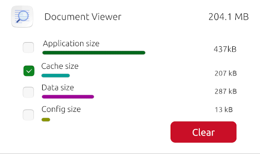
app size + cache size + data size + config size = total size. -
@potet said in Improve system settings disk usage analyzer:
Just a quick comment on the problem of short bars on relative graphs: Is this really a problem?
No, it isn't, you're right. Just a minor thing I noticed that 95% of the users won't...
When opening this setting I guess most users are interested in what is taking up space on their system, and the very short relative graphs is a great indication that "it's not this".
At least for me, that's much more valuable than the technical details about each app. And the graphs are a great way of making it clear, while the difference between 100 mb and 100 kb when written out is hard to grasp for most (non-tech) people.
Keep things simple! - Sometimes I forget about it lol...
Hello! It looks like you're interested in this conversation, but you don't have an account yet.
Getting fed up of having to scroll through the same posts each visit? When you register for an account, you'll always come back to exactly where you were before, and choose to be notified of new replies (either via email, or push notification). You'll also be able to save bookmarks and upvote posts to show your appreciation to other community members.
With your input, this post could be even better 💗
Register Login