tedit development and design discussion
-
@danfro This is necessary. With 3 options maximum, it makes sense.
-
@danfro I don't see it necessary but if you want to do it I see this option better than the one you have shown above, maybe the route to find the note is not necessary, I think it's better to put the route in Tedit information.
-
@Josele13 said in tedit development and design discussion:
maybe the route to find the note is not necessary, I think it's better to put the route in Tedit information.
The file storage folder is already named
- in the apps about section
- in the apps OpenStore description
- in the readme of the github
Users still get confused. This is partly due to how content hub works. Users do not expect that importing a file does copy the file. They think the original file will get modified.
So I think this does make the file storage folder very clear to avoid misunderstandings and users maybe using data.I too will try to improve the descriptions in the above places and maybe add some more details here and there.
And I need to run some tests to find out if that works with a symlink. So I may change it. But thanks for the opinion and thoughts about it.
-
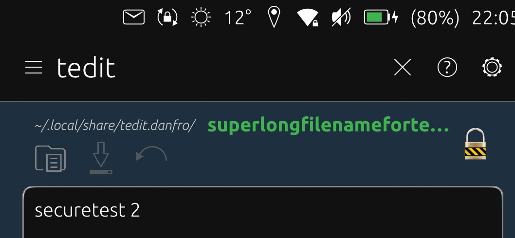
@danfro This looks very good. Since there is enough space vertically, I would prefere two lines. One line for the file name (including path) and one for the icons.
With this solution there would be space for additional icons, e.g. redo or open.
-
@ma Thanks a lot for the feedback.
I am not sure if we rally have that much space vertically. On my Xperia X the edit area, when the OSK is visible, is maybe 1/3 of the screen. And I hope to be able to add a second toolbar with formatting options in the future. So after playing around with this, I am more inclined to use the short toolbar in one row with the file name. The short toolbar would have the actions open, save and undo.
Although I agree, some other actions might be nice to have in quick access too. But making this configurable (one option) seems to be complicated to implement without loosing stability.
So which other actions woukd you like to have in quick access bar? I think of maybe have a fourth one, maybe depending on the available width or configurable. This would also depend on the general length of your file names. If one uses long file names, the toolbar might be inconvenient.
-
@danfro Often I just want to read a note. But while scrolling I accidentally change the text. Unfortunately, the keyboard also appears, which takes up about 1/3 of the screen. Therefore I would welcome a "read-only button" that prevents changes and blocks the keyboard.
-
@ma I think someone else asked for that as well. But when I tested that, making the TextArea readonly also drops all scrolling and pan interaction, so there is no way to navigate through the note. So far I haven't found a way to solve this.
-
@danfro Instead of making the component readyonly, maybe it could be possible to ignore all keystrokes?
-
@arubislander I guess it would need to prevent the OSK from rising. Ignoring keystrokes is no problem. If you just read, you don't press any keys anyway. The trick is, how to be able to navigate without raising the OSK. Maybe have an "input blocker" above the text area and adding some (external) scroll components. But not sure if thats a good solution, if possible at all.
-
@danfro Ah, right. The TextArea would need to be prevented from getting direct focus, but still react to swipes for scrolling ...

-
I haven't tried but wouldn't placing TextArea into Flickable work, making the TextArea the height of the
max(main app window, its content)and making Flickable handle the scroll?Albeit it is probably (and unfortunately) not going to automatically scroll down when inserting new lines in edit mode or just scrolling through with keyboard. Additional code to deal with that would be required, if at all possible

-
@zubozrout The TextArea is already in a Flickable. But the height is attached to the top of the OSK. Otherwise the OSK would hide part of the text when writing, which is not nice. Actually that is what is was before, I fixed that recently.
I will need to look into that deeper in the future, but for now I don't see an easy solution.
-
Everyone who wishes to give the short toolbar a try feel free to install the click from the latest pipeline.
I may try to test the folder and file name in one line and a toolbar below. But feel free to share your experience and thoughts about this stage.
-
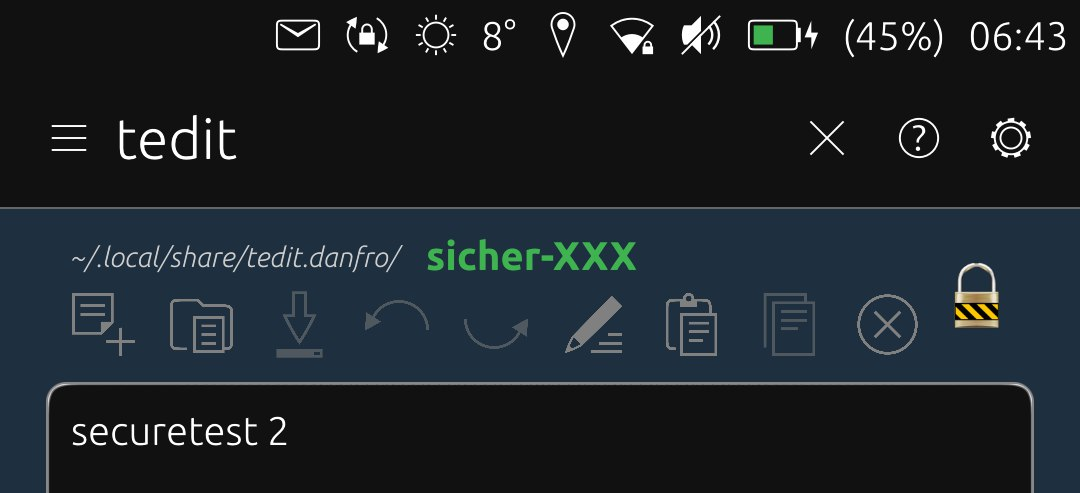
I did implement the exit button with check for unsaved content. And I did come up with this solution for buttons and file name which now allows us to have some more icons:

-
Hi @danfro , tedit is great as a general purpose text file editor, not just for notes. Because of that, it would be great to have an "Open File" option in the menu, that allows you to browse to any folder on the system, not just notes that have been created and saved from within tedit.
Thank you for any action on this!
-
@ancientsounds I do understand that this would be very convenient. But to achieve this, the app would need to be unconfined. And I would rather try to avoid that. I wrote some explanations in an issue recently.
You can share files to import them in tedit. I will (hopefully soon) find time to add content hub export too. Also you can create symlinks to tedit's file folder in other locations, as described in the README. I believe this does provide quite some flexibility to use.
-
This is as many icons as I can fit on my XperiaX, so I will not add more to make sure it works on smaller devices. Feel free to test the latest build from the pipeline.

-
@danfro Great work! There is the lock suru icon to fit with the style of the rest. Unfortunately there is no unlock icon, only a lock_broken icon. But maybe you could roll your own based on the lock one with the lock_broken one as a guide? Or is the icon removed when the document is in edit mode?
-
@arubislander definitely possible, but...
 If we later do a read only mode, the lock/locked system icon would be what I would use for that. Also the current lock sticks out, so it is not mistaken for a button. Thats why I kept it so far.
But sure, it doesn't fit our UI scheme. I will think about that. Maybe I have an idea. Or someone else has got one, then please share.
-
@danfro Forgot to add, the padlock indicates that the file is encrypted. Not related to the edit area.