OSK Enhancements Proposals
-
@kugiigi It's really cool. You know that?
-
@CiberSheep Cool and very helpful !
-
@kugiigi
Got the new changes in RC as well. Thank you for this, it is a huge usability improvement to the OSK.
-
I'm honestly not satisfied yet. The behavior of horizontal swipes might be erratic with one hand.
And I really want to add a better trigger than just the current "press and hold" the space bar.
Hopefully, I can work on it very soon so it'll be included in OTA-11.
Enjoy everyone! and don't be hesitant to nitpick so we can improve

-
Hello @kugiigi
i just realized that i don't see the words
cut copy paste
with portrait mode on BQ E5 HD. I'm on RC

The words appear in landscape mode.For NEXUS 5, there are the words in lands and portr.
-
@domubpkm Are you using the default scaling on your bq E5?
In any case, I really made it behave like that so that the buttons will fit regardless of the screen width.
The right buttons will have labels with enough width and then if there are more width available, the left buttons will have them as well. I believe bq E5's default scaling is a bit narrow than other UT devices. -
@kugiigi You are right. I used 17, a little too big.
With 15 not 16, it's good. -
Nice Work @kugiigi with the OSK of the current OTA! I really like it!
-
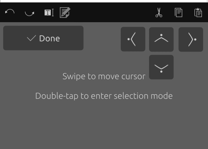
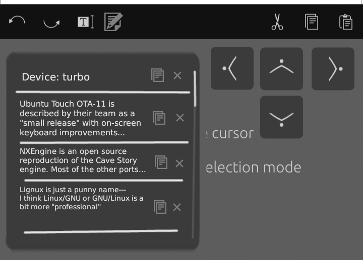
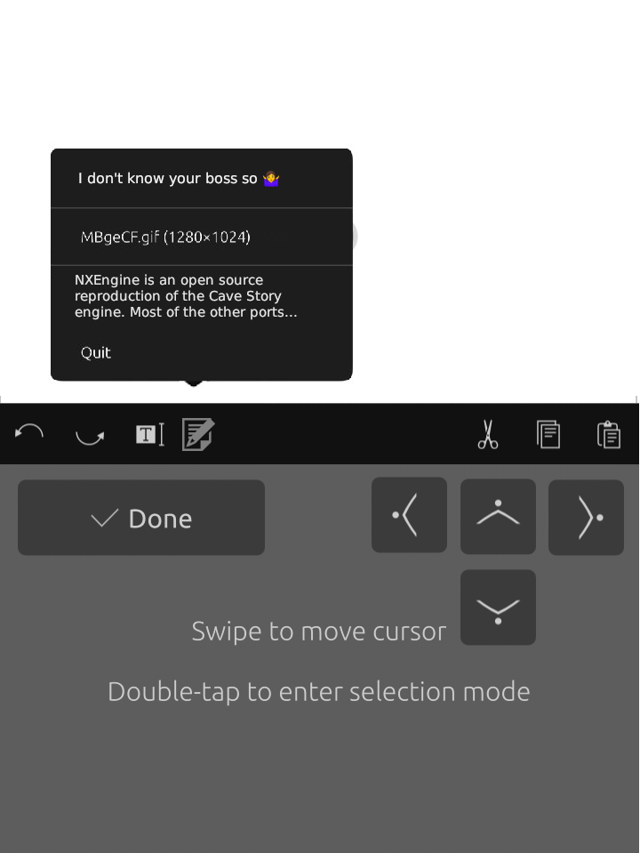
These designs are a bit eh, however, I know people have been wanting a clipboard manager, I dont personally use them, but I can see why people would want them, so I drew up some design ideas, hopefully someone will either itterate on the idea, or come up with a better solution, but I think it'd be neat on the keyboard.


This way it'd be inside the keyboard touch area, which some people might like if it looked nicer, perhaps the Done button would have to move, or you could tap elsewhere on the keyboard for it to go away.
This option removes the clipboard from the keyboard, to a external position.
A big problem with both these solutions, is that the clipboard wouldn't be usable in desktop mode, so something would have to be figured out with that, but theres an idea to throw into the pot, perhaps if the clip board isn't your guys style, these mockups could be used for something else one of you guys have been trying to cook up, but wasn't sure of an implementation.
-
@PhoenixLandPirat I would love a clipboard manager as well but I am not sure if there's such as thing already in the system available for the OSK to use. Sadly, I don't think I'm skilled enough for this kind of things. But if there's something we can easily integrate to the OSK, I'd gladly do it

-
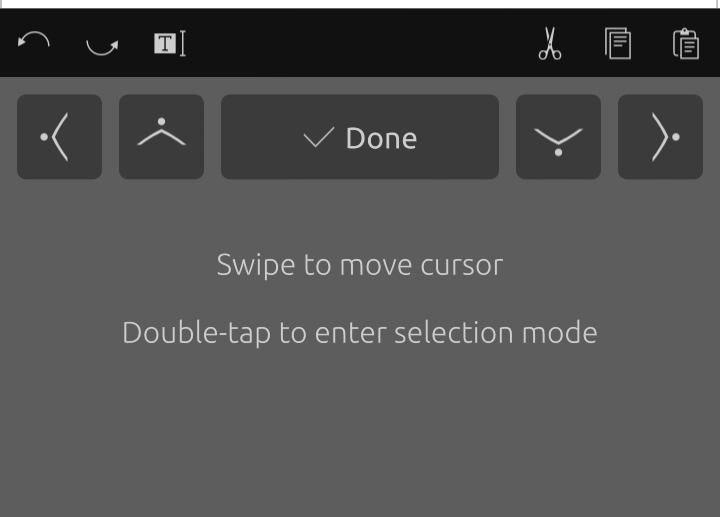
Just in case not everyone is aware of some details in the new feature in the OSK.
Did you know?

- After pressing and holding the space key, you don't need to lift your finger and do another swipe to move the cursor. You can press and hold and swipe immediately.
- For selection mode, you can also double-tap and swipe immediately. No need to lift your finger again.
- The arrow buttons can also be used while in selection mode.
Additional trivia:
There's a way to quickly select a word which can be done by putting the cursor within the word and double tapping. Just like how you do it using a mouse in desktops! HOWEVER, it was disabled because there are still known issues with the OSK and QtWebEngine. Enabling it would also mean breaking this feature in the browser and webapps
-
@PhoenixLandPirat why to squeeze a clipboard manager into OSK? I can imagine it better somewhere in system tray. It also solves the desktop mode problem.
-
@jezek If you're referring to the indicators, then thats been suggested previously, people have stated that they dont want more default indicators, so I suggested that it could be added to the text input indicator, but other people weren't fans of the idea.
https://github.com/ubports/ubuntu-touch/issues/1148
So I thought
(Stolen from Fuseteam), if people don't like it in the Indicator menus, the next logical place, would be the keyboard. -
@kugiigi I tested the selection feature on my Nexus 5 and found something weird.
When I'm selecting text or moving the cursor, swipes left or right works perfectly, swiping down works too, but swiping up has no effect...Is it by design or did I hit a bug ?
If it's a bug, I'll try to document it and open a detailed issue if you can just point me to your gitlab
Thank you for the great work. It's a very nice feature and I think a good advantage point to UT over other mobile OS
Cheers.
[Edit] I inverted swiping up and down, it's now correct -
@AppLee Hi. Strange, swiping down works for me on a Nexus 5. I can select, copy and paste with writer, tedit and a webapp ubports.
-
@domubpkm Oups sorry I tested again with messages and it's not swiping down, but swiping up that didn't work for me.
[Edit] I edited my original message to fix my mistake
-
@AppLee I've tested it. Indeed, we have to go to the beginning of the line to go back up.
But, is it really a bug or a voluntary programming choice? In the case of messages, I would rather opt for voluntary choice but.... -
Great work on this! One thing I think would be nice is adding a double tap to close selection mode, and clicking done should always close out all together which would eliminate having to click done twice to close.
-
@PhoenixLandPirat I see, people don't want more indicators. Then my proposal is to make a setting that can switch the clipboard manager indicator on/off. Default would be off, so no one would get a new indicator.
-
@domubpkm I'm not sure I follow what you're talking about ':)
But you mentioned messages, I guess you're talking about the focus jumping between theToandMessagefields when moving the cursor in the messages app. I think that's been like that even before and it's something that the app needs to adjust and not the OSK
@dieharddan That has been suggested before and I think it's very easy to implement. Maybe some one can try it and test it out if it's really better that way.
Hello! It looks like you're interested in this conversation, but you don't have an account yet.
Getting fed up of having to scroll through the same posts each visit? When you register for an account, you'll always come back to exactly where you were before, and choose to be notified of new replies (either via email, or push notification). You'll also be able to save bookmarks and upvote posts to show your appreciation to other community members.
With your input, this post could be even better 💗
Register Login