UBports Website rebuilding
-
It needs unification too...
Like merging https://devices.ubuntu-touch.io to https://ubports.com in a https://devices.ubports.com .Also, making clearer what works and not on the devices pages, and procedures to install for each phone, because even with ubports installer, it really is not as simple as "plug and let it do it's magic"...
-
@Keneda To modify, check and expand information on devices, we have a new way of doing it, more accessible to edition: https://gitlab.com/ubports/infrastructure/devices.ubuntu-touch.io
(I splitted the answer as we split the threads :D)
-
@CiberSheep
Can't manage to find the "what works and do not" for each devices.
Before, it was clear for each, now it's only a more or less filled orange bar that tells nothing factual. -
-
Hi Guys! I'm new here my name is Eyal, and willing to help with the new website.
My plan is to work on the home page copyrighting first, create 3d scenes (like a pro), and refine the whole devices and installation page into one flow. Does anyone wants to join me?
Eyal. -
@Kaizen Hello, and welcome. I think @CiberSheep is the best person to discuss this with as he is on the design team and can point you in the right direction
 and maybe NeoTheThird??
 -
@mintphin was doing some sketches as well.
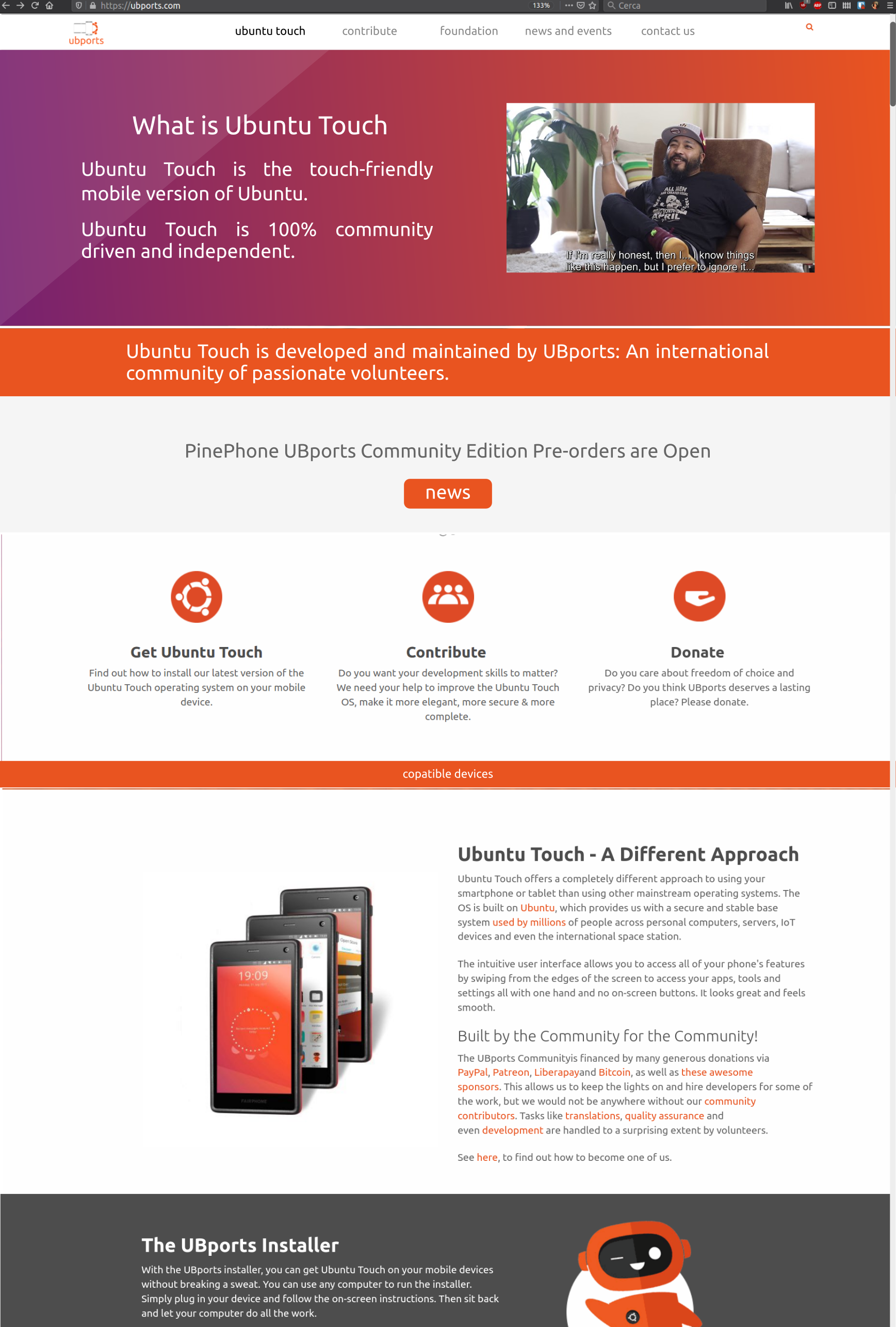
There is no hard plan yet but website needs some love indeed.I would love to keep it simple and keeping our style.
-
Speaking for myself, I think one of the biggest issues is simply the menu, there are far too many options to make sense of, consolidation is needed. Design-wise I think the website needs only marginal improvements.
I like the design Cibersheep posted. Simplicity is key.
-
Thank you, @loops! And thank you @CiberSheep for sharing your design/process with me! it seems that I've just arrived at the right timing! - First, let me introduce myself, I'm Kaizen 35y/o, designer from Tel Aviv/California.
To be honest - my goal is to create/design a kick-ass, super modern, and shiny website like any mobile OS entitle to have.
Let me share some of my thoughts and my point of view - The home page has to be stunning and be a pixel perfect design (like the OS)
Home page goals
- Attract developers/testers to join and contribute
- Be simple to Install for the general public
- Attract donors and supporters (hall of fame?)
General
- I would like to prioritize context and explore a different value proposition.
- Keep the navigation bar clean and straightforward.
- Create new high-resolution imagery - I was thinking of creating a Yumi 3D version in a low poly environment (doing stuff: building an engine, creating, developing)
- Simplify the download section into a nice flow.
- Add social and media proof.
- Keep the right balance between UBport and Ubuntu colors.
- Keep the texts easy to read.
I was thinking of a black background website, dark style with the right balance of colors (Orange/Purple), 3D Icons.
I have already created many 3D assets and still looking forward to creating the perfect figure and environment.
I have a lot of positive attributes, but if you have any genuine suggestions, I would be glad to hear them.
Please see the attached a rough drafts for concept only and share your thoughts.
WIP > Home page suggestion - https://ibb.co/bdS0CJv
Device List - a popup with device list! - https://ibb.co/DVcnZPw
Installer > Download Section - https://ibb.co/hyR69mr -
@Kaizen That looks great! Thank you. Hope it will be continued in multi-language version.
-
@Kaizen Very impressive. I hope you can catch the attention of the Design Team and hop on board.
You might want to dail back on the prominent displaying of the Ubuntu logo though. As I understand it, the UBports Foundation does have Canonical's permission to use the name Ubuntu in the name of the OS (Ubuntu Touch). But I believe it was also necessary to walk a fine line and make it clear the the project is in no way associated with Ubuntu or Canonical in any official manner. Having the Circle of Friends emblazoned in such a prominent manner in the artwork might give off the wrong signal. -
@Kaizen you have some nice ideas. Thank you but I think it needs more work:
- I don't think we should move away from mostly white. Black is cool but not for the project image as a whole.
- Let's keep the design as simple as possible. The less, the better. Avoid extra elements that add nothing to the design
- Don't abuse of Yumi even if it is a nice mascot
-
@Kaizen very striking designs, I do like what you have done! I will concede that I do think white should be the primary background colour instead of black, but the rest is certainly attractive. I will be following this closely.
Or, I just had an idea, maybe offer a dark and light theme? a bit like DuckDuckGo does. I understand this just adds complexity, just a thought.
-
This looks great @Kaizen and I totally agree that the homepage should attract. Your design is something fresh, different to what UBports has atm. I also agree with what @CiberSheep is saying and hope that this will end up in something gorgeous :).
-
Thank you all for your great comments! I liked the black version, but you right doesn't go along with the brand. Also, it was too "Gaming" and a bit childish.
@CiberSheep - I'm trying something new, white, cleaner, pure—worth waiting, not necessary without "extra elements that add nothing to the design."
Few words about these elements:
These elements are for an extra layer of communication like words (I don't believe in design BS, but it's true). As the same value, Ubuntu touch gives the market we need to provide the website visitors.
Ubuntu touch is not just a community-foundation with cool people creating geeky open-source OS. UBUNTU TOUCH IS A BRAND. If we want to attract donors and talented people, we need to choose the right communication tools.
@Loops - Exactly, something refreshing, attractive as you said. Dark/Light toggle button is something that I thought about, but I'm not sure that fits into the current website.
I'm here to deliver one page. As I see it, I need to design a new 'Header' and 'Footer' to be fit with the rest of the site. (If my design ever be used :))
@CiberSheep I've no attention to ruin Yumi, just lift his spirit. I plan to create beautiful scrolling animation, which tells a story of Ubuntu touch trough privacy, freedom, features, community, app store, etc.
@standwood - I see the urgent of multi-language website, I'm not sure I'm there. First I would like to the deliver perfect pixel design and see what the rest think of it, hope I earn my credit to design rest of the pages

It will be appropriate if anyone can tell me where I can find open store icons, screenshots, phone mockups, OS demo, and any materials which can help me.
I encourage everyone who is interested in taking part in the design process. Please leave comments!! positive or negative, I have thick skin (and much self-criticism)
In the end, I will deliver one page ready to use. (with animation and all the magic going on) Some parts of the design will be unusual elements, which may be hard to digest, but I promise It looks excellent.
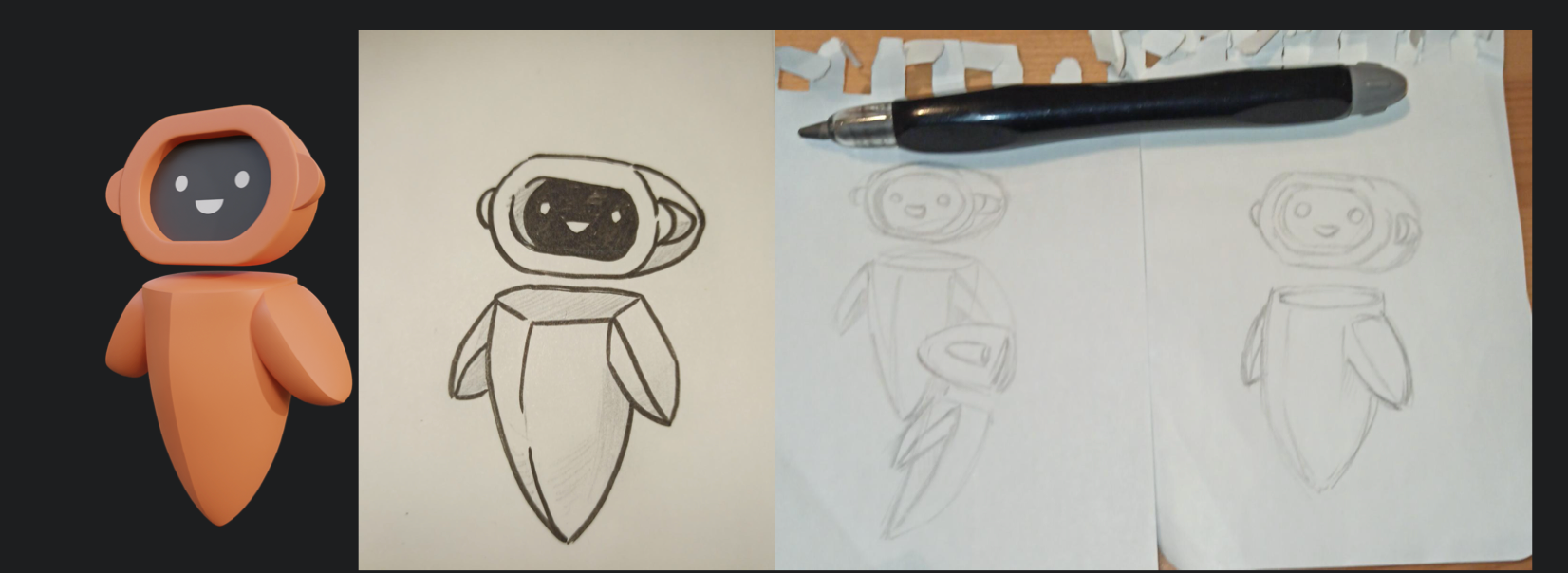
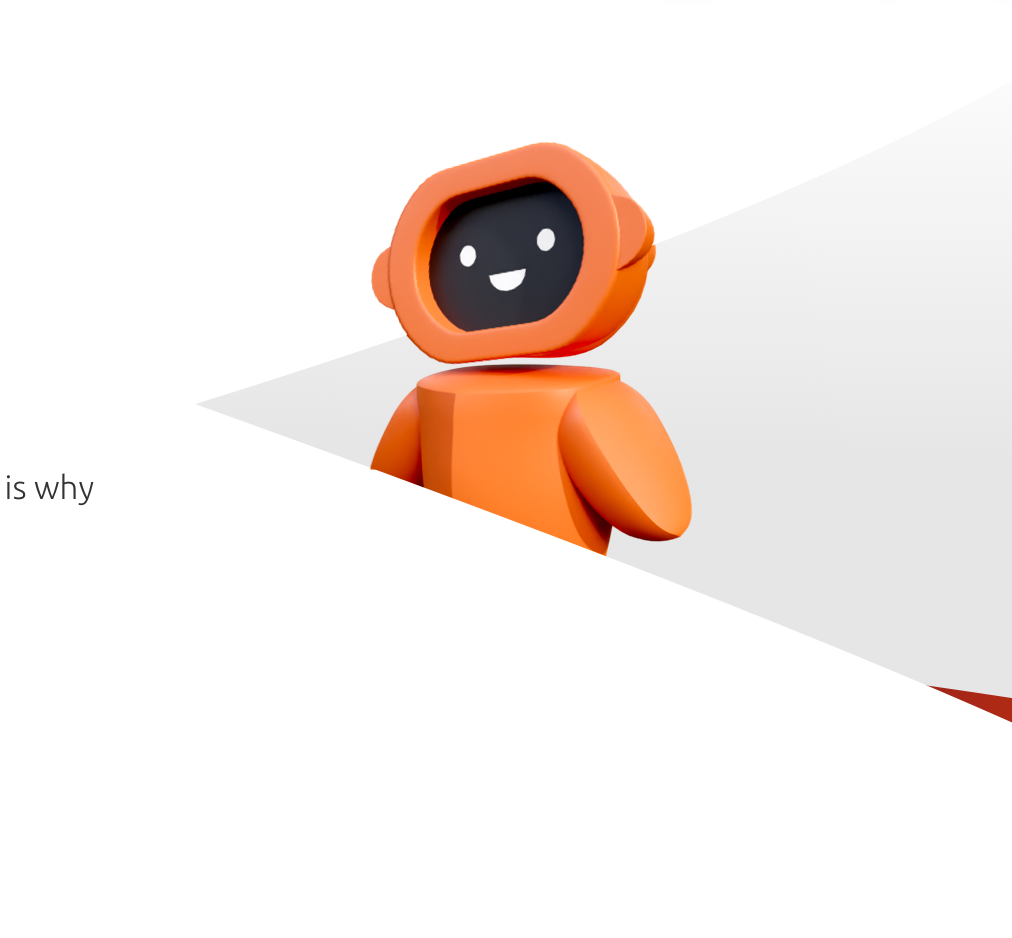
In meanwhile, see some of the 3D work in progress.
-
The 3d Yumi is great! I will be following your progress so please do continue, even if this seems a pointless endeavour, it will provide many new ideas and input into the website redesign.
-
@Kaizen said in UBports Website rebuilding:
It will be appropriate if anyone can tell me where I can find open store icons, screenshots, phone mockups, OS demo, and any materials which can help me.
You can find those icons in the git repository of the respective app.
https://gitlab.com/theopenstore/openstore-app/-/tree/master/openstore
https://gitlab.com/ubports/appsFor the phone mockups, I suggest using the PinePhone you might find them at pine64.org
[Edit] I like the 3D model and I'll be interested to have it as an STL or blender file if you're willing to share.
-
@Kaizen said in UBports Website rebuilding:
Few words about these elements:
These elements are for an extra layer of communication like words (I don't believe in design BS, but it's true). As the same value, Ubuntu touch gives the market we need to provide the website visitors.
I don't know what BS means.
Ok, I might have been a bit ambiguous sorry. With superfluous «additional elements» I refer to:
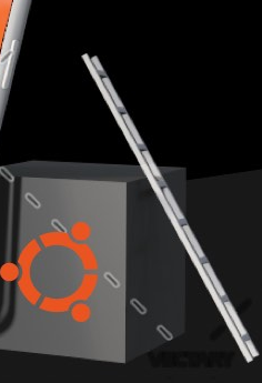
Extra balls and gradients:

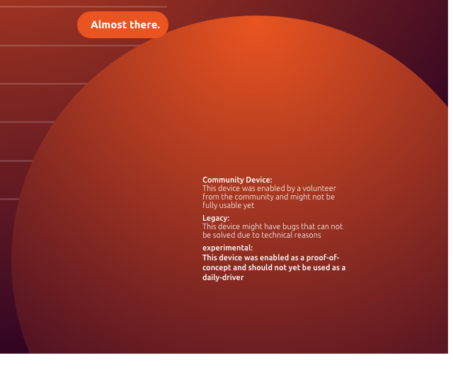
Extra elements and lines:
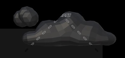
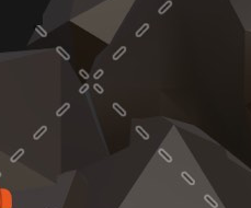
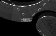
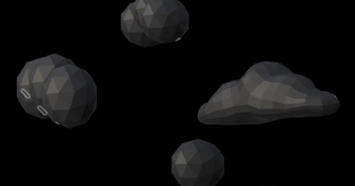
Over explained scenes / cumbersome images:

Extra elements + Inner jokes:
The ideal would be going to a more simple design, more in the way of:
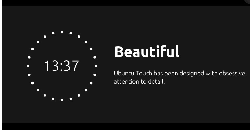
Keeps the OS image, it's simple even if the text is kind of mockery and negative, but that's «flour of another sack»
-
@Kaizen said in UBports Website rebuilding:
In meanwhile, see some of the 3D work in progress.

I love what you have there. The 3D model is cool but I'm a real fan of your hand drawings. They are absolutely gorgeous
-
@CiberSheep I would guess all of these things - with the possible exception of the "balls and gradients" - are mostly due to this being a relatively quick mock-up. The final page probably shouldn't describe Ubuntu Touch as a "A Powerfual alternative" either!

I think the way of thinking about Ubuntu Touch as a brand rather than a project makes all the sense in the world for the front page, at least if the goal is to convert people into using it. But "busy" elements should maybe try to mirror elements of the operative system itself, for example by dynamic animations illustrating the swiping gestures? It'd say animations are great as long as they direct (positive) attention towards elements of the OS itself rather than away from it.
Also, I'm not generally a software mascot kind of guy, but that 3D render looks great.
Hello! It looks like you're interested in this conversation, but you don't have an account yet.
Getting fed up of having to scroll through the same posts each visit? When you register for an account, you'll always come back to exactly where you were before, and choose to be notified of new replies (either via email, or push notification). You'll also be able to save bookmarks and upvote posts to show your appreciation to other community members.
With your input, this post could be even better 💗
Register Login