tedit development and design discussion
-
@arubislander Apps can be closed with a button press - if implemented. I think to remember uTorch or Timer app used that a while ago.
This is easily done, but it takes up space for one more icon. Unless many users think this useful, I would not provide it right now since it kind of is against the UT guidelines for UI and usage.
@domubpkm could you please file a feature request for that in the repo? We can keep the idea open and see what happens.
Edit: I guess the reason is simply convenience. I thought it useful at some point too. Just a single press, where otherwise several swipe gestures are needed.
-
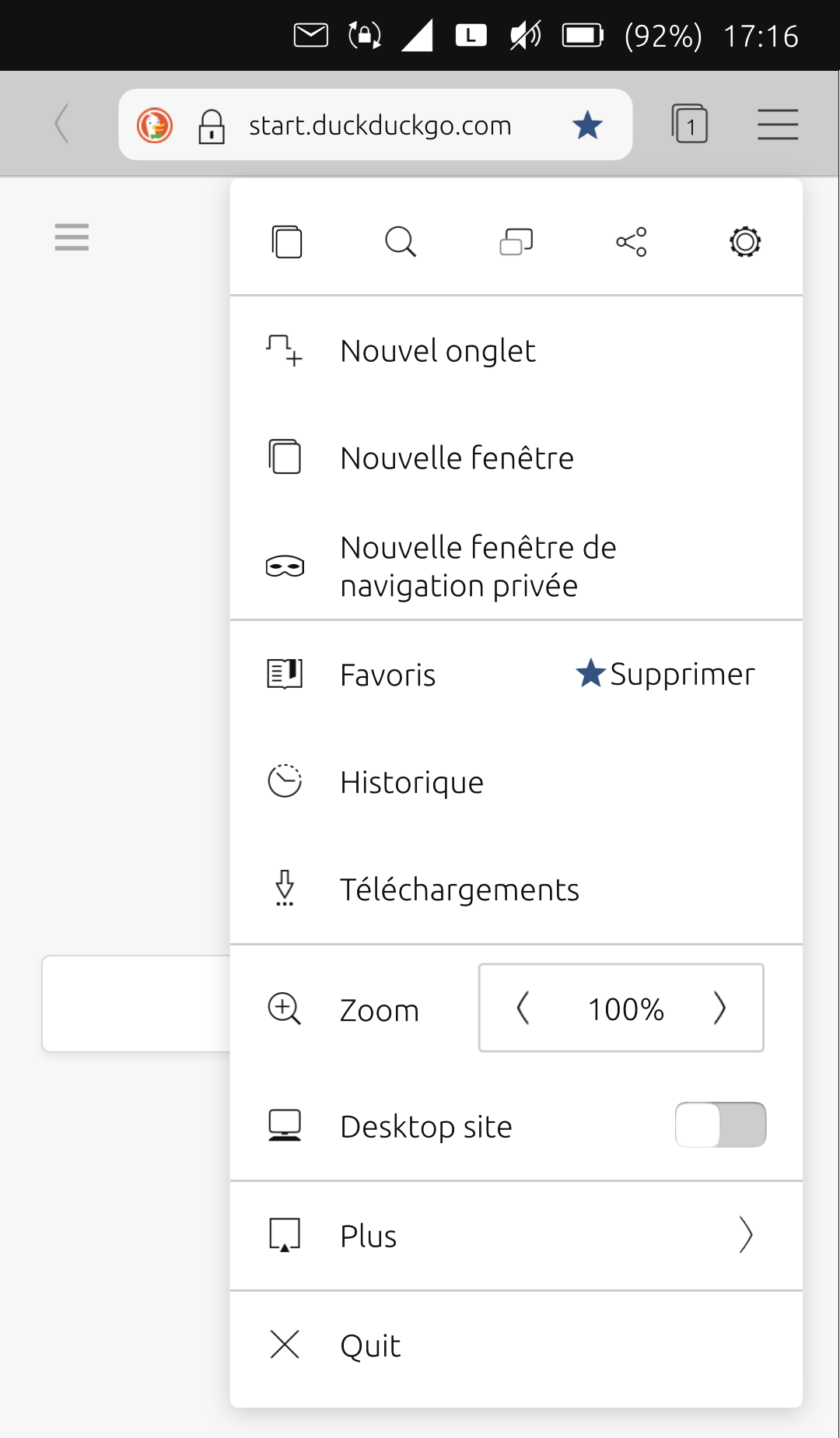
@danfro Just an example : in 'Sapot', there is the 'quit' option :

I don't want .odt
 . First, i thought it was necessary, but yes it isn't.
 -
I don't want .odt
 . First, i thought it was necessary, but yes it isn't.
It is perfectly fine to discuss this kind of features. I personally would like to have the option to use text, rich text, markdown but also odt as file format. The wish for that is perfectly understandable.
But that is beyond my skills and the technical capabilities right now. Also I don't think we should create a second LibreOffice.

-
@domubpkm said in tedit development and design discussion:
@danfro Just an example : in 'Sapot', there is the 'quit' option :
To be honest, in my opinion having this quit option in a menu makes it even less valuable. It either is a quick access or I may as well use the swipes.
Ah, I just checked Timer app. There I made this a setting. So users can choose to have a quit action on the header or not.
Thinking about it, I don't consider this good for tedit. Notes are not saved automatically. So accidentally pressing that button will make you loose all text. And having to confirm it every time makes it cumbersome to use. Again, my personal opinion.
-
@danfro Yes, the idea I submitted is not necessarily wise for tedit

-
Hi danfro, thanks for your efforts!
Color settings are not important to me. Only an adjustment to the system color scheme (dark mode) would be nice.
I would welcome a read-only mode. Sometimes I just want to read a note but unintentionally I change an entry while scolling. The keyboard also appears unintentionally.
-
When you open the app you can create a new note directly. That's pretty nice. But when you open an existing note, you first have to close the app to create a new not. In other words, there is no way back to the initial screen.
-
Notes are always saved in .local/share/tedit.danfro. When you select "save as" you can only choose a name but no directory. That would be a nice option.
When you open a file via file manager which is stored in your home directory you can edit the file. But a copy will be saved in .local/share/tedit.danfro. The original file in your home directory is unchanged.
-
@ma Thanks for the feedback.
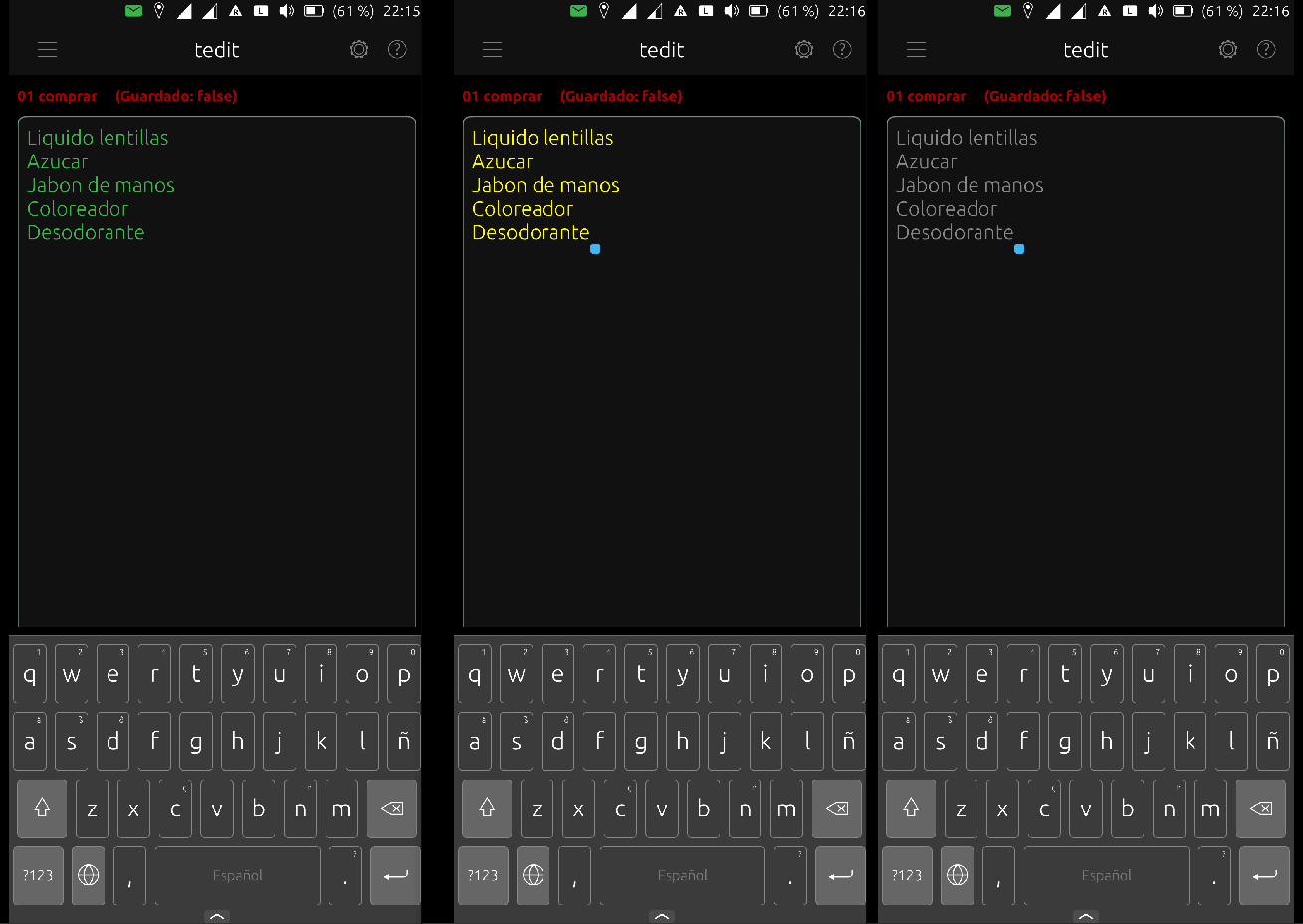
Those two things I will implement. The theme adjustment already works but is not released. I need to fix the edit area background changing with the theme. That is difficult e.g. with yellow letters and then white background.

The read only mode I think we will be useful for other things in future too. I am just not quite sure where to place that in the UI. But my development version already has a button for that.
-
@ma True, a "open new note" is needed.
 Could you please open a feature request for that in the repo?
I would also like a "open last note on startup". Not sure if I get that done easily.
-
@ma Yes, only the apps folders are readable and writable. That is due to apparmor restrictions. The app would need to be unconfined to get past that.
A note shared to tedit will be copied, correct. That is so the app can store changes.
Please see the readme in the repo for a way to link another folder for tedit to be used.
-
@danfro said in tedit development and design discussion:
Thinking about it, I don't consider this good for tedit. Notes are not saved automatically. So accidentally pressing that button will make you loose all text. And having to confirm it every time makes it cumbersome to use. Again, my personal opinion.
 Maybe this actually would be the benefit of an "quit" button. If using that button would prompt the user if there are unsaved changes so they can be stored before closing the app, that would be better than closing the app and loosing all unsaved changes.
 -
@danfro said in tedit development and design discussion:
Maybe this actually would be the benefit of an "quit" button. If using that button would prompt the user if there are unsaved changes so they can be stored before closing the app, that would be better than closing the app and loosing all unsaved changes.
In any case, one action would not exclude the other: exit by a swipe (no recording) can coexist with the 'quit' option which would ask whether you want to record or not.
-
I think the app is perfect, if the background colors are a problem, you can remove that and leave it to change the Ut theme, I prefer in Ut the dark theme, in tedit too.
a good option would be to share one or several notes and that way you can easily export them to Teleports or to another location in the file manager,
the possibility of colors in the text is great, if you can keep it is perfect, if you see difficult to keep it then choose a viable color, for example with the dark theme it fits well the white, light grays and even the green that it has now.
Thanks for your great effort in this app
-
Hi @danfro most of the times I read the notes ... I'd like to open tedit directly on notes list and and tap the note to open it.
Regarding colors the dark mode possibility It's enough for me.
-
@Br1 True, not having to swipe a note to open it is something I would prefer too.
I will think if having several start page options is possible: new (empty) note, notes list, last used note. But not sure yet if that is easy to do.
I will certainly not only support dark theme. Many users like Ambiance too. So an app needs to support that. But I may reduce coloring options to make this work. Although maybe I add a setting for a fixed theme in tedit like other apps do (system theme, Ambiance, SuruDark).
-
@danfro said in tedit development and design discussion:
@Br1 True, not having to swipe a note to open it is something I would prefer too.
Nevertheless, swiping the app away will remain possible. What happens to the note being edited then? Are the unsaved changes lost?
-
@arubislander said in tedit development and design discussion:
@danfro said in tedit development and design discussion:
@Br1 True, not having to swipe a note to open it is something I would prefer too.
Nevertheless, swiping the app away will remain possible. What happens to the note being edited then? Are the unsaved changes lost?
Yes, unsaved changes are lost on swipe&close of the app.
-
@danfro Sorry, but I'm not on gitlab. So I can't open a feature request.
Therefore I appreciate your survey here.

-
To open a note I would also prefer a tap instead of a swipe.
Having all notes on the initial screen would be a good option.
That unsaved changes are lost on swipe&close of the app is okay for me, because you get a red warning.
I like your idea of a toolbar. If there would be a save-button you may use two different colors for it. E.g. grey button (inactive) = note is already saved or black botton (active) = note is unsaved.