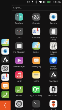
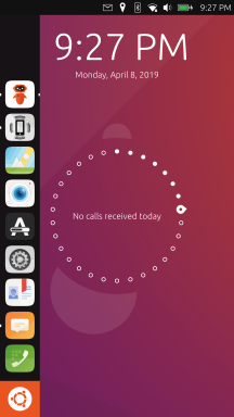
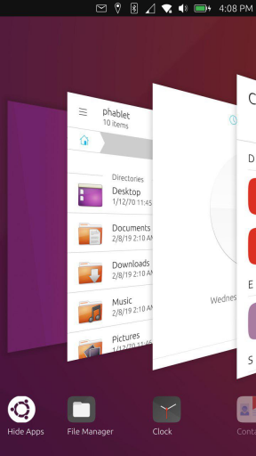
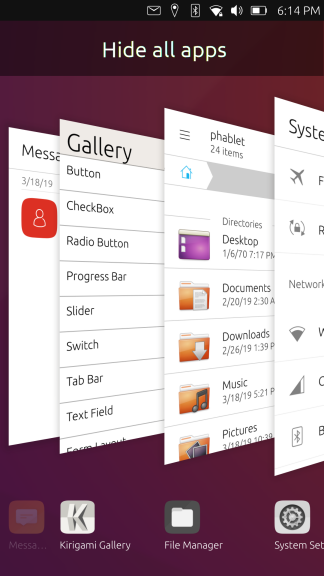
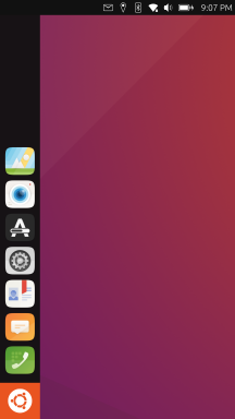
I wanna go home
-
@Keneda said in I wanna go home:
"Abusing" is a strong word i think, because it has a wicked connotation.
What word would you use instead? Exploit? Subvert?
It is an accurate description of what the app does, as it circumvents and modifies system behavior.
-
@dobey said in I wanna go home:
@stan said in I wanna go home:
the empty background comfortable and natural.
I still don't understand this. If you close all apps, it is empty save for top panel and launcher. What is good about wasting battery by keeping the screen on and staring at an empty background?
I think this is really just a preference. But to be fair, using a keyboard shortcut, there's a way to minimize all apps and show the desktop. So I guess it's not a bad thing to have it as well via gesture/button. Actually I was thinking of adding it in the app spread

-
I wana go home where it is safe and where my kingdom stands
the following are suggestions and just my two cents these suggestions and comments are directed at no party or developer, i am just a android developer adding my two cents in a attempt to help UBPorts become successful. i will break my comments down in sections that are hopefully insightful and a new perspective from a outsider.
The land on which i stand
It is important to understand when we are developing a new os which has its underpinnings solidly rooted in safety and security for the end user this does not mean we must give up on past experiences and leanings which may not be our own. Innovation is not the process of a new idea but the execution of a idea in a way that makes it better then before.for ubports what this means is do not attempt to rebuild the wheel there is a set of navigation traditions that work well and have been accepted by the mobile community and these traditions do not effect the safety and security of the device therefor we should adopt them bellow is a outline of what this could look like.
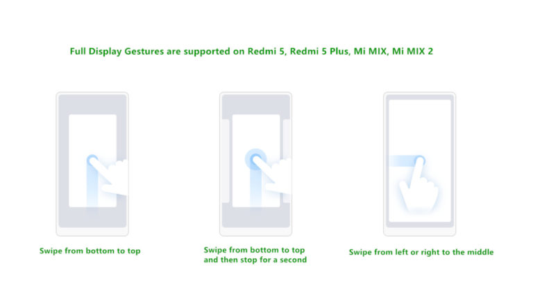
Gesture navigation has now been formalised in the mobile world these learning can be applied to ubports for a seamless transition into the OS. I would recommend we keep the left to right swipe to open the app menu as this is a uniquely ubports take on the apps menu. however we should consider a bottom to top swipe to get back to a home screen as well as a bottom to top swipe stopping in the centre to get to the currently running applications.

meanwhile the right to left swipe currently being used for the currently running apps should serve as a back gesture. many apps have the back key all the way at the top its hard to reach at times and will continue to be this way on larger devices.
Take me to my kingdom
The home screen every os has one this space should be one that is configurable and usable for the user. we must take into account ubuntu desktop has a screen where a wallpaper can be changed as well as shortcuts can be placed. this area should be available for each user to decide what they wish to do on it and not dictated to them by the os.

ubports != desktop in your pocket
we must remember however a mobile phone is not our desktop its purpose is not the same, therefor we must also consider how we use the device. allot of what users want to do is get information quickly at a glance and lets remember parts of what makes Linux special is the ability to customise it. we must consider implementing a way to have widgets and desktop apps on the main screen this dose not make us a lesser os just because others have also done it it makes this product a viable alternative with all the benefits of a safety and privacy respecting os.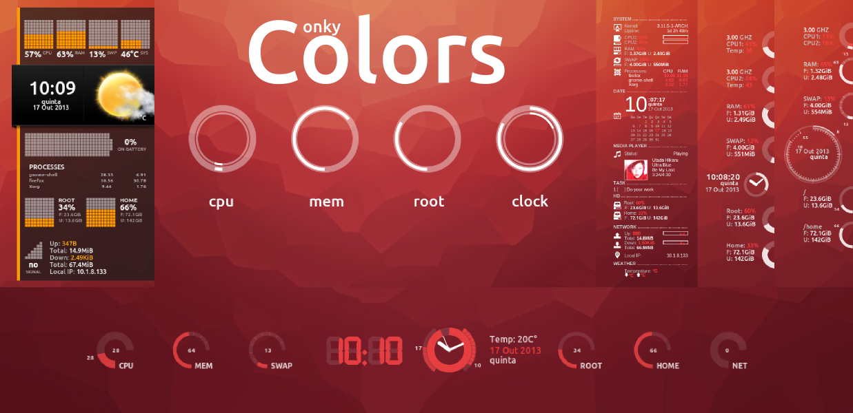
-
@KrishneshG said in I wanna go home:
we must remember however a mobile phone is not our desktop its purpose is not the same, therefor we must also consider how we use the device.
This is not quite true. Actually with Ubuntu Touch (and with Android 10+), when you connect the phone to an external display, mouse, and keyboard, either wired or with Miracast adapter, you get a more traditional windowed layout, and legacy apps can become useful through the Libertine container support.
Simply because you personally don't use something, or that you aren't aware of a capability of the OS, doesn't mean others use it or it doesn't or shouldn't exist.
-
@dobey said in I wanna go home:
Simply because you personally don't use something, or that you aren't aware of a capability of the OS, doesn't mean others use it or it doesn't or shouldn't exist.
You can apply this to home/desktop like feature on uTouch

-
@Keneda If we had infinite teams of infinite monkeys working on the project, then we could have every possible bit be configurable to satisfy every infinite person.
IMO, there are much more important problems to solve with UT, to make it usable. Also, the goal of UT isn't to have configurable things for every possibility and every user. It's to make informed and opinionated decisions on the design aspect to build something different and better suited for converged usage. It's understandable that people find something new and don't know how to react. But posting screenshots of GNOME (which by the way, does not have a home screen, and in fact no longer has icons on background), random Android manufacturer gesture configs, or random things from behance posts, isn't the best way to get a point across, nor will it solve anything, especially when there is no clear connection between said screenshots and the text in the post.
That means every pet feature that anyone wants to see may not be suitable, and may end up not being included, because it conflicts with those design goals.
-
Mobile UI isn't an easy problem to solve, which is why you're seeing some many - often conflicting - positions and requests. I have only been involved since the covid outbreak, and was able to daily-drive both options. My preference: the drawer. That said, there are positives from the other option as well.
I do believe, however, that my mobile phone shouldn't necessarily have the same interface and interaction as my desktop.
-
Hello
Just a simple remainder :
Feature Request : slide-show background #1359
Best Regards
Pulsar33 -
Here is a new home to experiment, thanks to Pavel Prosto.
https://open-store.io/app/uhome.pavelprosto -
 A AppLee referenced this topic on
-
When these "modern" OS-es start, the clean desktop is shown,
meaning the user knows it is there, and for some reason the starting state is off limits if there is one or more programs open.elementaryOS also does this.
Even the keyboard shortcut to show the desktop is removed.
The section isn't even there anymore.Would be interesting to see what kind of problems people think they are solving by implementing this.
It is 100% against convention of anyone touching a computer or device the last 30 years.
The upside seems to be not accidentally minimizing something you are working on.It is also not how the system the user is familiar with and is using has functioned in the past. For my own sake I will say this makes me think of something I know I can use, into something where I think I can't figure it out and no change was needed.
And no, it just isn't possible anymore. No explanation.The mind compartmentalizes information in structural hierarchies, and the spatial awareness to keep track of this is something you can do with cognition, but the ability to look at a clean slate actually has function.
It is the closest thing you get to seeing where your files are by default.Yes, that place someone decided no files are to be shown,
before they decided file hierarchy is something the user shouldn't do.There is a serenity to having just a clean slate to go back to.
It is as familiar, and not having what you are doing visible on the screen is useful.It also has the benefit of vested interest and familiarity in that the user often changes the desktop. Thus making it their machine.
Hello! It looks like you're interested in this conversation, but you don't have an account yet.
Getting fed up of having to scroll through the same posts each visit? When you register for an account, you'll always come back to exactly where you were before, and choose to be notified of new replies (either via email, or push notification). You'll also be able to save bookmarks and upvote posts to show your appreciation to other community members.
With your input, this post could be even better 💗
Register Login