uWolf (LibreWolf)
-
@ChromiumOS-Guy
Hello and many thanks for the work!
For me (from favorite to appreciated): Option 5 - Option 4 - Option 3 -
@ChromiumOS-Guy Options 1-4 are too detailed for small screens. Also the other new ones are more detailed than the current one.
The new ones are all very stunning, to be sure, but for legibility, I think the current one is better.
{EDIT: Just saw the modified icon, and that one actually fits better with the Suru style of UT. But if you want to avoid modified icons, then I guess adding some space around the original to avoid the clipping would be a good change as well.)
-
@arubislander i would say option 5 is what you mean.
-
@ChromiumOS-Guy Very nice! My favourites are 5 and 6. The ones before that are too detailed, and 7 is too busy.
-
@ChromiumOS-Guy Option5 is not too bad, but the fur on the wolve's neck is too much detail imho.
-
@ChromiumOS-Guy said in uWolf (LibreWolf):
@arubislander i would say option 5 is what you mean.
I think he means this one:

Closest to number 5 here but not quite the same.
-
@ChromiumOS-Guy I think also that the one shown by Moem is the one that fits Ubuntu Touch's design the best.
For reference:
https://docs.ubports.com/en/latest/humanguide/design-concepts/app-icon-design.html -
@ChromiumOS-Guy (round 2)
Looking at them close together, I actually like option 5 more, except for the fur on the neck. If that were smoothed out, that would be my pick. -
-
@ChromiumOS-Guy Option 5 without the fur and thanks for your work.
-
@ChromiumOS-Guy No rush of course but can you say a few words about noble? I don't see any commits relating to it yet, so I assume a real wayland port is not done yet? Do we know if the current state still works on noble? Thanks.
-
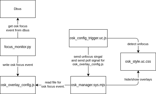
So have a question about security. I read that uWolf has unlimited access to the system. Isn't that a big security risk? How do you guys see that?
-
@rdfrs thats because apparmor rules (waiting for fix to trickle down to stable releases ask @Fuseteam he knows about this better then me)
confinment is mostly done, not a priority though because it will not raise security as much as you think only make it clearer to you the user what i am doing on you're phone, which granted is a very good reason and is why im working on it. (there is a branch with confinement implemented im just waiting until it won't break the app to use) -
@ChromiumOS-Guy said in uWolf (LibreWolf):
@rdfrs thats because apparmor rules (waiting for fix to trickle down to stable releases ask @Fuseteam he knows about this better then me)
confinment is mostly done, not a priority though because it will not raise security as much as you think only make it clearer to you the user what i am doing on you're phone, which granted is a very good reason and is why im working on it. (there is a branch with confinement implemented im just waiting until it won't break the app to use)Awesome! uWolf is currently my daily driver browser in UT. Thank you for your hard work!
-
@ChromiumOS-Guy good to hear! Sounds great!
-
Does it still start for anyone after the latest update (on 20.04)?
-
@haagch Yes, but I only got OSK on the second run.
-
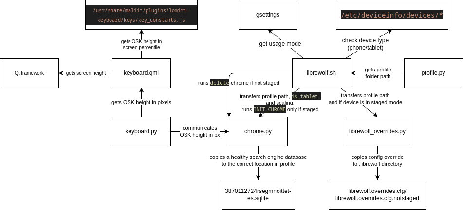
@Ida_ Ugh it started working again after restarting the phone. I didn't see any obvious errors in journalct or the output of /opt/click.ubuntu.com/uwolf.chromiumos-guy/current/librewolf.sh, not sure what the problem was, but a reboot fixed it.
-
@haagch i'm going on vacation today so development is going to be slower then usual combine that with the NixManager plugin for Noble which im also working on, and the fact i just moved all my devices to Noble in preparation for moving uWolf to Noble proper and i can't really do much about it.
but uWolf is janky like that because of Xwayland if the OSK gives you problems enter the wayland windows (the one with the icon and loading gif) it will redirect you back to the browser but in most cases will also unstick the OSK and make it work again, because somehow Xwayland "unselects" the window that is the browser.
-
you can also just tap and hold for the context menu, then it should work again
Hello! It looks like you're interested in this conversation, but you don't have an account yet.
Getting fed up of having to scroll through the same posts each visit? When you register for an account, you'll always come back to exactly where you were before, and choose to be notified of new replies (either via email, or push notification). You'll also be able to save bookmarks and upvote posts to show your appreciation to other community members.
With your input, this post could be even better 💗
Register Login