A possible Dash replacement
-
I have used this as a dash replacement the last days and I still love it. I have to say: Yes it is very like Android. But it is also very like FirefoxOS, very like TizenOS, Plasma Mobile, even a little bit like iOS. A classic appgrid just has proven itself like a desktop with icons and one or two panels (Forget Gnome3 :-P). Even WIndows Phone has an app grid which just has some eye candy bling bling effects and different sizes. And dont forget that we STILL have the unique selling point: The launcher at the left and the swipe gestures which are still undefeated! And of course we still blame Samsung with our REAL convergence

So I only see advantages with your idea and I would like to have this as default.
-
@krille It really feel like FirefoxOS. I had played with Boot2Gecko before, it was neet. Anyway, it should be optional, every user can decide for him/herself. We have a saying in Slovakia, "100 people - 100 tastes"
This would only benefit the Opensource UT, give consumers options, not restrictions. -
@stefano said in A possible Dash replacement:
We have a saying in Slovakia, "100 people - 100 tastes"
My personal modified version is "100 people - 200 tastes"

-
I love Unity, that's a known fact but I love Sprint because lets you use icon packs.
However, I don't think Sprint should be the default launcher. -
In germany we say 'ask two people and you'll get three opinions'
")
Lets make the empty Sprint the default 'background'/home screen... Noone is forced to put any app icons on it. Additionally lets make it interchangeable/configurable maybe, s.t. the user is able to set an arbitrary app as home screen. (we could let the user define multiple apps as home screen and use the same left/right swipe mechanic as for scopes now.)
Then lets think about what the ideas have in common that were brought up here:
https://forums.ubports.com/topic/2043/a-possible-dash-replacement/4
https://forums.ubports.com/topic/2074/ut-home-concept
https://forums.ubports.com/topic/568/the-big-scope-question/8Whereas in the later we wont have scopes indeed but only apps and an interface where they can provide/consume information to/from each other as @Krille has suggested in the first.
-
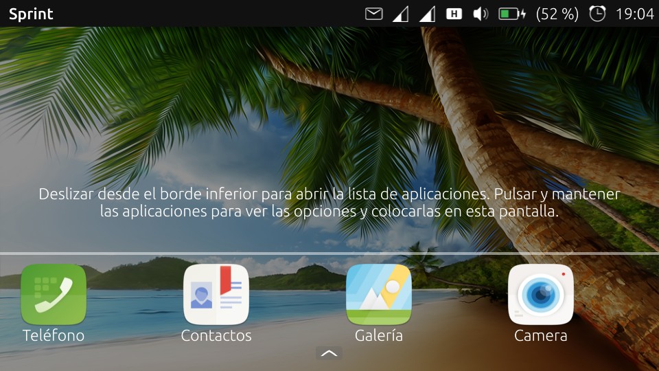
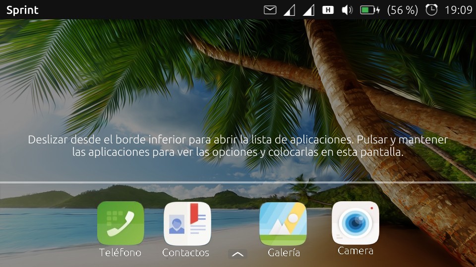
Hi guys, I love the new Sprint design, a step forward that I can see well in the case of any change, and gives the user the ability to change the home screen, a fresh view of the home screen. We can put a family photo without the icons blocking it.
We could add widgets as well, but there are two things that are missing in this change: the current white background is horrible, I think it's better to put the Ubuntu colors or add transparency at least, and something that I think UT is lacking is that developers shouldn't place the buttons in any place they want, you must promote a set of design rules to make the system homogeneous. I like the lower button for everything, or an arrow pointing upwards, like in the youtube app for example, although there are people who like more the traditional way, the buttons in the top area, me too, whatever the choice, all applications treated equally.
I think it would be a good time for a change. Sorry for my english...thank you Bhdouglass for your dedication and hard work.
-
@josele13 turn settings->background->dash-background on to get your background image as background in sprint too.
concerning the buttons I'm not completely sure what you mean. I think its relatively consistent for core apps. everything else is up to the freedom of the app developers. -
I really like the idea of being able to swap out the dash by installing a new click. Would go a long way for customization for our users.
-
@bhdouglass said in A possible Dash replacement:
I really like the idea of being able to swap out the dash by installing a new click. Would go a long way for customization for our users.
I really like the idea of being able to swap out everything by installing a new click. Would go a long way for customization for our users.
")
-
I am testing sprint on my Nexus 5 (16.04 RC). I like this desktop very much at least because there is a structure possible and icon packs can be used. Here some suggestions for next steps:
-
It would be nice to swipe left on this desktop to have than browser bookmarks to start directly web pages (like we had it in 15.04 with the bookmark browser). Or maybe something like a double screen. And probably bookmark icons should be smaller than app icons (5 icons in one row).
-
I would like to change text size separately (because they overlap)
-
It would be nice to change the place of the icons on the screen. Actually I can place them only at the first time when adding to the desktop.
-
Is it possible to autostart sprint? (and maybe autohide standard 'Anwendungen'?)
-
-
@hummlbach I think that developers should make a meeting, talk about it and decide a format, at least on the first screen, in any desktop app you see the 3 buttons close, minimize and large screen, or you also see in the second line File, Edit, View History, Bookmarks ........... everything in order, but that can be discussed later on another topic ..
an idea that has crossed my mind is to slide the arrow up the apps come out, could be put in differentiated order or adding more screens :
1º apps of Ut
2nd apps of Anbox
3rd Apps of Libertineis a suggestion of mine,
Greetings........
-
Hi! I will give my opinion as well, even if others already had similar arguments to mine.
Well, I'm really sorry to say it like that, but I sincerely hope that this will not be the future dash of Ubports...
For me Ubuntu Touch is an alternative OS to Android and the mainstream mobile OSs, that's why I think that what's special on it is to be different.
I hope the dash to look more like that : https://news.softpedia.com/news/ubuntu-touch-vibrant-venice-concept-is-absolutely-stunning-493303.shtml
Of course it was conceived with the scopes (<3), but in my opinion it was one of the best things of UT...
Nevertheless, thank you for keeping to work hardly on the OS !! -
I have been lurking here for a while now and I will try to sum up what I think are some of the best suggestions. None of the following is intended to be a criticism of any other ideas, just my random thoughts about what I would like to see. The basic idea of Sprint is excellent but it needs the ability to move icons once they have been placed, and a means to categorise apps. The obvious mechanism for this already exists in the '.desktop' files.
The HOME screen should be as clean as possible but fully customisable, and show any widgets placed there. By way of explanation of a possible mechanism, imagine a long vertical ribbon with collapsible sections, and the HOME screen at the middle. Below the HOME is everything RECENT and above is FAVORITES & CATEGORIES. HOME should effectively be DESKTOP and if larger than the current device screen could just scroll up and down as appropriate.
Widgets on the HOME would be active and automatically show latest information. Eg. Time, Weather, News headlines, etc. It could be argued that HOME screen could also control Login. For privacy, the HOME screen should not show anything other than generic info from the widgets. Attempts to slide the ribbon in any direction would prompt for password. The existing circle lock screen (without the lock) could be reduced to a widget within the HOME.
Once logged in HOME would display 2 icon bars, one above and one below HOME. See https://mir-s3-cdn-cf.behance.net/project_modules/max_3840/8d38e429848255.560b1cb20aad9.jpg for the lower bar representing each category of RECENT, eg, music, pics, documents, files, apps, etc. A similar icon bar at the top indicating categories of apps extracted from the .desktop files. These 2 bars should not scroll (ie would remain visible) until the HOME has left the viewed section of ribbon.
Clicking an icon on the 'recent' bar would display relevant files from that section of the ribbon. HOME could also be slid upwards to show sections of the ribbon corresponding to the icons; each section having a separator bar with the Icon, Section title (which scrolls horizontally if insufficient space), Expand and Contract buttons (^,v) and a home button. Initially only 1 row of most recent files would be displayed. This would allow quick up/down scrolling. Clicking Expand would show more files. A second Expand would launch a helper to extract info from files in that section, eg Artist, Album name, etc for music tracks; EXIF info for photos; Openstore description for Apps; etc.
Clicking an Icon on the top bar would show the appropriate category of apps, again with a separator bar. In a similar manner to recent items, clicking Expand once would show the most recently used within the category, and a second Expand would show description info from the .desktop file. Continuing to scroll up would show Favorite Apps, Categories (as declared in .desktop) and ALL.
I would propose also to introduce another meta-file (say .app_space) to perform GIEMM's 'universe' idea. This file could be stored in the same location as .desktop files (~/.local/share/applications) and a short_tap/leftclick could open a helper which displays a 'flower' similar to the navigation buttons which you can currently drag up from the bottom of some apps, each petal performing a different action. The .app_space file would have a similar structure to .desktop and declare a Description, Categories and an action & icon for each 'petal'. Actions would be URLs where appropriate, or executable with startup parameters to invoke different behaviours for an app.
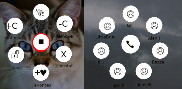
Rather than needing to have a separate area for selecting apps to add to the favorite screen, I would propose that a longpress on ANY icon should allow you to 'Launch, 'Unlock' to move within a Category display, 'Add to Favorites', 'Add to another Category', 'Remove' from Category, 'Uninstall'. Any changes to info held in a .desktop (or .app_space) would automatically save/update a local copy ( in ~/.local/share/applications). This action would be performed by a special xxx.app_space which responds to any to a longpress on any .desktop/.app_space file in order to implement the above add/remove/uninstall actions.
By allowing .app_space files to also have Categories, they can effectively be pinned to say Recent Comms. Also you could pin a games.app_space into Recent Apps to keep your 4-8 most favorite games on a single 'flower'
A question one should ask is: why do OSes need a taskbar? If you have a folder/ribbon section for RECENT apps, by definition anything running IS recent.
Proposed ribbon:
ALL
System
Settings
Office
Multimedia
Internet
Graphics
Games
Education
Development
Acessories
Favorites
HOME <-- ribbon always opens here and scrolls down and up to view other sections
Recent Apps <-- includes runnig apps (no need for separate taskbar)
Recent Communications
Recent Documents
Recent Downloads
Recent Music
Recent Pictures
Recent Video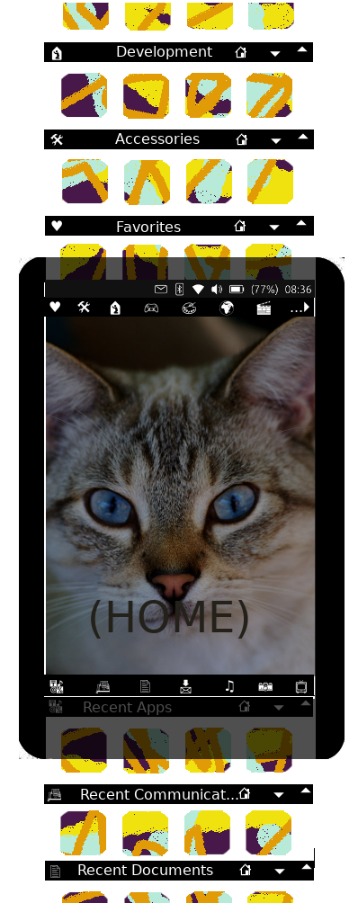
-
Whatever replaces the Dash, may I request one feature?
A way to show the indicator from it, similar to how it is in Android via a down swipe.
Then putting everything at the bottom when triggered via this swipe.
Of course this would need further Unity 8 integration though but I would love it -
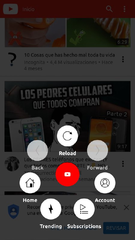
@bhdouglass I've seen that when you turn the phone, the four icons separate,
I think it would be better to put them closer to the center, even if it is empty on the sides,
greetings...
-
Warning: Image uploading is currently broken in our Forum. Our admins are working on it. Thank you for your understanding
-
Sorry, i don't like it at all. I love ubuntu touch, because it is different from the "other" systems. Using Sprint, i feel like in an android system. Please keep the current launcher, and please keep the scopes as well, this makes this system unique! I miss the Today Scope. That was brilliant.
-
With OTA12 out it is probably a good time to revisit this topic and app
-
@poVoq
Or that one https://forums.ubports.com/topic/2907/launcher-modular/85?_=1589541655241 as sprint not even longer available on open store. -
Sprint is still available in OpenStore. And it does still work. Not all features might be working though.