UBports Website rebuilding
-
Speaking for myself, I think one of the biggest issues is simply the menu, there are far too many options to make sense of, consolidation is needed. Design-wise I think the website needs only marginal improvements.
I like the design Cibersheep posted. Simplicity is key.
-
Thank you, @loops! And thank you @CiberSheep for sharing your design/process with me! it seems that I've just arrived at the right timing! - First, let me introduce myself, I'm Kaizen 35y/o, designer from Tel Aviv/California.
To be honest - my goal is to create/design a kick-ass, super modern, and shiny website like any mobile OS entitle to have.
Let me share some of my thoughts and my point of view - The home page has to be stunning and be a pixel perfect design (like the OS)
Home page goals
- Attract developers/testers to join and contribute
- Be simple to Install for the general public
- Attract donors and supporters (hall of fame?)
General
- I would like to prioritize context and explore a different value proposition.
- Keep the navigation bar clean and straightforward.
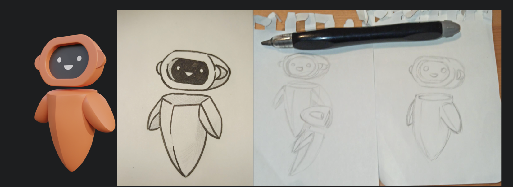
- Create new high-resolution imagery - I was thinking of creating a Yumi 3D version in a low poly environment (doing stuff: building an engine, creating, developing)
- Simplify the download section into a nice flow.
- Add social and media proof.
- Keep the right balance between UBport and Ubuntu colors.
- Keep the texts easy to read.
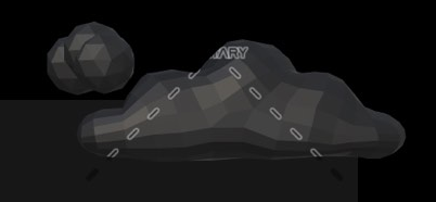
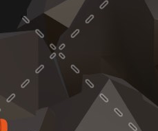
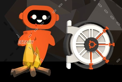
I was thinking of a black background website, dark style with the right balance of colors (Orange/Purple), 3D Icons.
I have already created many 3D assets and still looking forward to creating the perfect figure and environment.
I have a lot of positive attributes, but if you have any genuine suggestions, I would be glad to hear them.
Please see the attached a rough drafts for concept only and share your thoughts.
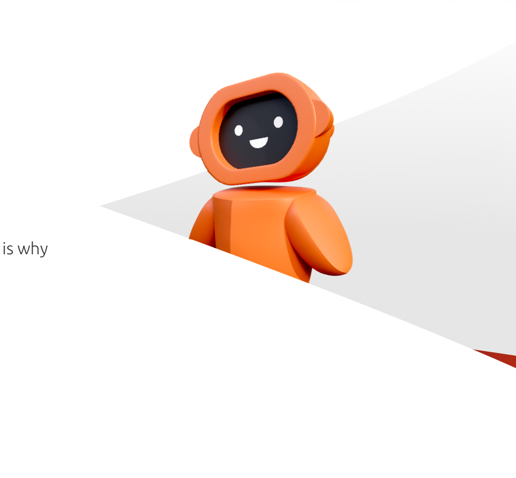
WIP > Home page suggestion - https://ibb.co/bdS0CJv
Device List - a popup with device list! - https://ibb.co/DVcnZPw
Installer > Download Section - https://ibb.co/hyR69mr -
@Kaizen That looks great! Thank you. Hope it will be continued in multi-language version.
-
@Kaizen Very impressive. I hope you can catch the attention of the Design Team and hop on board.
You might want to dail back on the prominent displaying of the Ubuntu logo though. As I understand it, the UBports Foundation does have Canonical's permission to use the name Ubuntu in the name of the OS (Ubuntu Touch). But I believe it was also necessary to walk a fine line and make it clear the the project is in no way associated with Ubuntu or Canonical in any official manner. Having the Circle of Friends emblazoned in such a prominent manner in the artwork might give off the wrong signal. -
@Kaizen you have some nice ideas. Thank you but I think it needs more work:
- I don't think we should move away from mostly white. Black is cool but not for the project image as a whole.
- Let's keep the design as simple as possible. The less, the better. Avoid extra elements that add nothing to the design
- Don't abuse of Yumi even if it is a nice mascot
-
@Kaizen very striking designs, I do like what you have done! I will concede that I do think white should be the primary background colour instead of black, but the rest is certainly attractive. I will be following this closely.
Or, I just had an idea, maybe offer a dark and light theme? a bit like DuckDuckGo does. I understand this just adds complexity, just a thought.
-
This looks great @Kaizen and I totally agree that the homepage should attract. Your design is something fresh, different to what UBports has atm. I also agree with what @CiberSheep is saying and hope that this will end up in something gorgeous :).
-
Thank you all for your great comments! I liked the black version, but you right doesn't go along with the brand. Also, it was too "Gaming" and a bit childish.
@CiberSheep - I'm trying something new, white, cleaner, pure—worth waiting, not necessary without "extra elements that add nothing to the design."
Few words about these elements:
These elements are for an extra layer of communication like words (I don't believe in design BS, but it's true). As the same value, Ubuntu touch gives the market we need to provide the website visitors.
Ubuntu touch is not just a community-foundation with cool people creating geeky open-source OS. UBUNTU TOUCH IS A BRAND. If we want to attract donors and talented people, we need to choose the right communication tools.
@Loops - Exactly, something refreshing, attractive as you said. Dark/Light toggle button is something that I thought about, but I'm not sure that fits into the current website.
I'm here to deliver one page. As I see it, I need to design a new 'Header' and 'Footer' to be fit with the rest of the site. (If my design ever be used :))
@CiberSheep I've no attention to ruin Yumi, just lift his spirit. I plan to create beautiful scrolling animation, which tells a story of Ubuntu touch trough privacy, freedom, features, community, app store, etc.
@standwood - I see the urgent of multi-language website, I'm not sure I'm there. First I would like to the deliver perfect pixel design and see what the rest think of it, hope I earn my credit to design rest of the pages
")
It will be appropriate if anyone can tell me where I can find open store icons, screenshots, phone mockups, OS demo, and any materials which can help me.
I encourage everyone who is interested in taking part in the design process. Please leave comments!! positive or negative, I have thick skin (and much self-criticism)
In the end, I will deliver one page ready to use. (with animation and all the magic going on) Some parts of the design will be unusual elements, which may be hard to digest, but I promise It looks excellent.
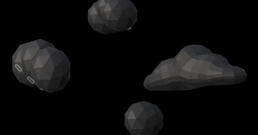
In meanwhile, see some of the 3D work in progress.
-
The 3d Yumi is great! I will be following your progress so please do continue, even if this seems a pointless endeavour, it will provide many new ideas and input into the website redesign.
-
@Kaizen said in UBports Website rebuilding:
It will be appropriate if anyone can tell me where I can find open store icons, screenshots, phone mockups, OS demo, and any materials which can help me.
You can find those icons in the git repository of the respective app.
https://gitlab.com/theopenstore/openstore-app/-/tree/master/openstore
https://gitlab.com/ubports/appsFor the phone mockups, I suggest using the PinePhone you might find them at pine64.org
[Edit] I like the 3D model and I'll be interested to have it as an STL or blender file if you're willing to share.
-
@Kaizen said in UBports Website rebuilding:
Few words about these elements:
These elements are for an extra layer of communication like words (I don't believe in design BS, but it's true). As the same value, Ubuntu touch gives the market we need to provide the website visitors.
I don't know what BS means.
Ok, I might have been a bit ambiguous sorry. With superfluous «additional elements» I refer to:
Extra balls and gradients:
Extra elements and lines:
Over explained scenes / cumbersome images:
Extra elements + Inner jokes:
The ideal would be going to a more simple design, more in the way of:
Keeps the OS image, it's simple even if the text is kind of mockery and negative, but that's «flour of another sack»
-
@Kaizen said in UBports Website rebuilding:
In meanwhile, see some of the 3D work in progress.
I love what you have there. The 3D model is cool but I'm a real fan of your hand drawings. They are absolutely gorgeous
-
@CiberSheep I would guess all of these things - with the possible exception of the "balls and gradients" - are mostly due to this being a relatively quick mock-up. The final page probably shouldn't describe Ubuntu Touch as a "A Powerfual alternative" either!
")
I think the way of thinking about Ubuntu Touch as a brand rather than a project makes all the sense in the world for the front page, at least if the goal is to convert people into using it. But "busy" elements should maybe try to mirror elements of the operative system itself, for example by dynamic animations illustrating the swiping gestures? It'd say animations are great as long as they direct (positive) attention towards elements of the OS itself rather than away from it.
Also, I'm not generally a software mascot kind of guy, but that 3D render looks great.
-
@potet Thank you! that was great feedback that changed my concept
@CiberSheep As @potet said, what you just saw it's a low fidelity mockup - If I were you, I wouldn't give much attention to details now, trust the process, I promise good results.
Before I present my next (stunning) design - I want to talk in the same language as the audience, and for that
I want to understand what's driving the community, so for that, please choose any statement that applied to you (as an individual - multiple-choice is ok) or add one or more.General statement
- I want to contribute UT because it serves my OS needs.
- I'm here to support open source.
- I'm fun of Ubuntu.
- I care about privacy/data/personal information
- I appreciate open-source.
- I comfort with knowing what's running on my mobile device.
Device usage statement
- UT is my first/second operating system
- I consider myself as advance user (I use terminal or tweaking my OS)
- I consider my self as regular user (normal use: mailing, messaging etc.)
-
General statement
- I want to contribute UT because it serves my OS needs.
- I'm here to support open source.
> * I'm fun of Ubuntu. - I care about privacy/data/personal information
- I appreciate open-source.
- I comfort with knowing what's running on my mobile device.
- I am proud to be part of such a rewarding community

Device usage statement
- UT is my first/second operating system
- I consider myself as advance user (I use terminal or tweaking my OS)
- I consider my self as regular user (normal use: mailing, messaging etc.)
I have added new points in Bold and left what applies to myself. I think that you'll find that most points you provided are true for most people;
Looking forward to your new designs.
-
If I were to summarize the general statement in three tabloid keywords, I would probably go for:
Transparent
Developed as an open source project, Ubuntu Touch contains no hidden nuts and bolts. Your usage data is kept exactly where you want it: on your device, and nowhere else.
Community-driven
Rather than being developed by one of the richest companies in the world, Ubuntu touch is fully developed by the community of users. As a consequence the system is developed with the sole purpose of giving the best and most secure user experience possible, while mainstream systems balance these concern against profit.
Built to last
Rather than being developed individually for each device, Ubuntu Touch runs the exact same operative system on all phones. This means that your phone will continue to receive software updates for years after traditional vendors would drop support. -
@Kaizen Your suggested design looks ok. But for my opinion, that black design isn't that nice. I more prefer white and clear design, than very dark and less contrast design.
Dark and black websites always have something negative.
Just check any website of huge companies, they are never dark or even black.
Text should always be whether full black on a light background, or full white on a dark background to maximum contrast and not some in between, to lower visibility and contrast.
Not everyone have perfect display and perfect 20:20 vision of the eyes. -
@Loops This was a refreshing comment! I'm not sure how you get rewarded for contribution but would like to hear more in DM or on Telegram ka1iz3n.
@potet Inspiring words and great copy writing! where did you get this man? you nailed the first draft!
@WLBI Agreed, black is not cool - I already have an advanced white version.Btw, is that part is true?
"This means that your phone will continue to receive software updates for years after traditional vendors would drop support. "Soon I will drop the first design (3-4 days) :crossed_fingers_medium-dark_skin_tone:
-
The wife took the kids for ice cream, and I couldn't wait. Here is my half-mile away design, without the demonstration part, and Yumi's icons/imagery.
Please shoot on anything (aim to kill
) -
@Kaizen Much, muuuuch better. Well done