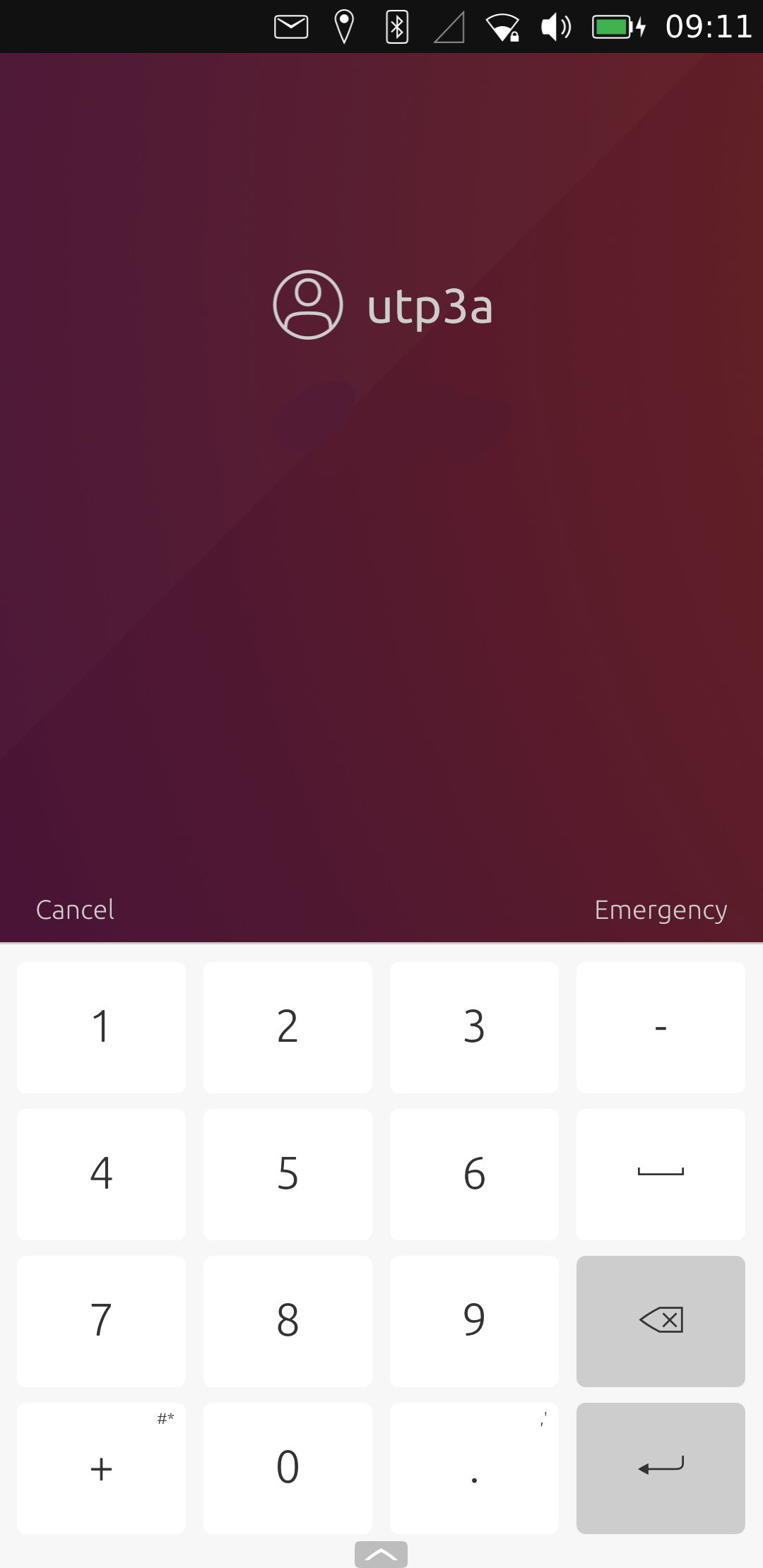
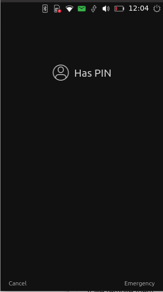
Pin code removal of 4 digits limitation
-
@lduboeuf Think it needs something to remove guess work be that the circles or ******** or an empty box but something to show it needs doing.
-
I think it's better to drop the dots so the length will stay unknown for security reasons. And maybe just use the texfield.
Auto login is more convenient but having unknown length and pressing enter is more secured.
-
@kugiigi It's a pin code, security is not improved that much by not showing the length - best UX would be to offer a choice.
But if we are not saving the length then it should start with no circles - we could show some helper text like "enter PIN" and "enter PIN or use the fingerprint scanner" if that's also set up.
The circles could show up empty and fill over ~200ms to preserve the current design a bit too.
Also, @lduboeuf why 12 as the new limit?
-
@lduboeuf I think it's okay to remove them and allow the point size to increase as needed to get away from guessing the number of digits password
-
Also, @lduboeuf why 12 as the new limit?
Idk, it is because of current code in the Lomiri wizard that expect a max number :).
-
-
@lduboeuf said in Pin code removal of 4 digits limitation:
Do you think it is ok to remove them, or just let the 4 empty dots placeholder first and allow to increase the dots size as needed ?
No, you should keep dots, and increase dots number accordingly to the amount of digit the code has.
This for user to know his action on screen is correctly done.Good improvement to pin unlock you're doing though.

Edit : reading other users, i agree choice seing or not dots would be the best, and for security reason, one dot that has size increase on each input can be a good alternative (why not some choice here too?).
-
Are you planning a mix of the two or using parts of this https://open-store.io/app/unlockertest.ld Testeed on 3a running Focal
-
Hi @lduboeuf
Thanks for the work you're doing Lionel :thumbs_up: :clapping_hands:
I would use the same UX as for password/passphrase with an empty text field.
At each strike you add a dot to give the user feedback on what they typed.Also the OK/Enter button is fine for me.
Addendum:
Thoughts for the future
For security reasons I would also merge password UI and PIN UI.
I would add a screen asking the user to swipe left or right to get to the alphanum keyboard or the numerical pad... -
-
Option to disable visibility of dots or one big dot looks great, also I would add an option to enable/disable auto unlock (without pressing OK button), I personally prefer when phone unlocks right after entering correct PIN without additional key press, because it seems more intuitive.
-
@lakotaubp said in Pin code removal of 4 digits limitation:
Are you planning a mix of the two or using parts of this https://open-store.io/app/unlockertest.ld Testeed on 3a running Focal
The circle prompt is another story, but i prepared it for the no limit number of digits too.
-
Sometimes, when unlocking the screen, the keyboard doesn't show up. Then after clicking on the empty dots, the keyboard pops up. So, when removing them, there should be some visual hint that indicates where to click if the keyboard didn't pop up by accident.
-
@jezek said in Pin code removal of 4 digits limitation:
Sometimes, when unlocking the screen, the keyboard doesn't show up. Then after clicking on the empty dots, the keyboard pops up. So, when removing them, there should be some visual hint that indicates where to click if the keyboard didn't pop up by accident.
Yes known issue, so i've added "enter PIN" to replace the empty dots. And try to display " Tap to enter pin" when un focused. But i have to dig a bit more. Because un focus is also when user just logged in or user start to drag on indicator, and should only be displayed if no physical keyboard.
The best would be to tacckle that focus issue...
-
By discussing this on the TG Q&A group, it appears it is hard to have a mutual agreement.
Some people want a more "secure" login some want user friendly UX.So i will try to add an option, to not change actual behavior, i would add opt-out auto-login option.
We can still remove the dots placeholder at least an replace it with a text. -
@lduboeuf said in Pin code removal of 4 digits limitation:
Some people want a more "secure" login some want user friendly UX.
That's why user choice in security options would be the best (from actual behavior, 4 digits, dots, and no need to push enter, to the most secure one with 12 digits, text field, and push enter).

-
Set the minimum to 3 so 3 digits + enter would be like it is now

-
Happy New Year! :


 3️⃣1️⃣
 1️⃣
1️⃣Hi @lduboeuf
In all variants, the design should be such that the user has the possibility to recognize if the touche screen has a defect. With age or much used the touche screen function gets gaps, and this should be recognized by the user. It is not always about whether something looks great.Regards Mario :winking_face:
-
@keneda That's how you end up with "password123" everywhere. Not everyone stores sensitive data on their phone + as long as the bootloader is unlocked and data unencrypted any point about security is moot

-
@klh
Don't understand why you tell me that


