@dobey said in Is there a possibility to completely disable/uninstall the Launcher?:
@chdslv The launcher is where favorite (and running) apps appear. It is not an "additional dock" but a core part of the shell. I'll agree it's not ideal to have it and the app drawer open on smaller devices like Nexus 4, as then you only get two columns of icons in the drawer, rather than three, but I don't think that's cause for the extreme view of it shouldn't exist.
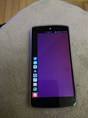
If the device is 10" and more, such as a desktop, having the launcher is not a problem, considering the width of the launcher to the rest. But, on a mobile phone, it is just a waste of space. A special vertical column for favourites is not a necessity on a mobile (or even on a desktop) these days. I am using a N5.
On my Nexus 6, I have the latest (August 2020) Android 10 - Colt OS. There's 5 "favourites," which I can change whenever they stop being such. Swiping up any place on the screen would bring in the app drawer. No need to go to the left side to swipe. I can open all the open apps by swiping from the bottom and move through them left to right, vice versa. By swiping from the right or left edge, I can move back through last open pages. It is a question of ease of use. And, of course, the look.
Ubuntu Touch/UBPorts on N5 looked nice sometime ago, without the black launcher/dock on the left. Now, it is ugly.
You know, UBPorts doesn't have to look like Ubuntu. It should look like a mobile phone.

The top left edge is a black, meeting of a black vertical and horizontal areas, making my N5 look even thinner. Bottom has a square Ubuntu logo that doesn't match with other icons. If that launcher is not there, the phone would look clean and nice.


