• Categories
  • Recent
  • Tags
  • Popular
  • Users
  • Groups
  • Search
  • Register
  • Login
UBports Robot Logo UBports Forum
  • Categories
  • Recent
  • Tags
  • Popular
  • Users
  • Groups
  • Search
  • Register
  • Login
  1. Home
  2. sverzegnassi
  3. Posts
S
Offline
  • Profile
  • Following 0
  • Followers 1
  • Topics 1
  • Posts 60
  • Groups 0

Posts

Recent Best Controversial
  • RE: OpenStore design suggestions

    @Mitu - Yes, we're about to move the 'Open' button alongside "Remove" or "Update". I posted a screenshot a few weeks ago about a proposal for redesigning the "App Details" page (don't mind the slightly darker bg on that row, it wasn't meant to be there)

    About the page scrolling from bottom, again yes. I'm going to get rid of that component, as we'll probably move the page into the regular PageStack,

    App Details - Screenshot

    posted in Design
    S
    sverzegnassi
    13 Dec 2017, 19:07
  • RE: OpenStore design suggestions

    Hey, sure! We might decide to use a "[Design]" prefix for the topic title, in the meantime.

    I took some time to explore the different proposal. I have built up some screenshot, we might have interesting alternatives to the current design indeed.

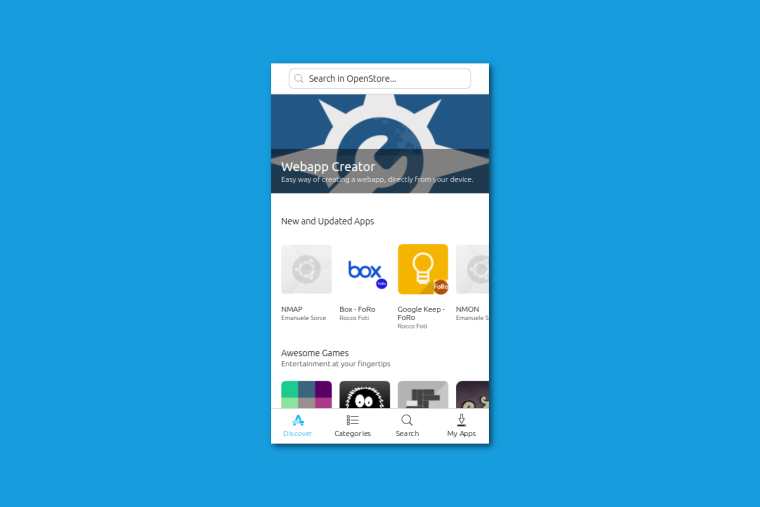
    Here's the current OpenStore, as it appears on our phones.

    0_1512683419239_current.png

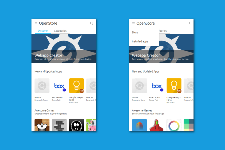
    This is your first proposal with hamburger menu. To be fair, it looks a bit strange to me to split the navigation and the installed apps in that way. But I guess you already knew that πŸ˜›

    2_1512683419240_proposal_m1.png

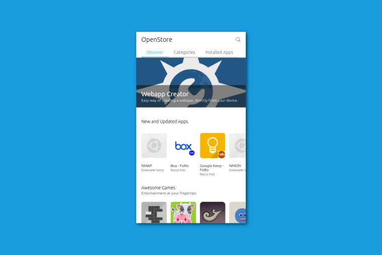
    Here's your second proposal with header sections only, as I understand it. (asking confirmation)

    3_1512683419240_proposal_m2.png

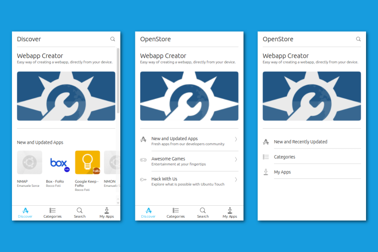
    I wanted to push the limit a bit more further, and try some alternative solution. I came with three different proposals, but there is still some room for other permutations.

    The first one is just the store as-is now, with a smaller bottom navigation, and a different style for header and highlighted app.

    In the second one, I removed those carousels, and I collapsed them into ListItems. The result seems interesting (at least for me)

    In the third one, I removed the bottom navigation. Search is now into the header, and the other destinations (categories and installed apps) are ListItems now.

    0_1512684026312_proposal+current.png

    They look a bit iOS-ish, it's true. But the second one looks a bit interesting and promising. We could try to add further highlighted apps, and see if mixing my second and third proposal might eventually work

    posted in Design
    S
    sverzegnassi
    7 Dec 2017, 22:12
  • RE: Organizing the design process

    On a sidenote, we indeed haven't done our best yet to provide all the information about our needs for UX.
    The website is currently going to be refreshed, so we'd ask you to stay tuned for further updates πŸ˜„

    As you all properly pointed out, one of first goals is to provide consistency. Or, at an higher level, coherence.

    At the moment we're approaching a transition from Ubuntu Vivid to Xenial, and we will be tied to a different toolkit (QtQuick Controls 2, shortly QQC2[1]).

    Our effort is to port the Suru design to QQC2; in this regard, we're creating a new style for the components. Here's a very early video, the style is based on Vanilla Design[2].

    https://www.youtube.com/watch?v=0ahCT7yqr08&feature=youtu.be

    With the new toolkit, which offers less control on how components behave, and all the features that convergence brings, including the ability to run apps that hasn't been designed for Ubuntu Touch, we can expect some obstacle in fully implement the current set of specifications.

    Our hope is that it could turn in an opportunity to refresh our Suru specifications.

    The full documentation for the current Suru design is not available or, in some parts, outdated (mid-2013, when Suru was still using those odd gradients).
    The same documentation available on docs.ubuntu.com has never been completed during the last four years.

    In the meantime, we have seen the raise of new UX trends, one of the controversial components (the bottom navigation) has been officially adopted by the Material guidelines, and Canonical decided to drop its Ayatana project (i.e. Unity 7) and adopt the GNOME 3 HIG.

    What we need is help and guidance through these multiple inputs, in order to fix some of the current issues in usability, and eventually validate the design of new UI components. In a longer term, we might want to support an effort to revisit the current design guidelines.

    I saw you've been interested by the recent changes in clock-app.
    Feel free to open a new issue, or join existing discussions at: https://github.com/ubports/clock-app/issues

    Thank you again!

    ======

    [1] https://doc.qt.io/qt-5/qtquickcontrols2-index.html
    [2] https://github.com/ubuntudesign/vanilla-design

    posted in General
    S
    sverzegnassi
    6 Dec 2017, 20:23
  • RE: Organizing the design process

    That's a great proposal, we'd like to follow up with some plan.

    Documentation is expected to be available soon on docs.ubports.com, once the transition from the old wiki to ReadTheDocs will be concluded.

    For the moment being, it's available at https://github.com/ubports/phone-docs/blob/master/en/apps/design/index.md
    It's fully browseable through GitHub.

    One of biggest concerns is how to coordinate the two concurrent efforts (by developers, and UX designers), without compromising the quality of the process.
    While we want to avoid awful visuals like red scrollbarsβ„’ or mixed typography [1], we need to ensure that coordination between developers and designers can be smooth as possible. I'd suggest to avoid any cross-posting of pull requests both on GitHub and this forum, since it might get easily insane to keep the discussion on the right track.

    What we could do (and it's welcome):

    • Promote the participation of developers on this forum, and enable a channel where app maintainers and designers can discuss their ideas with no friction. This should work as a place where we can explore multiple solutions and proposals, without bloating GitHub with informal discussions.

    • Promote the participation of designers on GitHub. Feedbacks and bug report for UI/UX questions are welcome in the bug tracker, and we're currently planning to mark any existing design-related issue with an 'UX' label for better discoverability. We might also offer a repository where we could store all the official mockups and existing documentation, with a full history of changes.

    • Ask code contributors to answer a few short questions whenever they prepare a new pull request. This would work as a first filter for "unconfirmed" changes, and is what the 'unity8' project used to do back at the time. An example of the questions can be found at [2].

    I already see some reply by designers, and we absolutely appreciate it.

    I'd like to ask all the designers on the forum to let us know if they're interested in the creation of this new group. If so, please feel free to reply here.

    I'd also like to survey your familiarity with the typical tools used in open source projects and, in particular, GitHub.
    Most of the developent happens there, and many design teams (including GNOME and Canonical) currently use the platform for design discussions with a discrete success[3].

    Knowing your preferences on this would help us to support you with the most effective workflow.

    As a final note, I'll try to get in touch with Canonical to see if we can get some documentation for the various UT projects, since not all the docs have been publicly disclosed during the last years.

    Thanks for your posts, and in particular @Mitu for the proposal.

    =======

    [1] An interesting insight on early design approach in Microsoft
    https://medium.com/microsoft-design/a-brief-history-of-design-8641bd186e00

    [2] A current example of a merge proposal / pull request: https://code.launchpad.net/~josharenson/unity8/dashboard-manager/+merge/319522

    The list of questions included at the link above:

    * Are there any related MPs required for this MP to build / function as expected? Please list.
    * Did you perform an exploratory manual test run of your code change and any related functionality?
    * If you changed the packaging (debian), did you subscribe the ubuntu-unity team to this MP?
    * If you changed the UI, has there been a design review?
    

    [3] As a reference, both GNOME and Canonical coordinate their design processes on GitHub. The topic has been nicely disclosed here:
    https://design.canonical.com/2017/04/designing-in-the-open/

    posted in General
    S
    sverzegnassi
    6 Dec 2017, 20:20
  • RE: Some opinions related to the latest community update.

    @Flohack Sure, it's in one of my earlier replies. (still WIP)

    Here's how the "Donate" button might look in future OpenStore releases

    Screenshot

    posted in General
    S
    sverzegnassi
    21 Nov 2017, 23:43
  • RE: Some opinions related to the latest community update.

    Thanks for your replies!

    I chose the 'heart' symbol since it was the nearest symbol in terms of kindness and appreciation. I like @vadrian89 's idea of using a gift box as icon; the bad news is that our Suru icons set does not provide the icon.

    If someone wants to contribute and create for us an icon that matches the Suru specs, the contribution would be very appreciated.

    As an alternative to the 'gift box' and the 'heart', we could still use the currency symbol as proposed by @doniks . QML provides an easy way to get the currency symbol according to user's locale. That way we can solve any ambiguity related to its usage.

    posted in General
    S
    sverzegnassi
    19 Nov 2017, 15:31
  • RE: Some opinions related to the latest community update.

    I missed this topic, but I see @Flohack has already provided solid arguments.

    elementaryOS is backed by "elementary LLC" which likely enables them to handle money on a solid legal base. I gave a quick look at "Houston", the app store back end used by elementary, and it seems they only support a single service, called Stripe. I haven't tested personally, but what I see is that developers might likely have to create a Stripe account in order to receive donations.

    This might add a further consideration: choosing a single service implies excluding others.

    We could offer e.g. PayPal support, but I'm mostly sure our developers might (legitimately) ask to support Patreon, Liberapay, Bitcoins, etc. Not to mention potential existing service bans in specific countries. It might end up in a huge amount of work, for an app store service that merely counts 400 apps and has not fully shaped yet.

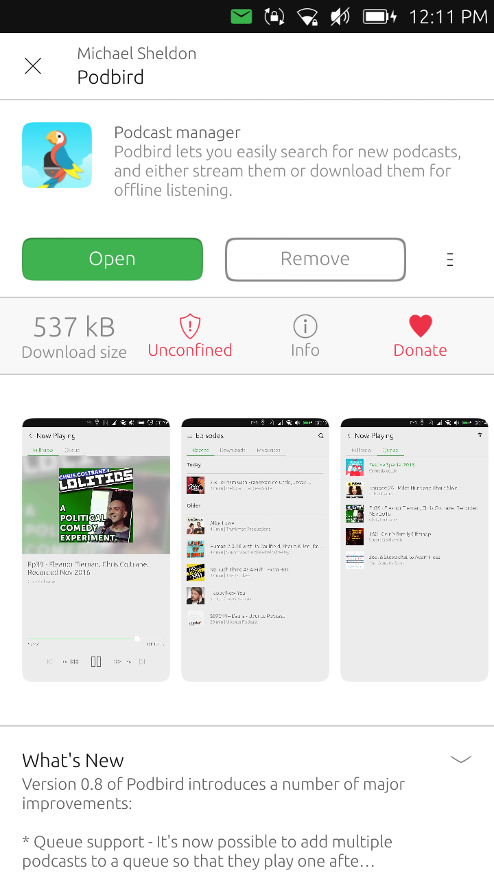
    What we did in OpenStore, but we still need to expose it to the client app, is to let developers to specify a link of their choice for donations. This already enabled developers to received donations through the OpenStore web UI - e.g. Dekko.

    I'm in charge to get this done in the client app. Despite my expectations, adding a single button to an existing hiearchy of informations is not so trivial; as a consequence, it might take a while before we could roll this out in a new update, since we have to redefine how we provide other metadata.

    I'm currently redesigning the "Package Details" page in the OpenStore client, and the idea is to ensure that our "Donate" button would always be placed above the fold, in order to ensure that potential donors would not miss the opportunity to support the work of developers and contributors.

    Here's how the "Donate" button might look in future OpenStore releases

    Feedback welcomed!

    posted in General
    S
    sverzegnassi
    17 Nov 2017, 11:19
  • RE: Content Hub - suggestions for improvement

    0_1507070400218_Screenshot from 2017-10-04 00-33-23.png

    This is part of the draft I was working on:

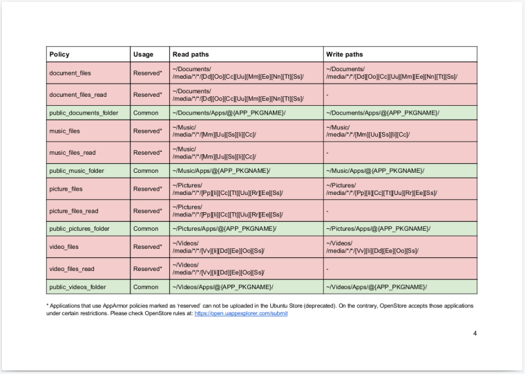
    1 ) Allowing apps to access specific sub-folders in XDG user's paths. That would be possible by adding 4 new AppArmor permissions, for a total of 16 lines added.

    2 ) Changing the path where core apps import ContentHub files.
    The current situation is:

    • ~/Documents/Imported/*
    • ~/Music/Imported/yyyy/MM/dd/hh/mm/ss/*
    • ~/Pictures/imported/*
    • ~/Videos/imported/*

    I would propose to change them as follow:

    • ~/Documents/Apps/<app_id>/*
    • ~/Music/Apps/<app_id>/*
    • ~/Pictures/Apps/<app_id>/*
    • ~/Videos/Apps/<app_id>/*

    The major effects are:

    1. We would provide a proper separation between private storage and public storage
    2. Apps that currently uses ContentHub for exporting pictures, could easily (re)gain ownership on the exporting content
    3. Exporting content via ContentHub to a core app would be de-facto deprecated, so your point 3) would be fixed.
      ContentHub would still be available for sharing files between third party apps.
    4. MTP would be available for third party apps too. This might be useful for e.g. platform emulators, since users would be able to sideload ROMs in ~/Documents/Apps/gameboy.appmaintainer/*

    Issue you mentioned at 1) would also be solved in the 80~90% of cases. For instance:

    • An audio recorder app could use the new "public_music_folder" policy and save recordings in the Music folder.
    • Received media on Telegram would automatically be stored in the Pictures folder, and they would be available in gallery-app
    • Uncovered cases are mostly about the hack/dev tools currently available in the OpenStore. However, as they require restricted permissions, they are not a huge problem.

    I haven't found the time for further validations, as I planned to check how these policies would work with ~20 different apps currently available on OpenStore.
    Anyway, it might be worth to add them to this discussion in order to have more proposals, and try to see the overall picture πŸ™‚

    posted in OS
    S
    sverzegnassi
    3 Oct 2017, 22:54
  • RE: Content Hub - suggestions for improvement

    As part of the File Manager refactoring, I've been working on a draft for Content Sharing back in August. The main problem was that users were expecting File Manager to load any content type, rather than exporting it through ContentHub; then, I started a comparison with the Android platform.

    TL;DR
    What I found by far was:

    • Ubuntu Touch does not actually distinguish between private storage and public storage. Third party apps can only access private storage (i.e. ~/.local/share/app_id)
    • Ubuntu Touch does not provide any Android-like intent for opening files, and the respective XDG protocol (xdg-open) is not supported as well.
    • In Ubuntu Touch, all these features above are replaced by ContentHub, which causes huge issues in UX.
    • The whole SD card acts like a public storage on Android - but it's out of scope for this specific topic

    My wild guessing for your questions πŸ™‚

    1. That seems hard to achieve in the way we would expect on a desktop - I guess - for the reasons explained above. The confinement rules and the non-standard way content are handled does not seem to integrate with standard tools.

    2. This could be achieve already:
      2.1) Apps like gallery-app could prompt for a specific action when there's a transfer on-going
      2.2) A single click package could ship more than an application registered to ContentHub.
      2.3) For specific "well-known" actions implemented by core-apps, third party applications could rely on UrlHandler. For instance, this is what we're planning to do with the new File Manager, when we will add the built-in text editor.

    3. When I still was the DocViewer maintainer, I've been asking to ContentHub devs to expose the original path of an imported file, in order to prevent this (in a sane way).

    posted in OS
    S
    sverzegnassi
    3 Oct 2017, 22:53
  • RE: [Discussion] File Manager improvements

    @hans1977se

    Ok, so is the problem only related to the icon shown in the header? If so, we can remove it, and keep just the text. πŸ™‚

    @Mitu

    Yes, I have some files due to my contributions on the Document Viewer. I'm not sure whether I can publish it on internet or not, since it's internal documentation (and in some part it was still WIP).
    Actually, we (as UBports) might want to ask - or try to - Canonical if they can give us all the design stuff they have been working on, and add them to docs.ubports.com

    @Glatorius

    Yes, the question is that we provide the same functionality as a sidebar on tablets and desktops, through an hamburger menu at the leftmost position, therefore the problem. I've been thinking to some solution: we will push an update on OpenStore in order to see if that might work.

    @Teigneux

    That's on our to-do list. It's not planned for v. 0.5 though, but we expect to make it available within two months. Specifically, we have planned an image viewer, a media player (i.e. video + music), and a text editor.

    posted in OS
    S
    sverzegnassi
    30 Sept 2017, 14:30
  • RE: [Discussion] File Manager improvements

    @hans1977se

    • Select All/None is a standard implementation as appears on Document Viewer app and Clock app too. We might consider to review those strings for all the core apps in future, but I wouldn't try to implement something different: it might still be confusing for many others. πŸ™‚

    • A clipboard manager (and "progressive" paste) were planned initially. I'm not sure they will be there in the final release, but I would like to add them in a near future. Glad to see there's someone else who would like such feature.

    • In the list view you can swipe each item and reveal the "Properties" action. For the grid view it is still WIP, as we're currently redesigning the component.

    • Sorting on size should be feasible, we will try to include it in the final release.

    @Marathon2422

    • I got your point, but I don't think we need it. Both regular users and advanced users perform mostly the same operations on files. The only difference I see might regard the type of file they manipulate (user's content vs system files) and some specific actions (e.g. symlinking or changing file permissions). It's still something we can handle from a single app, and I'd prefer not to duplicate the needed effort on two different projects. Did you take in consideration some specific scenario?

    @Mitu

    • There is - in my opinion - a huge problem with the Ubuntu palette.
      The blue is over-saturated: it might be good for highlighting selection state of small items, it does not seem suitable on bigger items. We updated the source code yesterday, and we will anyway push an update that includes the blue highlight, in order to get a wider feedback from users.
      Just for reference - from the toolkit v. 1.3 specifications - blue is specifically suggested for text selection and text cursor. Green - instead - is used for the check boxes that are usually shown in the ListItem component, and that was the reason of our choice. We could otherwise revert to a tone of grey, or use a checkbox (definitely - not orange like in gallery-app πŸ˜†)

    • Border radius: yes, we have already changed it after I saw your feedback on Telegram

    • Scrolling speed. Long story short: I forgot to apply for the hundredth time the well-known old patch which is included in all the core apps to fix this issue. πŸ˜„

    • Thanks for the feedback on actions placement. We didn't pay much attention to this, since it was still on our to-do list. Glad you gave us something to discuss. ^^

    @Glatorius

    • We moved the hamburger menu on the right, since we already got some request for showing the "go back" action on the left. From my point of view, we shouldn't show a "go back" button at all, and we should move the menu back at the leftmost position. We will discuss about this again, and see what we can do. Thanks for the feedback.
    posted in OS
    S
    sverzegnassi
    27 Sept 2017, 16:17
  • RE: [Discussion] File Manager improvements

    A development release of File Manager (v. 0.5.x) is now available on OpenStore. It won't uninstall the stable version you have already installed.

    https://open.uappexplorer.com/app/filemanager.sverzegnassi

    Please let us know your feedbacks, so that we can sort out the final fixes and release it as stable. πŸ™‚
    Thanks everybody for your help!

    posted in OS
    S
    sverzegnassi
    26 Sept 2017, 17:56
  • RE: [Discussion] File Manager improvements

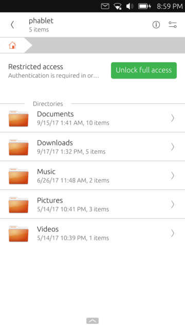
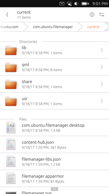
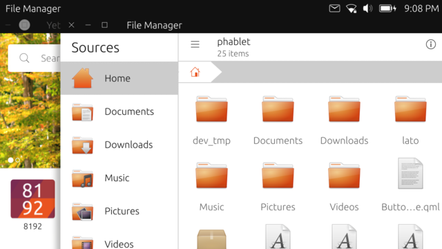
    It's still work-in-progess, but we have some good news. During the last weeks, with a massive help from @nfsprodriver , the new File Manager finally started to take shape.
    We will probably release a testing version in the store next week, so you can provide us all the feedback about the new UI and - most likely - bugs

    2_1505761993669_1.png
    1_1505761993669_2.png
    0_1505761993669_3.png

    posted in OS
    S
    sverzegnassi
    18 Sept 2017, 19:18
  • RE: UBports Community Update 12

    I have some question as well πŸ˜›

    • Are you planning to relax the app confinementβ„’ rules a bit, so that apps e.g. can save files in /home/phablet/Pictures?
    • Could we expect some minor change to the design of some UI components (e.g. buttons)?
    • Huh, yeah... I've heard there has been some discussion about a new home screen at the UbuCon@Paris. Is it true? πŸ˜†
    posted in General
    S
    sverzegnassi
    16 Sept 2017, 17:14
  • RE: Telegram Style Reduction?

    I don't like the idea of a full-white application, I'd prefer to see the current background or, at least, a different shade of white (e.g. #F8F8F8).

    For the message bubble, I think you could use the light shadow that was meant to be used for Suru buttons.
    I agree with the other guys, a bit more of padding for the text, a lighter font, and a different tint of UbuntuColors.green (#63c972 or #71ce7f) might be more appealing. πŸ™‚


    (with Telegram bg: http://i.imgur.com/LUbFMPd.png)

    The shadow is a simple Rectangle which stays below the white/green container. Something like:

    Rectangle {
        id: container
    
        Text { [...] }
    
        Rectangle {
            width: container.width
            height: container.height
            radius: container.radius
    
            y: units.dp(1)
            z: -1000
    
            color: "#e6e6e6"    // theme.palette.normal.base (i.e. #CDCDCD) with opacity: 0.5
        }
    }
    

    See e.g. the Button style in the Suru theme for QtQuick Controls 2
    https://github.com/sverzegnassi/qqc2-suru-style/blob/master/qqc2-suru/qml/Button.qml

    posted in App Development
    S
    sverzegnassi
    12 Aug 2017, 14:07
  • RE: [Discussion] File Manager improvements

    @TLF I see you mentioned Document Viewer. I proposed a patch for this issue more than an year ago. I've pinged Canonical people several times, nobody cared to release an update in the Ubuntu Store - this is something somehow sad.

    As former DocViewer developer, I'm really sorry to read this and I want to apologize.
    I'll try to win my resistance, and plan to release a few small fixes in order to solve those issues that appeared over time.

    posted in OS
    S
    sverzegnassi
    26 Jun 2017, 20:24
  • RE: [Discussion] File Manager improvements

    @Emanuele-Sorce

    Leaving the security questions apart[1] , you've greatly summarized the reason of our research. πŸ™‚
    File Manager escapes any abstraction provided by the system, but other apps don't. We end up with an unconfined app that actually seems even more "caged" than others.

    I’m planning two different strategies in order to solve this:

    1. extend ContentHub capabilities (e.g. mimetype support, and being more transparent with default apps);
    2. add some basic tool in the FM itself (a simple image viewer and a text editor, mainly).

    Anyway, it's great to read you're going to improve SD card management, this would be a big change πŸ˜„

    ======

    [1] It’s all about enforcing consistent policies. We just had some early discussion on this topic for now, but I’m sure others will follow

    posted in OS
    S
    sverzegnassi
    26 Jun 2017, 20:24
  • RE: [Discussion] File Manager improvements

    Nice to see so many replies, thank you all for your help!
    I'll try to keep this very brief. πŸ™‚

    I see that moving files is somehow more important than other operations. We'll try to respect this evidence.

    There will be improvements for the user interface, we want to be consistent with Suru specs as much as possible.
    However there could be some exceptions, since a File Manager allows an high number of advanced features.
    Our keyword here is probably "predictability" rather than "consistency".
    In any case, we'll wave back to the forum once we have our first mockups. πŸ˜„
    We want to keep things as transparent as possible

    I’m glad you mentioned "checking downloaded files" or "delete [files] when space is tight". We were expecting similar replies, and we’ve got a confirmation of how relevant is making such actions easier to perform.

    SD card access: we'll probably allow it. According to the consensus we had at the App Devs meeting, there's no reason to prevent this.

    Tabs: many of your replies concern this. This is for sure on our To-Do list. Implementation is still TBD.

    Search: Yes, it's on the list. πŸ˜‰

    Scripts: This is an interesting option for the future, however it’s a feature that needs to be wisely designed. I think we’ll keep it in consideration for a mid term.

    posted in OS
    S
    sverzegnassi
    26 Jun 2017, 20:24
  • [Discussion] File Manager improvements

    If you’ve watched the latest UBports Q/A, you might already know that we’re looking to improve the File Manager.

    Yesterday @Flohack and I briefly discussed this, and we agreed that it’s unclear how a File Manager is supposed to work in the β€œbrave new world” of containers and app confinement.

    While we all know how a File Manager should work on a desktop, this is not a trivial question for a mobile environment.

    We have decided to run a short (informal) survey[1], in order to understand your real usage of the app. This is open to everyone willing to help, and I want to thank in advance all the people who are going to contribute. πŸ™‚

    1. Why do you think it’s important to have a File Manager on your phone? (Or why not?)

    2. Which are the most important features for you?

    3. Which are the common tasks you try to accomplish?[2]

    4. How the current version of File Manager fails to meet your expectations?

    ==========

    Note #1
    This is not about bug reports, we are interested in your typical app usage. Please do not reply:

    • add { missing feature | support for x | etc. }
    • can't open { file format }.

    We’re going to address those issues once we have the whole picture clear. πŸ™‚

    Note #2
    I.e. "Why do you use those features?" A few examples:

    • Accessing remote files through Samba.
    • Cleaning up internal storage because memory is low.
    posted in OS file manager
    S
    sverzegnassi
    25 Jun 2017, 16:34
  • RE: Ubuntu for mobile devices post mortem analysis by Simon Raffeiner

    @advocatux said in Ubuntu for mobile devices post mortem analysis by Simon Raffeiner:

    @sverzegnassi, yep I agree with your conclusion.

    Not reinvent the wheel. That's a fact. It seems even Canonical has learned the lesson.

    I'm a bit disappointed for the consequences for the people who worked on the project, but returning to GNOME is the wisest decision they could take.

    Address the real issues. I hope there'll be a consensus in which are those issues.

    That could easily go controversial. I would only ask if it's better to have a phone with a smooth experience, or a phone that converges to desktop, at first. In any case I think that supporting xdg-desktop-portal should be a priority (it seems Snap is going to support such Flatpak specification as well). But we are a bit OT here

    posted in Off topic
    S
    sverzegnassi
    21 Jun 2017, 08:41