Clock Redesign Ideas
-
@3T_Ed this is what I'm interested to see, because the Picker moves at the speed of your finger. Also, you can tap on the numbers you see
-
@AppLee That's the game

-
@CiberSheep said in Clock Redesign Ideas:
Just to make sure what I mean. This is the timer. Trying to set it is a terrible experience. It must go (the UI).
Yes the timer is such a devil of a job to set that I don't use it.
My principle request though is the same as 3T_Ed to alter the rolling set dials for the alarm. It needs to be slower/less sensitive or maybe use the keyboard instead.
-
@cliffcoggin You can be part of «the quest» if you have time
-
Slower wheel won't be good IMO, there are 60 possible values and you need to set it precisely and rapidly.
I like how it's done for the timer (moving the minutes hand) but in order to be precise we will need +/- buttons to fine settings.@CiberSheep do you know what kind of widget (visually) we have in QQC2 ?
I'm still confused with QQC2 and the old framework and probably other things I don't know about :smiling_face_with_halo: -
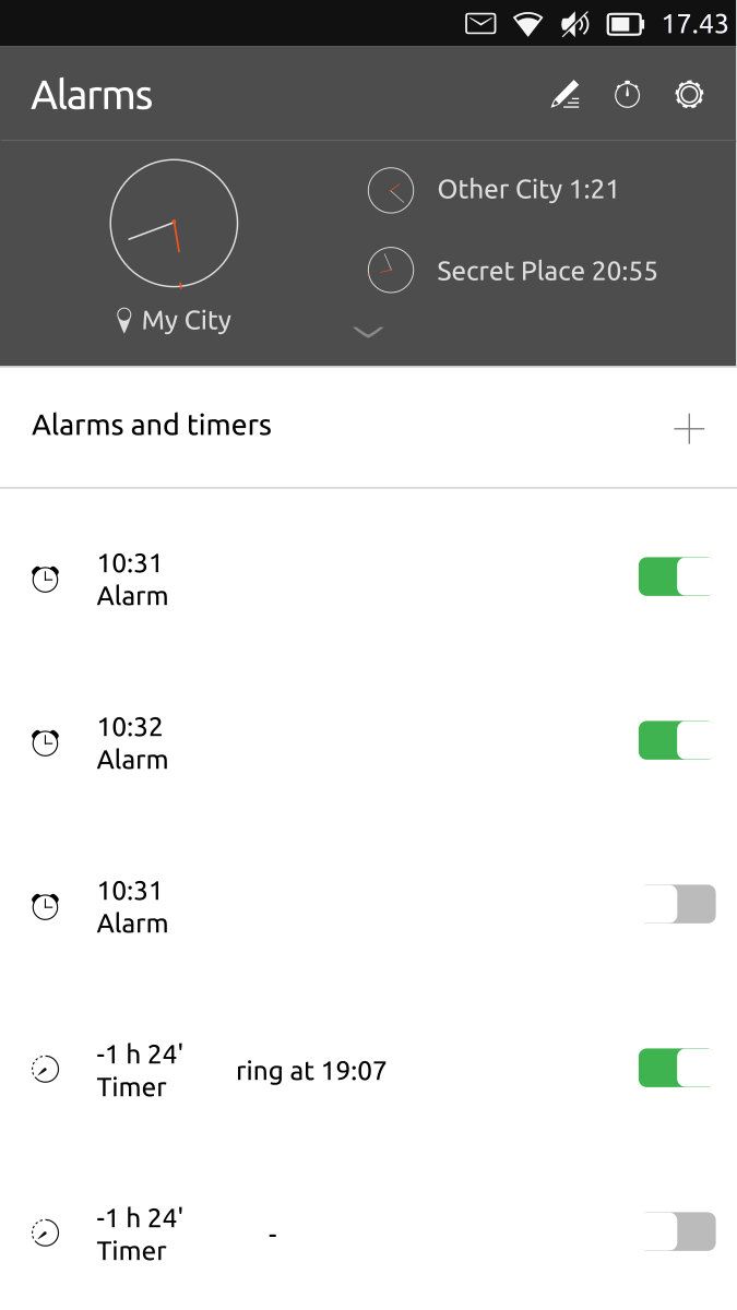
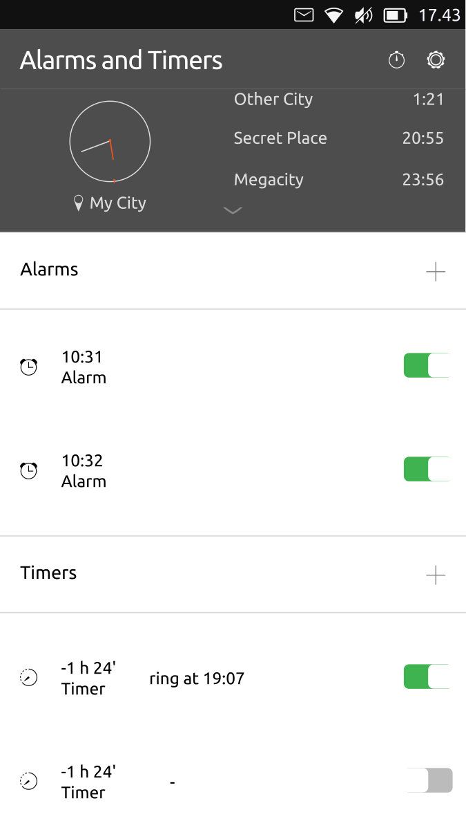
This is an step forward. Still a little ugly. Something is missing...
Word Clock tweak from AppLee idea.
We could show the analogue clock for other places only in big screens or when top panel be «open»
-
@AppLee said in Clock Redesign Ideas:
@CiberSheep do you know what kind of widget (visually) we have in QQC2 ?
You can take a look at the tumbler in https://open-store.io/app/qqc2-gallery.ubadI'm still confused with QQC2 and the old framework and probably other things I don't know about :smiling_face_with_halo:
It took me a while as well. Ubuntu UI Toolkit (uuitk) is a toolkit that uses QtQuick Control (QQC1) module. In the OS there is the QQC2 module but ¿no toolkit? That means you have to use the «raw elements» with Suru Style... or something similar
 very confusing
 -
@CiberSheep said in Clock Redesign Ideas:
@cliffcoggin You can be part of «the quest» if you have time
I have the time and I'm willing to help, but note that while I am good with words I am useless at computing. I couldn't even load UT onto an Android phone, and had to pay somebody to do it for me. If that level of incompetence is of any use, try me.
-
@cliffcoggin said in Clock Redesign Ideas:
If that level of incompetence is of any use, try me.
You are already accepted

-
@3T_Ed said in Clock Redesign Ideas:
Would it be possible to have the alarm time dialer move slower by default for better control?
I don't understand what's your problem with this, as it moves at the exact speed you make it move, thus you can stop it with a touch at any moment, and if you want it slower, just launch it slower, or do not launch it at all, and swipe it instead.
I like it very much like it is, and never have problem setting an alarm with it.
-
I can't answer for Ed, but I have difficulty stopping the numerals once they are rolling at speed, and when I do stop one roller the other roller has moved. If that happens with my slender fingers I hate to think how others with big hands cope. I reckon larger numerals would help, or alternatively lower acceleration when swiped, or keyboard setting.
-
@cliffcoggin
Just swipe it gentle :beaming_face_with_smiling_eyes: -
@cliffcoggin said in Clock Redesign Ideas:
I can't answer for Ed, but I have difficulty stopping the numerals once they are rolling at speed, and when I do stop one roller the other roller has moved. If that happens with my slender fingers I hate to think how others with big hands cope. I reckon larger numerals would help, or alternatively lower acceleration when swiped, or keyboard setting.
Thank you for describing the difficulty here
-
@Keneda Gentle means more time, people that set their allarms they just want to go to sleep ASAP. Try swiping those numbers drunk :))))))))
-
@C0n57an71n
Reducing max speed means more time...
Reducing your swipe speed means the same more time, just those who know how to control the actual max speed would not be impacted.So more time means more time yes, but that time being you swiping more gentle or the max speed being reduced is not the same. In one case everybody have what he needs, in the other, only big finger and low motor control one have.
So maybe solution could be a swipe max speed setting, so that you can tweak max speed if you can't tweak your own finger swipe speed.
-
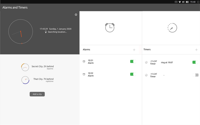
Don't look too close because it's really fast / dirty idea for tablet

Adapt to mobile / side stage

-
That looks to be a big improvement.
-
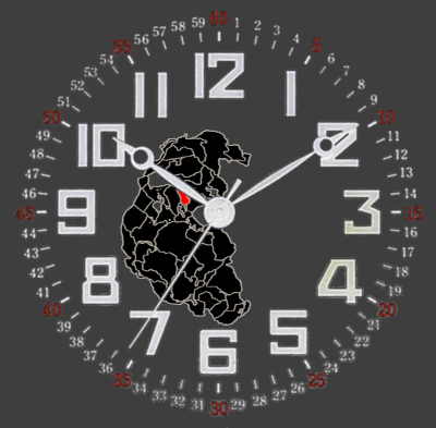
@CiberSheep I have an idea of tweaking the clock it self, I like the analog clock in the app. So add some design to it, I know this is not what you are looking for but hey it maybe makes it a little less ugly :winking_face:
This is just a mock up so please don't look to close.

The red field on Pangea is the country that you set your time accordingly too. It's not a very detailed map, there are better ones. -
@Rondarius said in Clock Redesign Ideas:
[...] I know this is not what you are looking for but hey it maybe makes it a little less ugly :winking_face:
Thanks. I agree that that design is really busy and thinking that clock and world clock are the least used features of the app...
If you think about it. The main clock makes little sense: you have the time on the indicator... at all time... on the lock screen... when unlocking the phone, there's two clocks in front of you... at the same time...
-
Couple of words in general on clocks. I love to wear watches on my wrist. I tend to buy only analog-style watches. Because they have style, they look good. BUT, when it comes to information, even tho sometimes they have numbers, it takes a few good milliseconds to get the time (compare to digital). When it comes to daily driver and digital information, I would like it to be practical. (even tho I like Day/night indicator you made it very nice Job)
MHO I would of find how to combine style alongside with quick informative clock design. There is plenty of good stuff on the web, which can help.
I would love to help, But I'm too busy with other stuff on my mind.