Information:
Here will be shortcut of our best ideas discussed below and information about available projects.
There are two points of view, how this functionality should looks. That's why there are described both.
The priority is the basic form.
When somebody want me to add something in 1st post you call me up using "@" 
However I'll try to mark helpful information here in spare time.
Started & Connected Projects:
ICE - Personal Safety App - by @syper
![]()
OpenStore - https://open-store.io/app/indicator-ice.ubuntouchfr
Source - https://framagit.org/syper/ice-personal-safety-app
Support - https://framagit.org/syper/ice-personal-safety-app/-/issues
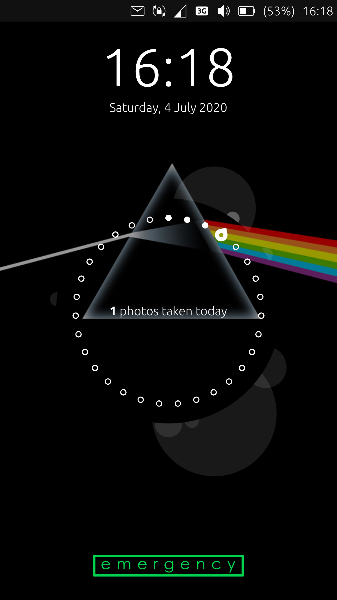
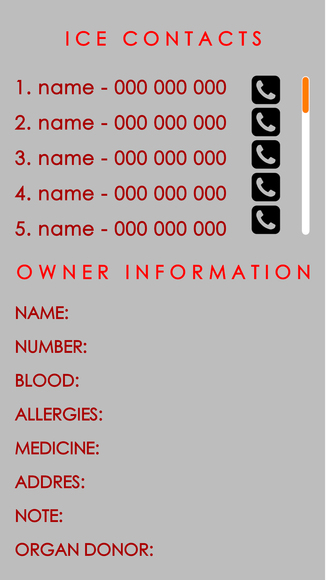
This Project adds ICE Information on status bar but for now there is no possibility to call contact form owners phone or to access this screen using button - you have to swipe down from statusbar
Big thanks for @syper 
Basic form:
(simplicity and other popular mobile OS are the key)
Overview: The idea is to create SOS, ICE, EMERGENCY screen available without permission on UT lock screen.
Layout: Simple access to that screen after double tap ICE/EMERGENCY button available on lock screen. Button may be at the bottom of the screen. It shouldn't be aggressive looking. It can be transparent. However writings border looks good and may be a good choice. Button redirect to screen where place is separated in two parts: ICE Contacts and Owner Information
ICE Contacts includes:
- Priority Number on list
- Name
- Phone number
- Call button - in stress this way may better than gestures
Owner information fields:
(Excluding 2, these points you can find in LineageOS 17)
- Owner Name, age, gender
- Owner (this phone) number
- Blood Type
- Allergies
- Medicine
- Address
- Organ Donor
- Note - here may be everything we forgot to include
Extended form:
(proposed by @3T_Ed )
#1. parameters
- open source UT
- Armor/confined (lowering treshold for installing)
- basic feature with minimal data permissions
- extensions (opt-in) for geolocation, QR-code, etc
#2. Front-end: structure/lay-out
a. lockscreen: emergency call button + medical ID button (one tab to -> b.)
b. one click to Overview (basic/essentials), similar to this existing ICE app (last screenshot)
c. Overview:
- Tab 1. overview (current: basic medical ID with optional links to geolocation, call nearest ER, etc.)
- Tab 2. owner details
- Tab 3. medical condition (optional linking to Tab 6.)
- Tab 4. medical history (opt-in extension)
- Tab 5. relationships
- Tab 6. show procedure/ (manual input or standard first aid procedure)
- Tab 7. Red Cross standard guide on common first aid procedures, preferably in your own language
- Tab 8. User log (logging access usage+detecting unauthorized usage)
After consensus on #2., #5. and #6. a visual draft can be made.
#3. back-end: structure/lay out
- to be determined
#4. Usability and possible opportunities
By allowing more permissions
- direct call emergency rooms
- pinpoint the exact location for helpers to guide emergency services to that spot
- QR code/NFC for emergency services
- geolocation for sending out emergency text to ICE in case of falling (think diabetics, elderly people)
#5. Must have/Nice to have
- see #1
- see data provided by @BigB
#6. List of data fields
Tab 1: Overview
- photo (identifying owner)
- name, date of birth (+age), gender
- this/owner's phone number
- ICE (most important + dropdown showing rest)
- family doctor (name, phone number)
- blood type
*height + weight
*allergies
*medication - medical condition(s) - clickable to Tab 3.
- Organ donor
Tab 2. Owner details
- full name
- call name
- address
- phone needed
- important notes (like children nearby - extra ambulance needed)
- relationships (clickable -> showing Tab 5)
optional by opt-in:
- insurance data
- car data + nearest servicepoint
- upload organ donor registration
Tab 3. medical condition(s) details
detailed description (bullet points of each separate condition + dropdown for description)
linking to Tab 7. to show procedure
Tab 4. Medical history (only by privacy opt-in/extended permissions!!)
- detailed history health issues
- detailed history medication + dose
- upload medical/dentist/etc. records
- upload x-rays
- upload donor registration
Tab 5. Relationships (only by privacy opt-in/extended permissions!!)
- status (married/single/divorced)
- name spouse + phone number(s)
- children (names+date of bidefault+phone numbers)
- address (same as owner by default)
- next of kin (in case of emergency if it involves family)
Tab 6. first aid procedure
- description by owner how to respond/act in case of known issue x,y,z
- show general procedure in case of medical issue according to first aid guide (direct link)
- show first aid guide Red Cross + language selection (default: country of address)
Tab 7. user log (only by privacy opt-in/extended permissions)
- registration times of use + how long
- optional by opt-in: take picture of user (getting image of helper to identify/thank him/her later or identifiable abuser
- registration for doctor to determine history
Other Ideas:
- Problem with too any information (in extended form) - group information for basic available in basic for and rest hidden under second button "more". Empty field shouldn't be displayed.
- Problem with storing this data - those are really personal information so It could be good to store it in restricted part of system.
Pros and Cons of both forms:
Basic form
Pros:
- Simple and fast to use in stress
- Similar to other mobile OS. That means it wouldn't causes problems in use for paramedics
Cons:
- Sometimes it's to less information
Extended form
Pros:
- Really enough information for everyone not only paramedics to help
- Good for people living alone, who doesn't have anyone to call
- Identifying person, contacts, facts is much simpler especially when someone dies...
- Medical history can help when someone is ill for not ordinary disease
Cons:
- It's easy to get lost when these information are not grouped/hidden properly
- problems for paramedics to get needed information they should fond in regular phone (they are not notified how to find it on Ubuntu Touch)
- Someone unwanted (thief, founder of lost device) could know your restricted, personal data...
Important Posts:
@Flohack about project and ideas
"some words on that from the core team:
- Adding a colored icon like this to the indicator bar will break the style that we try to keep consistent for system-realated things. So this wont be acceptable at all for taking it into the main OS
- Even if we would accept it, its much too small. Somebody who does not know ,Ubuntu Touch and that is the majority of the ppl on the planet will never ever figure out that they can find ICE contacts and infos
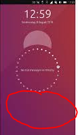
- Why don´t you use the free space below the circle for that:

- Yes, that change involves hacking into Lomiri quite a bit, but it is not that complicated. And then add it to the system settings for configuration.
- In this position the icon can be colorful, and big enough so ppl recognize it.
- If you want to align design ideas with the core team, please ping @CiberSheep for that, he is always a friendly sheep
 "
"
@Flohack wrote important information: "The problem is make something accessible on the lock screen. (...) That's basically that you need to design an API for that"
@Lakotaubp & @theare27 proposed temporary solution for only displaying some information in circle using app: https://open-store.io/app/circle-message.mivoligo but as @dobey said to change information in circle you have to double tap it and it ma causes problem for first aid.
@Flohack about NFC - "NFC is currently not an available option in UT, the API is not implemented down to the Android layer."
First post changelog:
- 2020.07.28 - Title changed
- 2020.07.13 - added @Flohack 's post to important posts.
- 2020.07.13 - Added Started & Connected Project Section and written about @syper project, changed header "Missing (...)" to Information, added [solutions] to title
- 2020.07.07 - Added headers, split to basic and extended form, added NFC information, added "Other Information section", added Pros and Cons of both forms, added lock screen tag (@3T_Ed I couldn't add more than 5 so I picked lock screen)
- 2020.07.06 - added draft including information what we need to design everything, quotes, temporary solution, moved my first message to bottom
First message:
Hello everyone,
It would be wonderful if on lock screen there will be available big red/green button Emergency (for now it's too small in my opinion). Under it, there is dial pad. What I miss there, is second button for medical services called ICE Contacts & Owner information. I heard that paramedics are notified how to find this in regular phones, like android or apple. According to that, in contacts/settings we should have option to mark contacts as ICE and create queue of displaying them - not automatically by alphabet, but you know, your choice of most important person. The last thing is medical information like blood type, am I an organ donor and so on. It's pretty well done in LineageOS so it may be base model, but yeah, if you could include more and more information (and mentioned special contacts queering), It would be wonderful. I write it because I use my UT device as daily driver. It may safe life one time.
Thank You 


