UBports Robot Logo UBports Forum
    • Categories
    • Recent
    • Tags
    • Popular
    • Users
    • Groups
    • Search
    • Register
    • Login

    New badge for Yumi?

    Scheduled Pinned Locked Moved Design
    70 Posts 23 Posters 21.9k Views 2 Watching
    Loading More Posts
    • Oldest to Newest
    • Newest to Oldest
    • Most Votes
      Reply
      • Reply as topic
      Log in to reply
      This topic has been deleted. Only users with topic management privileges can see it.
      • ? Offline
        A Former User @Opolork
        last edited by

        @Opolork šŸ™‚ yes

        OpolorkO 1 Reply Last reply Reply Quote 2
        • OpolorkO Offline
          Opolork @Guest
          last edited by

          @3arn0wl said in New badge for Yumi?:

          @Opolork šŸ™‚ yes

          Cheers 3arn0wl. :thumbs_up_light_skin_tone: :smiling_face:

          How can you trust that an app really won't send some company your location data, when you tell it not to? The only way you can trust a program not to do something it isn't supposed to do is if it is free software. ~ RMS

          1 Reply Last reply Reply Quote 0
          • J Offline
            JassMan23
            last edited by

            I have come to this rather tardily I fear, but here are my suggestions if it is not too late.
            UBports Badge.png UBports Logo.pngUBports Badge2.png
            I am not very artistic on a computer screen but in this case, I thought it might come out better for the symmetry if I used a gimp.
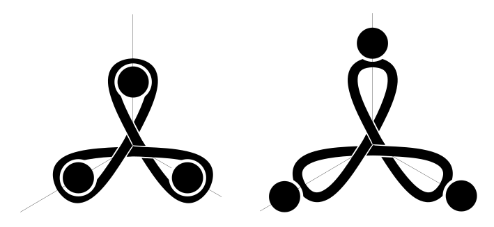
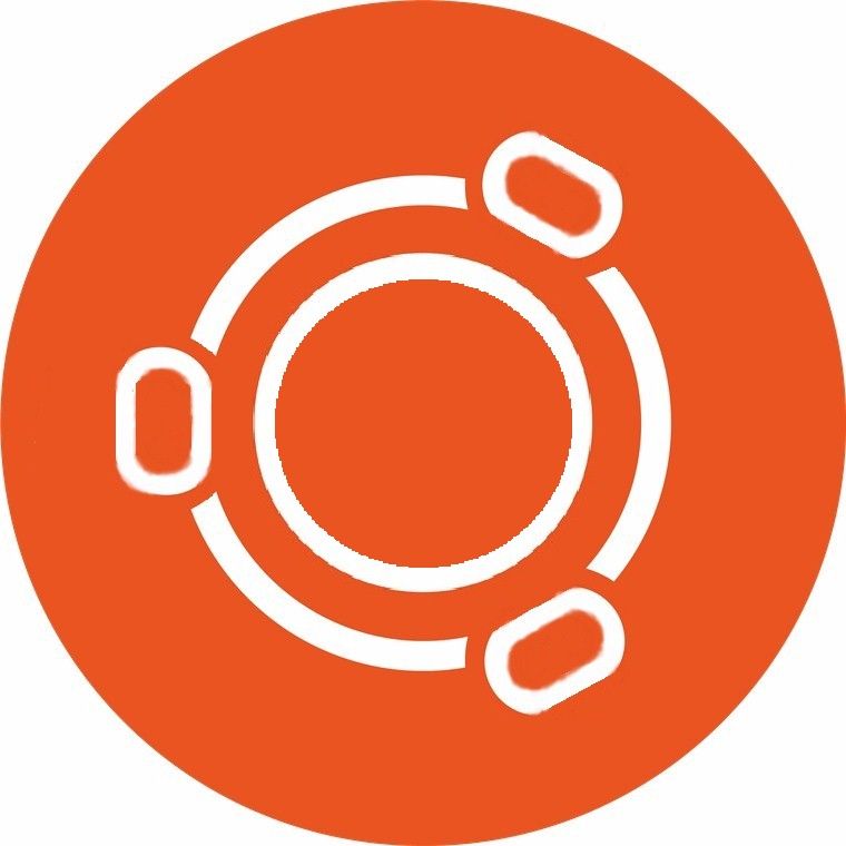
            I really liked the idea of the 3 "semi-circles above" but think it is still too similar to Ubuntu. I thought also that 4 U-people might represent Coders, Translators, Testers, &Users which is the community of UBports. By having the heads half in, half out of the containing circle, I think it represents that we look to each other as well as to the rest of the world at large.

            A major improvement to the design would be edging to the characters and circle, particularly on the last (Yumi badge) design so that it could be just the white parts and the edging without the background red.

            1 Reply Last reply Reply Quote 3
            • PhoenixLandPiratP Offline
              PhoenixLandPirat
              last edited by

              74db734b-dc57-402c-aeb4-9e2bac683c19-image.png

              My favourite so far is the one on the right, just needs to the right colour šŸ™‚

              ccc5b196-799d-4c00-a437-9714acac6564-image.png

              I also like this one, but I think this is asking for legal issues honestly.

              Josele13J 1 Reply Last reply Reply Quote 0
              • Josele13J Offline
                Josele13 @PhoenixLandPirat
                last edited by

                @PhoenixLandPirat I'm not good at drawing, but I like something like that...

                cccacac6565-image.jpg

                Xiaomi Redmi Note 9 pro
                Oneplus Nord 100
                Xiaomi Redmi Note 7
                Nexus 5
                Bq E4.5 Ubuntu edition .... is dead

                1 Reply Last reply Reply Quote 0
                • dobeyD Offline
                  dobey
                  last edited by

                  Why does Yumi need this sort of "badge" at all?

                  If you want to design a new OS logo for UT, that's fine, but let's not waste time conflating multiple different pieces of branding, trying to shove them all together into the same thing, and having too much in too little space. We already have enough of that.

                  And no, I don't think we should just tweak the Ubuntu circle of friends logo into some odd distortion of things. IMO, there should be no such "badge" on the Yumi mascot.

                  1 Reply Last reply Reply Quote 1
                  • ? Offline
                    A Former User
                    last edited by A Former User

                    I know the topic is old and I'm a little bit late to the party, but maybe, when will be the time to look for another logo other than Ubuntu, have a look here....
                    Thanks!

                    touch.png

                    1 Reply Last reply Reply Quote 1
                    • ? Offline
                      A Former User
                      last edited by

                      touch2.png

                      1 Reply Last reply Reply Quote 1
                      • ? Offline
                        A Former User
                        last edited by

                        touch3.png

                        LakotaubpL 1 Reply Last reply Reply Quote 0
                        • LakotaubpL Offline
                          Lakotaubp @Guest
                          last edited by

                          @C0n57an71n Ok I'm being very slow so please explain.

                          ? 1 Reply Last reply Reply Quote 0
                          • ? Offline
                            A Former User @Lakotaubp
                            last edited by A Former User

                            @Lakotaubp said in New badge for Yumi?:

                            @C0n57an71n Ok I'm being very slow so please explain.

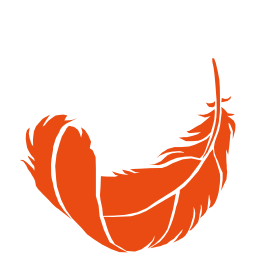
                            @Lakotaubp The reason for doing a logo or the reason of doing a feather as a logo? What's your question? šŸ™‚

                            LakotaubpL 1 Reply Last reply Reply Quote 0
                            • LakotaubpL Offline
                              Lakotaubp @Guest
                              last edited by

                              @C0n57an71n The feather

                              AppLeeA ? 2 Replies Last reply Reply Quote 0
                              • AppLeeA Offline
                                AppLee @Lakotaubp
                                last edited by

                                @Lakotaubp
                                My bet (or interpretation) is light weight and soft touch.
                                Or maybe because the feather is stronger than the sword...

                                ? 1 Reply Last reply Reply Quote 0
                                • ? Offline
                                  A Former User @AppLee
                                  last edited by

                                  @AppLee You are right about the two, I didn't knew the one with the sword šŸ™‚

                                  1 Reply Last reply Reply Quote 0
                                  • ? Offline
                                    A Former User @Lakotaubp
                                    last edited by A Former User

                                    @Lakotaubp Well..., I came up with the feather since I didn't want to recycle the Ubuntu logo and, to be honest, we might want to step out from it's shadow in the future, as Manjaro doesn't carry Arch in it's name, and this is just an example. Yumi it's nice, but I see it as a mascot, not as an OS logo, and is just an adaptation between Android logo and Eve from Wall-E. So..., giving this, I just played around the word "Touch".

                                    LakotaubpL KenedaK 2 Replies Last reply Reply Quote 2
                                    • LakotaubpL Offline
                                      Lakotaubp @Guest
                                      last edited by

                                      @C0n57an71n Problem being "feather "features in a lot of other branding one way or another. It certainly might be something for the future for all the reasons you mention.Short term think the Ubuntu one will be be here for a while. Good to see you thinking about it though might be worth a chat with @Kaizen or @CiberSheep for the long term.

                                      ? 1 Reply Last reply Reply Quote 0
                                      • ? Offline
                                        A Former User @Lakotaubp
                                        last edited by

                                        @Lakotaubp Just because one thing appears in a logo somewhere doesn't mean you can't use it. Nobody has a copyright to nature. @Kaizen and @CiberSheep are more than welcome to debate and come with their own ideas, and not only them.

                                        1 Reply Last reply Reply Quote 1
                                        • KenedaK Offline
                                          Keneda @Guest
                                          last edited by Keneda

                                          @C0n57an71n said in New badge for Yumi?:

                                          I see it as a mascot

                                          Me too.

                                          and is just an adaptation between Android logo and Eve from Wall-E

                                          lol so true i told myself the same some time ago :grinning_face_with_sweat:

                                          @C0n57an71n said in New badge for Yumi?:

                                          Nobody has a copyright to nature.

                                          Don't be so sure...
                                          https://uk.pcmag.com/apple-3/128119/apple-is-attempting-to-block-a-pear-logo-trademark
                                          https://www.qwant.com/?q=apple pear logo&t=web&client=qwant-firefox

                                          🤢

                                          2015-2023 : Meizu MX4 ā˜ ļøāš°ļøāœļø
                                          2023-2024 : Nexus 5 ā˜ ļøāš°ļøāœļø
                                          2024-***** : FPOS Fairphone 5 waiting UT for freedom šŸ˜‰
                                          šŸ‡²šŸ‡«šŸ‡¬šŸ‡§

                                          ? 1 Reply Last reply Reply Quote 0
                                          • ? Offline
                                            A Former User @Keneda
                                            last edited by

                                            @Keneda Yeah, I've read about it, but that's 'merica.

                                            1 Reply Last reply Reply Quote 0
                                            • KaizenK Offline
                                              Kaizen
                                              last edited by

                                              @C0n57an71n I liked the feather!

                                              I see it as a mascot, not as an OS logo.

                                              Yumi has plenty to offer as a character. There are many ways to improve him to a really memorable logo, but he is already taken the mascot position. The bottom line it's all come down to the process.

                                              And the process is sometimes full of many stressful decisions. Since I do it for my living, I can say behind every pixel hiding many stakeholders' decisions, expectations, and argues.

                                              Nobody has copyright to nature.

                                              Some companies even claim colors.

                                              giving this, I just played around the word "Touch".

                                              Yes, and that is where process start from. I like your styles, you are definitely a thinker.

                                              ? 1 Reply Last reply Reply Quote 0
                                              • First post
                                                Last post