I wanna go home
-
After https://github.com/ubports/unity8/issues/121 was filed and we've had not one, but many sour discussions about this or related topics, I figure we should try to slow it down a bit.
People are getting antsy (read: livid) about the changes to Ubuntu Touch in upcoming releases. In this post I'll try to tackle the issue of "home." More specifically, Where is home in Ubuntu Touch now?
The case for going home
Home, in terms of an operating environment, is the first place where a user arrives and a place they can return to. It's taken many forms over the years of personal computing:
7000 BYTES FREE, READY.$(orC:\>)- Windows' Start menu (Then its Start screen, then its Start menu again)
- Screens which are actually called "Home" on Android and iOS
The concept of Home is slightly different for every operating environment, but it serves a few important purposes:
- It is used to start other interactions with the environment (applications, for example)
- It is "returnable," a user should always know how to get to it. Now that operating environments are used for multitasking, this shouldn't be by destroying all running activities.
- It is "safe," a user should always know what to do once they get there
Home serves as an anchor point for the environment's experience. If the user gets lost or stuck, returning home should help.
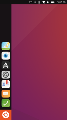
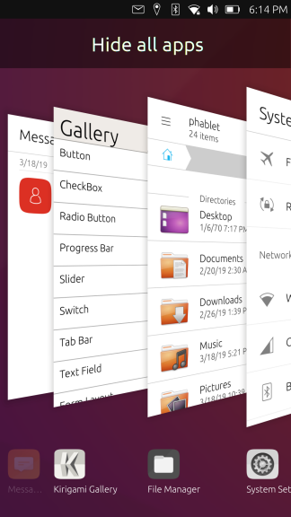
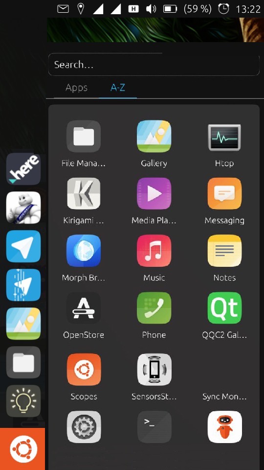
The Dash
We can currently assert the following things about Unity8 on a mobile handset:
- Long swiping from the left of the screen always returns you to the Dash.
- The Dash is a window and is shown in the app stack.
- Due to the last point, the Dash remains focused when the device is locked and unlocked.
The dash is home.
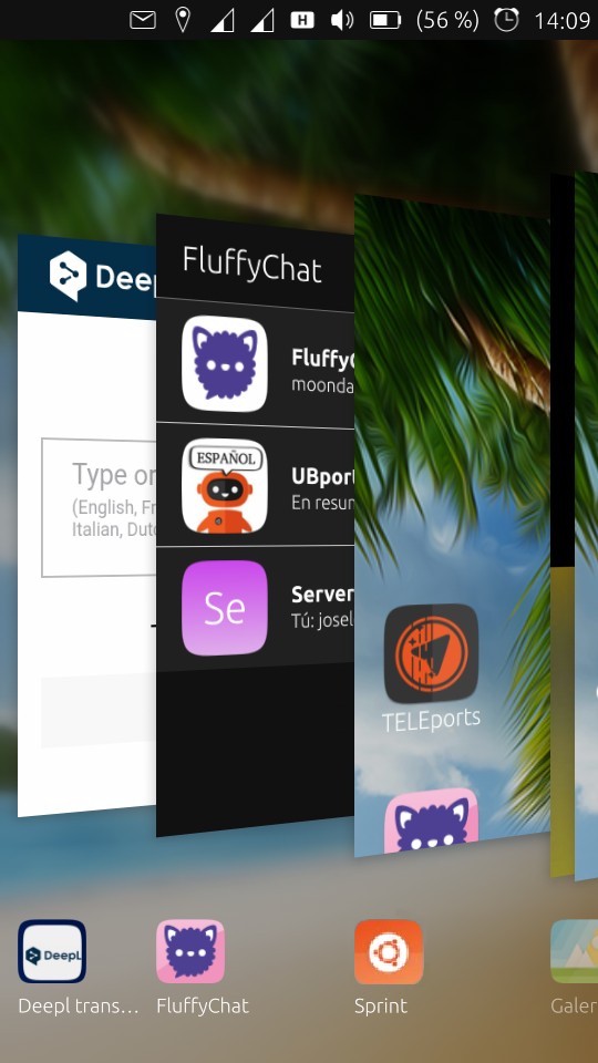
The Drawer
The following things about those assertions have changed:
- We no longer have the Dash. Long swiping from the left of the screen opens the App Drawer.
- The Drawer is not a window and does not appear in the app switcher.
- The Drawer does not remain focused when the device is locked and unlocked.
It is consistent with our desktop experience.
But it's got everyone up in arms.
Where is home now?
By far, the most important question I see us asking ourselves (indirectly) is, "where is home now?" The answer... isn't straightforward.
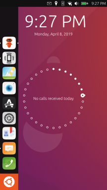
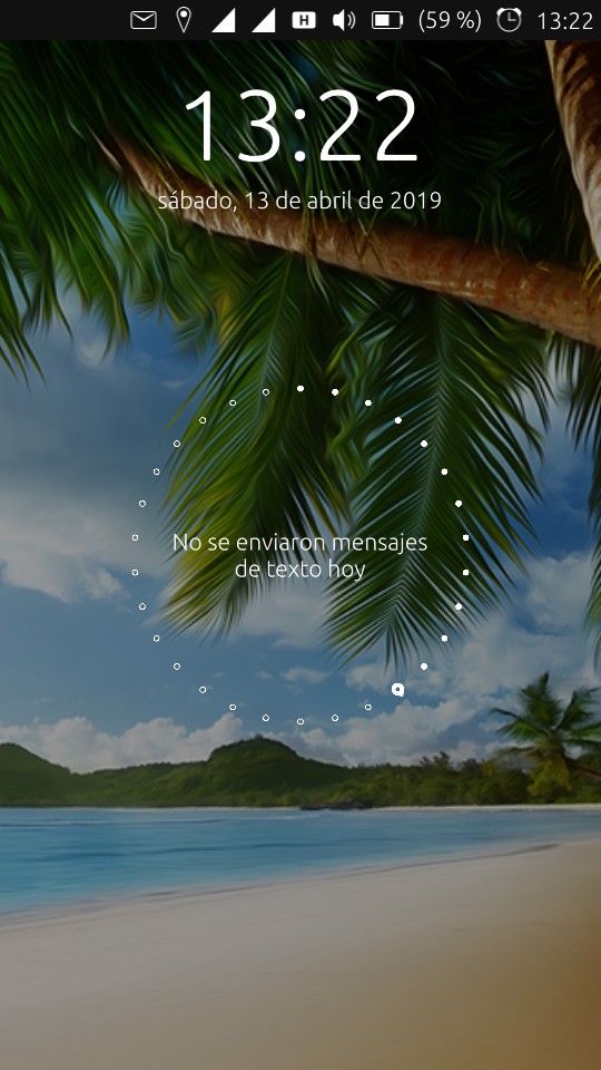
Is the Background home?
Users will land in the Ubuntu Touch experience at the Background (NOT the desktop, which implies you may put things on it):
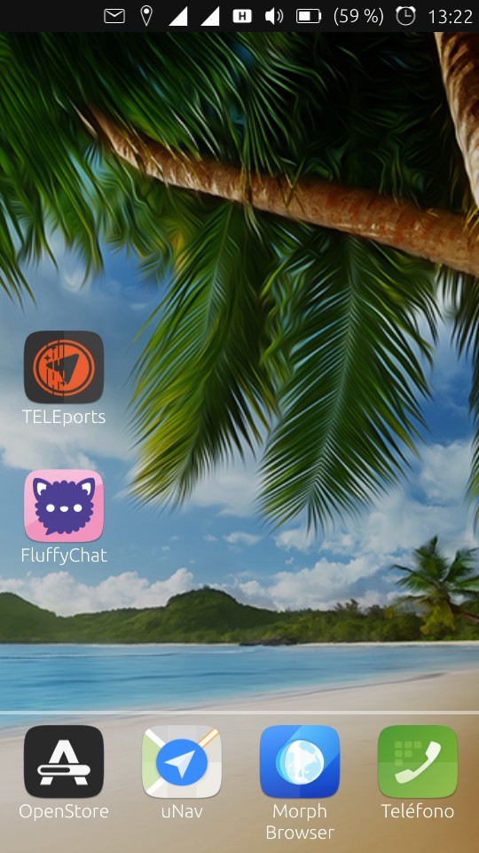
When arriving at the Background, the Launcher (some call it the dock) appears to greet them. The user may arrive at the background by booting the device or closing all their apps. By offering the Launcher, the background can be used to start other interactions AND it is safe. However, it breaks one of our main rules: There is no way to return to the background without destroying all of your activities.
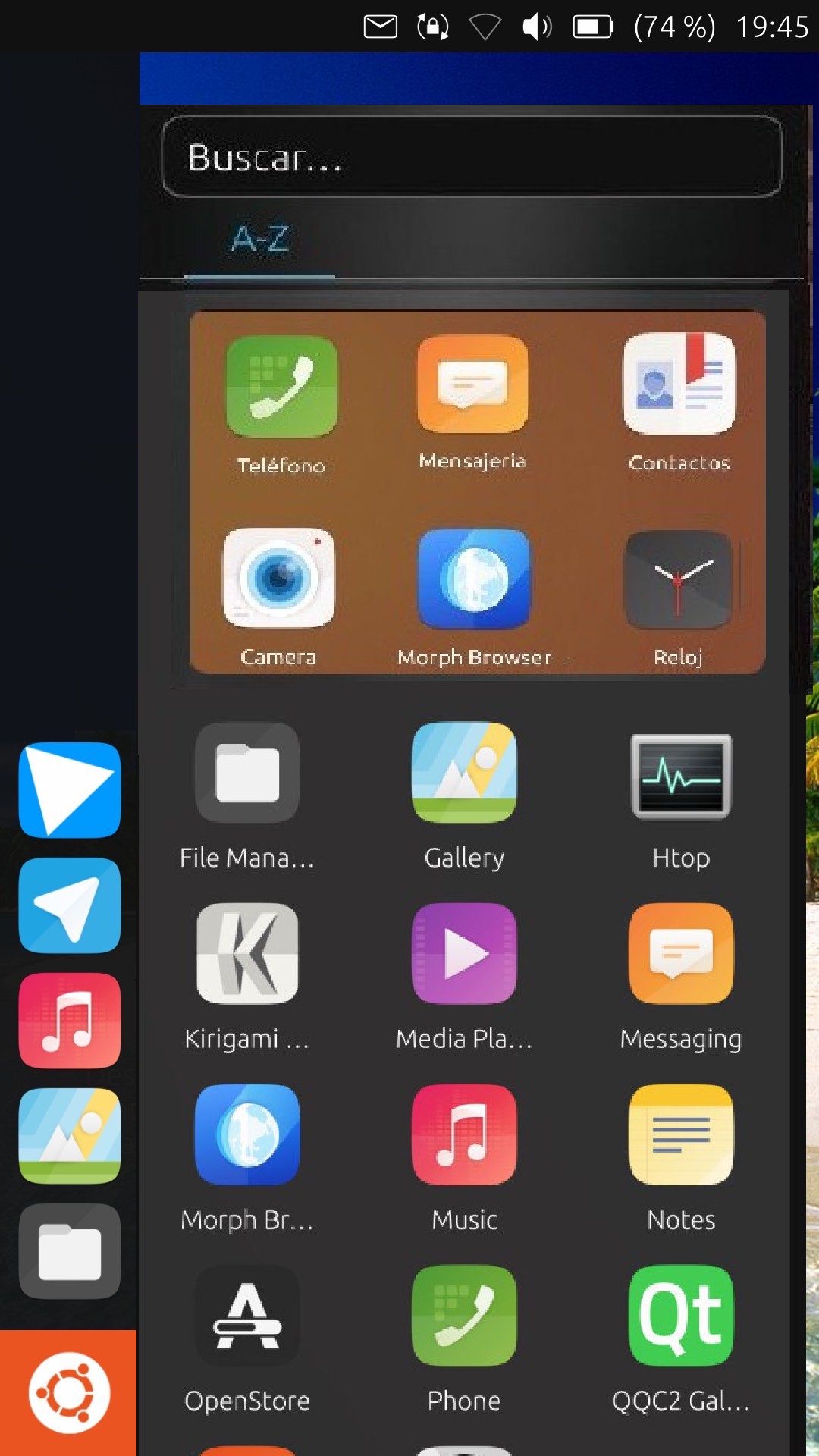
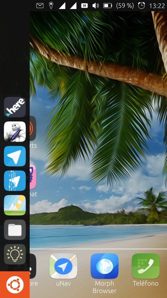
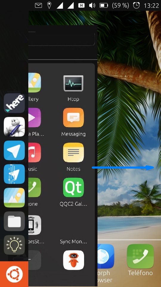
Is the Drawer home?
The Drawer may be opened by long-swiping from the left of the screen or tapping on the big ol' orange button:
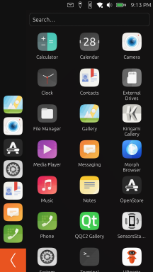
This can be done at any time. This makes the Drawer returnable. It is very simple, so I assert it is safe. And, well, it starts new interactions.
Something about it has people really uncomfortable, though. Maybe it's the fact that, unlike the Dash (or iOS' home, or Android's home), the Drawer is dismissed when you lock the device. This resonates with me a bit, a serial home-presser before locking my device. I like to start at square one whenever I pick up my phone.
Can we find home?
Does this add a new requirement to home? Does home also need to be durable (or comfortable?), lasting through transitions to lock states or other huge events?
Or, is this okay? Is this a case of a different design being more efficient? The ideal use of Unity8 is pinning applications to the Launcher, where they can be managed and switched between (even on the lock screen).
(Maybe the Launcher is home, or the lock screen!)
Home must be durable
If home must be durable, the Background is close to being home. The only problem is we can't return to it easily. There are an infinite number of ways to solve this, here are a couple I've thought of:
Go to background as an app
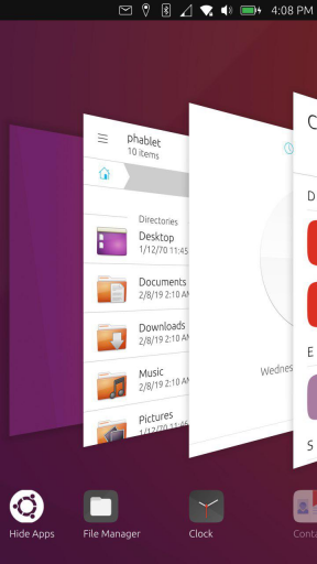
Hide apps appears as another window in the app switcher. It is always located behind the most recently used app, as shown here.
Go to background as an action
We discussed having Go to background as a specific action you perform on the app switcher. It could also go somewhere else, but there's nowhere to put it. This issue proposes having it be the "Cancel" action of the app switcher, when you tap in the blank space. That caused a lot of upset since it changes the current behavior (tapping in the blank space goes to the app you were just using, today you learned) and is not explicit (as a Python developer, I agree). Here's a way to make it explicit:
(It took me twenty minutes to make that, don't judge me)
Nah, this is more efficient
If home doesn't need to be durable to be home, maybe there is a way to offer an olive branch to people who think it does?
What do you think?
Does home need to be durable? If so, is the Background a good place to have that interaction? Is there a good way to get there?
How do we keep the home interaction consistent between phone, tablet, laptop, and desktop?
Note that "just add another setting to..." is not an acceptable compromise. More customization means more development overhead, makes it more difficult to support users (you might have to do this, or you might have to do that), and takes away from a consistent experience. (If you want to discuss this metatopic, please make another thread.)
Addendum: ground rules
You're talking about a bunch of colorful rectangles, remember. Take your time when replying and keep it respectful and on-topic. This is a good place to brainstorm, but make your ideas concrete with mockups rather than talking about them abstractly.
-
I like the idea of collecting adjectives for home. Thats how you would do it in mathematics. Things are defined by their properties. So up to now we have: home is a safe and returnable starting point that maybe also needs to be durable.
I gonna add one more feature I find very crucial about homes: individuality!
If something should be configurable then its your home. How to achieve this? You already know what I gonna say now...") Let the user pin an app as their home.
Let the user pin an app as their home.
Pros:- It provides the most individuality you can think of
- Their are some people willing to implement that
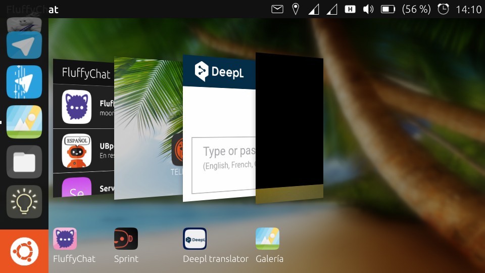
- We already have Brians Sprint app as a starting point
- Imho its much easier to contribute apps than contributing to the core and we have a broad app dev community who could build homes for us
Are their any cons?
-
"Explicit is better than Implicit" is a great principle for programming language design, but a user-friendly user-interface plays by different rules. In UX design, actions should be intuitive, and what could be more intuitive than tapping the background to get to the background?
If you think there needs to be a text or icon to hint for this action as well, ok, maybe. But it should be way more subtle than in the mockup. For me, the Application spread is one of the most distinctive and beautiful features of Unity 8, we can't f*** (mess) this one up.
A go-to-desktop-app in the spread... I don't know. Being able to just tap the background feels way more practical to me. Either the go-to-desktop-app would always be in the end of the spread, which would cost you time, or it would be somewhere in the list making it more difficult to find an application you want to switch to. Why add another UI element, if there's already a perfectly good option we can go with that doesn't bloat the UI nor reduce ease of use of the existing usecases?
On the topic of what is home, might i add:
Don't kill the desktop: A manifesto
In my opinion, Unity 8 should become a proper desktop environment, and that includes being able to put stuff on your desktop. Doesn't have to be applications (unless the user wants to, then let them do it), but it would also be incredibly useful for short-lived files. For example, i'm very often travelling by train in Germany, and since we don't have a ticketing app for Ubuntu Touch, i always put the ticket-pdf on my phone and open it in document viewer. That's something i would put on my desktop. Yes, i know, Gnome removed that feature a while back. But for many people that is a standard feature of Desktop Environments and it would be foolish to dismiss it as a legacy usecase. For me, it is clear. The desktop is my 127.0.0.1. And i'd love an easy way to get there.
-
This post is deleted! -
My opinion is that there's no immediate need yet for an easy way to go to the "background".
This is mainly because the background has not much use or functionality right now. It's just a background.
I myself is one of the people who usually go back to the "home" (dash at the moment) before locking.
I guess I really like using the left swipe and seeing the animation But it's a habit I learn to give up when I'm using the edge channel.
We have to be careful adding UI elements in the application spread because it could get crowded especially once the workspace switcher gets into the action. Perhaps a quick solution for now is to have a bottom edge gesture in the app spread to hide all apps AKA "Show desktop". Well it might not be actually quick since the animation might have to be handled
")
As for the possible functionality in the "background" to make it something useful, my mind is a bit confused because the things that come up in my mind are like "scopes" LOL. Like aggregating all your favorites - apps, folders/files (file manager), links (browser), etc.
I guess I could live without "home" until we get a great idea that's really a game changer
-
Let the user pin an app as their home. Are their any cons?
Well, since you asked...
The problem with this proposal is doesn't offer a consistent experience that makes sense between mobile and desk workflows. Now you have an app that you aren't allowed to close on your background for some reason... why?
Also, it's a bit like raising the white flag and saying that we can't make a better user experience as a community than individuals can on their own attempts. I don't believe that's true.
My recommendation: If you want to use Sprint, use Sprint. Place it at the bottom of your Launcher and go back to it when you need it. It might get a little mixed up in the app switcher, but it won't get mixed up on the Launcher.
it's a habit I learn to give up when I'm using the edge channel. [...] I guess I could live without "home" until we get a great idea that's really a game changer
That's interesting. I've tried to encourage people to give the new Unity8 a try before getting upset about it, but that doesn't appear to work. Maybe this is the biggest non-issue ever.
We have to be careful adding UI elements in the application spread because it could get crowded especially once the workspace switcher gets into the action. Perhaps a quick solution for now is to have a bottom edge gesture in the app spread to hide all apps AKA "Show desktop".
I agree, we could crowd the space. That is definitely a concern. I'm not sure about a bottom edge gesture... two gestures from different edges to go home? We'd be pushing it at a gesture and a tap.
Implementation might be a little bit difficult as well.
Either the go-to-desktop-app would always be in the end of the spread, which would cost you time, or it would be somewhere in the list
No. Like Unity 7, the "Go to desktop" entry is leftmost and your cursor starts on the app to its right (shown by @CiberSheep here). Spatially, it would appear behind the app you just dragged out. It would always be where it is in the mockup in the first post. (Actually, the Dash was always supposed to be there too. It's a bug that it's not.)
stuff on your desktop
As long as it's consistent, we can do anything.
As an aside, I should add that I'm trying to protect developers' time... so home should also be "Easy to implement." Changing the behavior of the app switcher background or adding a new button is easy. Re-introducing the code that made the Dash work is not.
Also, whatever we do is not set in stone forever. We can experiment and try new things. As the Ubuntu Code of Conduct says:
The poorest decision of all is no decision: clarity of direction has value in itself. Sometimes all the data are not available, or consensus is elusive. A decision must still be made. There is no guarantee of a perfect decision every time - we prefer to err, learn, and err less in future than to postpone action indefinitely.
-
In terms of "what is home", i typically use the "scopes" app rather then the dash. For me, on the phone, the dash is just a place of shortcuts for apps that I open a lot.
There's no real value in the empty background right now - nothing there i cannot do from elsewhere except see nothing. If convergence comes, then putting stuff on the desktop makes sense (if we liked gnome, we wouldn't be here). Or, setting a default home app could also work (and then you could default that to a "desktop" app that shows shortcuts ...).
If any real option gets coded, we would indeed need a way to get there. Swipe left is for the drawer (and apps), which is a change I'll at least have to get used to instead of accessing the scopes app in the spread. You could put a desktop icon on the drawer somewhere, which would re-inforce the drawer as the unit of navigation. You could also put both the open drawer (as a replaces of the scope app) as well as the background as defaults in the spread. You could also just do both.
Concerning the "click outside" from the spread: it's a new form of interaction. It might be more intuitive if there's a card to select from, and if that card is always at the same place.
Also, "hide apps" sounds wrong to me. I want to (positively) go home, not (negatively) hide other stuff.
-
@UniSuperBox said in I wanna go home:
Now you have an app that you aren't allowed to close on your background for some reason...
Have you ever closed your desktop?
 Our apps are - or at least they should be - convergent. So should be the "Home Apps". And the idea would be to maximize home (the pinned app) and put it in the background as your desktop.
Also, it's a bit like raising the white flag and saying that we can't make a better user experience as a community than individuals can on their own attempts.
The individuals vs community statement irritates me. It has nothing to do with raising the white flag. Its about diversity and taking into account that there are very different ideas of home out there. You and me we're contempt without a home, for us the drawer may be perfectly fine. Then there are a lot of people I guess who would be fine with a replacement of the App Scope (@mateo_salta also already made one btw i think). Some want scopes back in general (what ever that means), then I also heard people talking about Widgets and some want to have files on their home (even on the phone).
My recommendation: If you want to use Sprint, use Sprint.
I'm not sure whether I want to use Sprint. I'm one of the guys whos fine without a home...
So I'm not really arguing for me here. Its just the diverse ideas of home became obvious in the discussions make me think its the best way to make most people happy. And also technically its an appealing thing imho. And its freedom! -
@rogier-oudshoorn said in I wanna go home:
In terms of "what is home", i typically use the "scopes" app rather then the dash. For me, on the phone, the dash is just a place of shortcuts for apps that I open a lot.
The "Scopes" app is the dash. The thing where you pin apps on the left edge of the screen, is the "launcher."
@rogier-oudshoorn said in I wanna go home:
(if we liked gnome, we wouldn't be here)
Being able to place icons on the background or not has nothing to do with GNOME. One can also agree with many of the design principles of GNOME, but disagree with their implementation of those principles. Let's not conflate Unity 8 existing with the idea that we must do things traditionally which GNOME has chose to not do in newer versions. If that's really what one wants, MATE/Cinnamon exist for that.
-
Re: I wanna go home
Very interesting post.
In my opinion, we should follow Unity's design. Unity 7 behaves like this: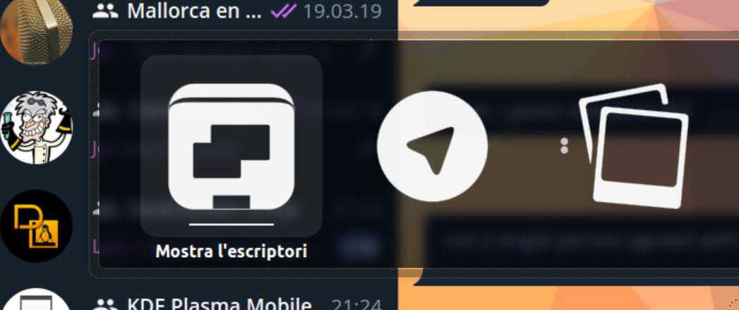
If you click outside of the «spread» you cancel it. If you want to show the desktop, you alt+tab or click on the most left icon.
@NeoTheThird has being arguing that the behaviour we discuss is for staged and not for windowed mode, my answer is that the behaviour of the spread should be the same no matter the mode. On the desktop I use alt+tab to go to the desktop with the apps maximized (the staged of the computer)
Swiping all across the spread to go to the desktop icon is quite quick in my opinion, is as quick as looking for another app to switch to.
-
Hi guys, I really like the drawer idea, it's very similar to the Unity dash, I'll leave you my opinion too, the idea of closing the drawer with an arrow doesn't seem right to me, especially if it's in the lower zone, why not in the upper zone?
The assumption of closing the Drawer is because you haven't chosen any app, and if we slide it from the center of the Drawer to the left to close it, wouldn't it be better?
Another idea, not to overload the left app bar, before the drawer apps, to have an area that you move the apps there, calling this area FAVOURITES. Sorry about the photo, it's not perfect,
I think the background should be empty of everything, only on the screen unlocking the relog with the circle, as it is now,
it would be nice if the wallpaper slides like the apps
So we can get to what we leave there.greetings...
-
if we slide it from the center of the Drawer to the left to close it, wouldn't it be better?
The swipe is how it's supposed to work, but can't be used due to https://bugreports.qt.io/browse/QTBUG-74842. So for now, we compromise with a back button.
Favorites are hard to justify when the Launcher already exists and includes your favorite apps.
-
@UniSuperBox ok
-
Hey, I have written a little blog post about this topic. My idea was that it might be helpful to look how other operating systems are solving this problem: https://christianpauly.github.io/homescreen
The conclusion is that it might be very important weither the "Homescreen" is below or over the open apps from the user point of view and Gnome 3 might have a very good solution for this. -
All the discussion makes perfectly sense for desktop environments on PCs and laptops...
On a mobile all I want is to get the funktion/information as fast and easy as possible... every extra klick or swipe is just an extra delay... my best mobile experience has been meego followed by the scopes idea
(while I only ever used the "today" "news" and "apps" scope which resambled the meego experience)So whatever you plan to do, keep it simple and without swipes and Klicks everywhere to get to another screen, function,...
BTW I've never been a fan ov unity
- xfce is the DE of my choice - so I might be a bit old fashioned -
@Krille said in I wanna go home:
The conclusion is that it might be very important weither the "Homescreen" is below or over the open apps from the user point of view and Gnome 3 might have a very good solution for this.
But the GNOME 3 solution is not "minimize all apps" in this case. It is simply that the "all applications" view is not some transparent thing that appears on top of the system, but simply is a separate thing and the open applications are not visible behind it.
There's also an important thing missing from this "comparison" (and which is commonly ignored in many such types of comparisons), which is that it only considers what other systems are currently doing, and not how we can do things different/better.
Why can't the "home" screen just be simple and plain? When you come home to your abode, and you're standing in front of the door, all you can see is the plain exterior. You can't see what's stocked in the pantry/fridge/freezer, or what all accessories, etc… might be stored within it, or even how you can access them. You must first go through the openings to get inside and discover all those things. In the same way, having only the launcher/panel visible along with the background wallpaper is the clean exterior, and it makes it clear where you need to go in order to find the interior.
-
My 2 cents, @UniSuperBox - for what it's worth!
I'm a great fan of Unity7: I like the app tray, and I think the Dash is a powerful tool for searching the computer for apps and files.
I think that development in this direction would give UT real distinctiveness as well as it being a great user experience. Of course, it would also leave the "Desktop" free for the adoption of widgets... or whatever we choose to call them.
Perhaps on the first time of using it, the app tray should be open, but have the option, as we have now, to hide it...
-
Just 2 cents from a Windows user:
The Windows desktop was made in resemblance to a real desk and the things you find there: Files, Folders and even a trashbin (technically not ON the desktop ofc). Its a matter of personal preference HOW you organize your desktop:
- Some keep it 100% clean
- Some have a few items lying around
- Some got a sh1tload of unnecessary things there.
My current desktop at work has 32 items: A mixture of starter icons, documents and whatever. Windows got adopted also for the "chaotic" way how you can work with it. It tries to give you maximum freedom on that:
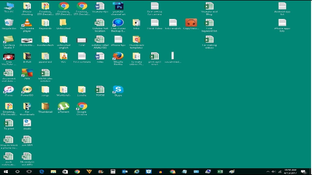
Does anybody understand what´s going on here? No. Does the owner of this desktop understand it? Yes, and he might be most productive with it.
During work, I almost never have to go to the desktop, however. I use it rarely. Also a matter of personal preference.
Can´t we just offer: Appdrawer AND background to organize stuff? You could pin starters and documents to the background (Problem: convergence and how to deal with the layout?)
A good DE gives all users a possible way to develop their own habits and preferences. Not try to force them into a single use pattern.
BR
-
I was thinking what Flohack said, we'd have an empty desk,
I don't know if anyone's ever said it,
but we have the solution to it and it's done.
It would be to unite the work of Brian and Dalton, SPRINT+Drawer, 2 programs better than one.To have a modulable background to which you can add your apps and maybe one day Widgets, with the home of Drawer apps, this would be the best and each person can put the apps as everyone wants, for Unity 8 we would have a desktop in optimal conditions of use, in this case would follow the desktop background as Scopes does now by sliding all the apps. I think it doesn't look like android,
greetings...
Maybe it's better with your own logo
-
Hello
My opinion is that you can put as many things as you want on the background as long as you don't impose this to everyone. I only have my favorite image as well as the date and time and I don't want anything else, not even the message circle I disabled. A plus for me would be that the background image changes regularly among a personal choice (images or links contained in a specific folder for example).
So whatever you add, make this optional please.
Best regards
Pulsar33
Hello! It looks like you're interested in this conversation, but you don't have an account yet.
Getting fed up of having to scroll through the same posts each visit? When you register for an account, you'll always come back to exactly where you were before, and choose to be notified of new replies (either via email, or push notification). You'll also be able to save bookmarks and upvote posts to show your appreciation to other community members.
With your input, this post could be even better 💗
Register Login