@mateo_salta said in Login screen/Code input Design:
@purplevvay yes, this is implemented as a background could be white in places making the text there in unreadable, if we come up with a better option, this could be removed
possibilities?
- adapt color with calculating brightness(could lead to just grey text, or partially disappearing text)
- drop shadow(difficult to get right)
- more complicated text overlay blend mode( more difficult, resource intensive, might not exist in a simple command)
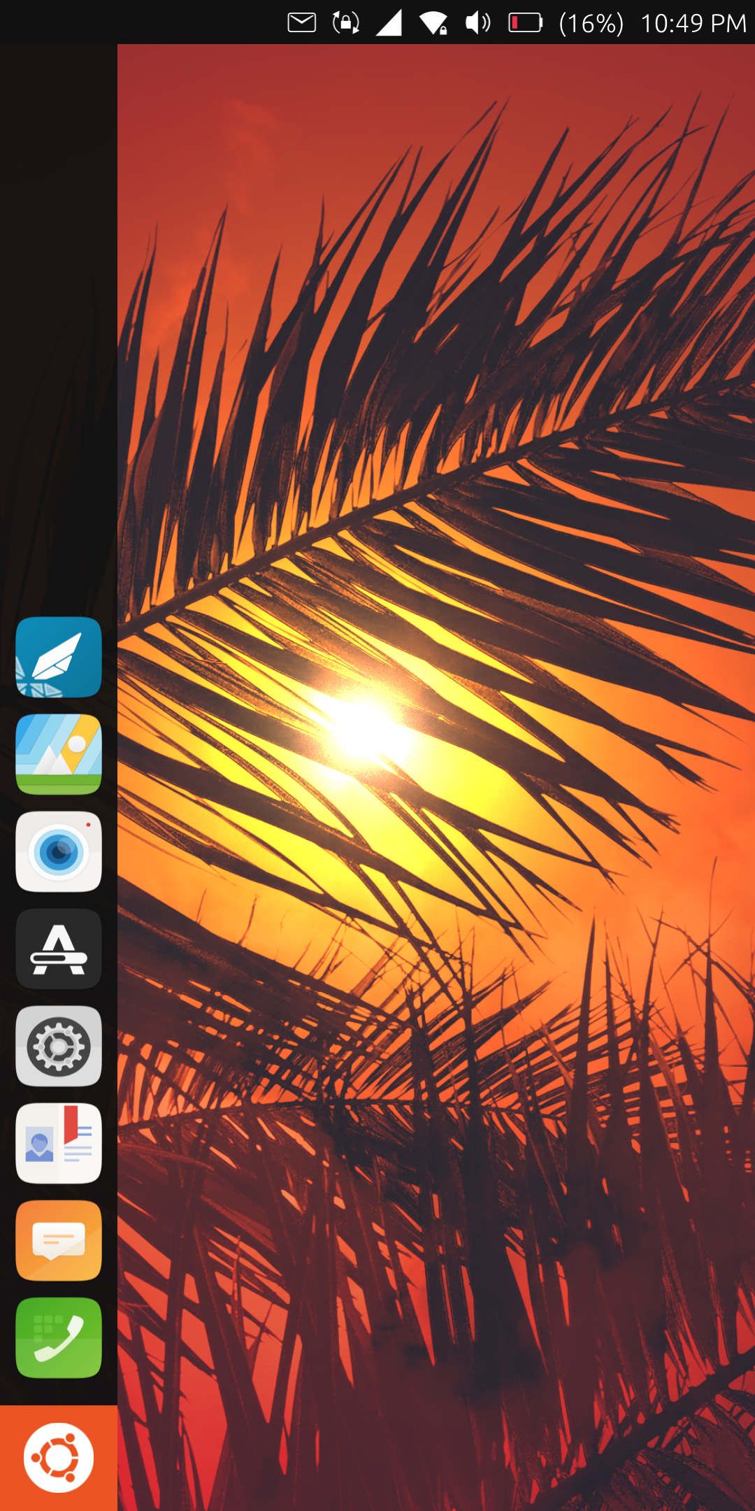
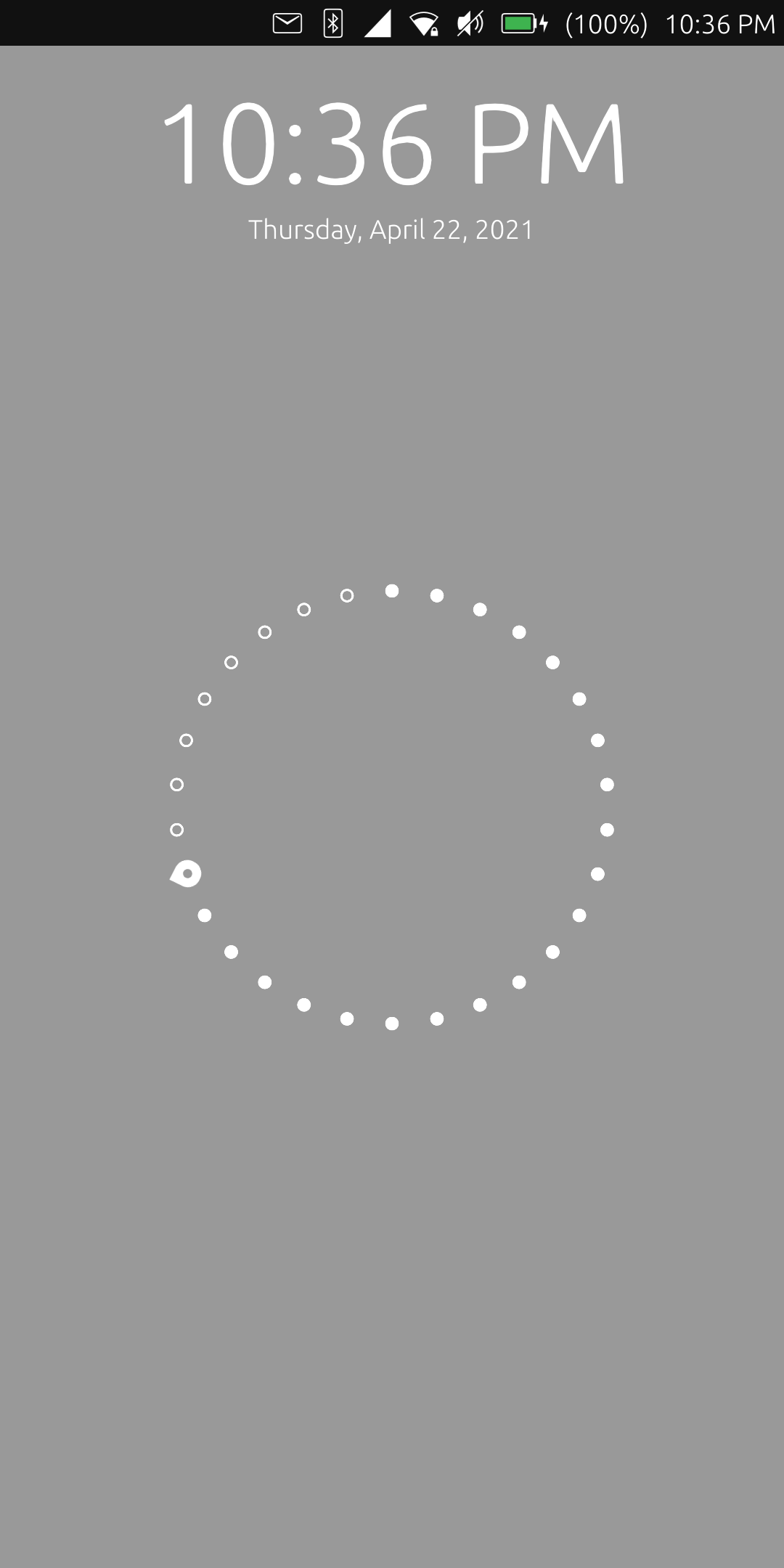
I don't think so. Also the time and the day showing widget are white. So we don't need to worry about that. ")
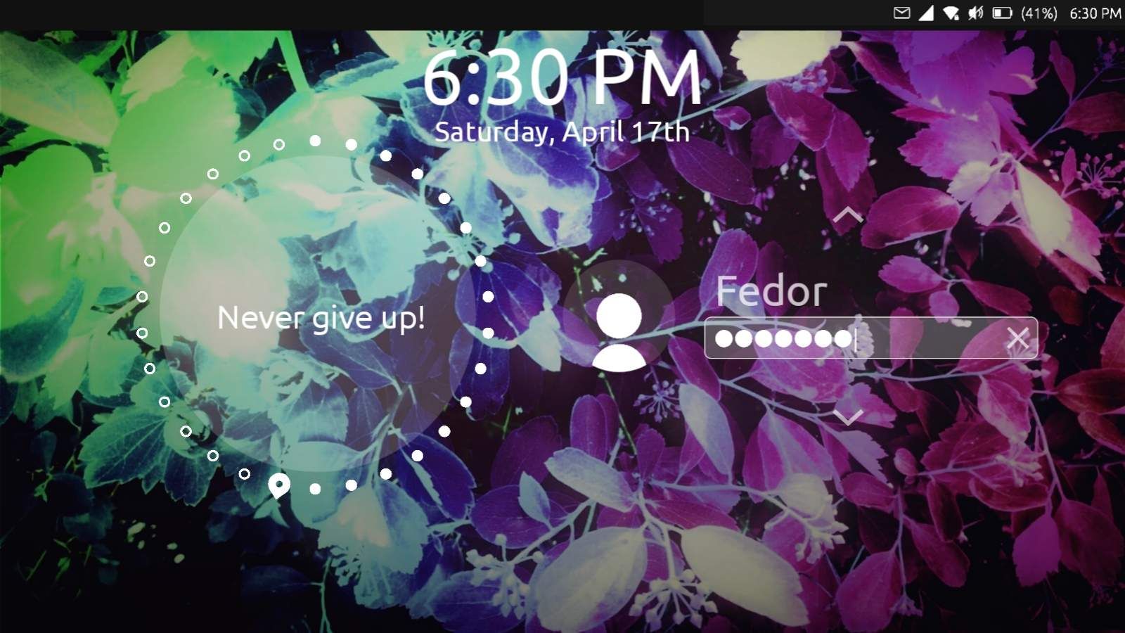
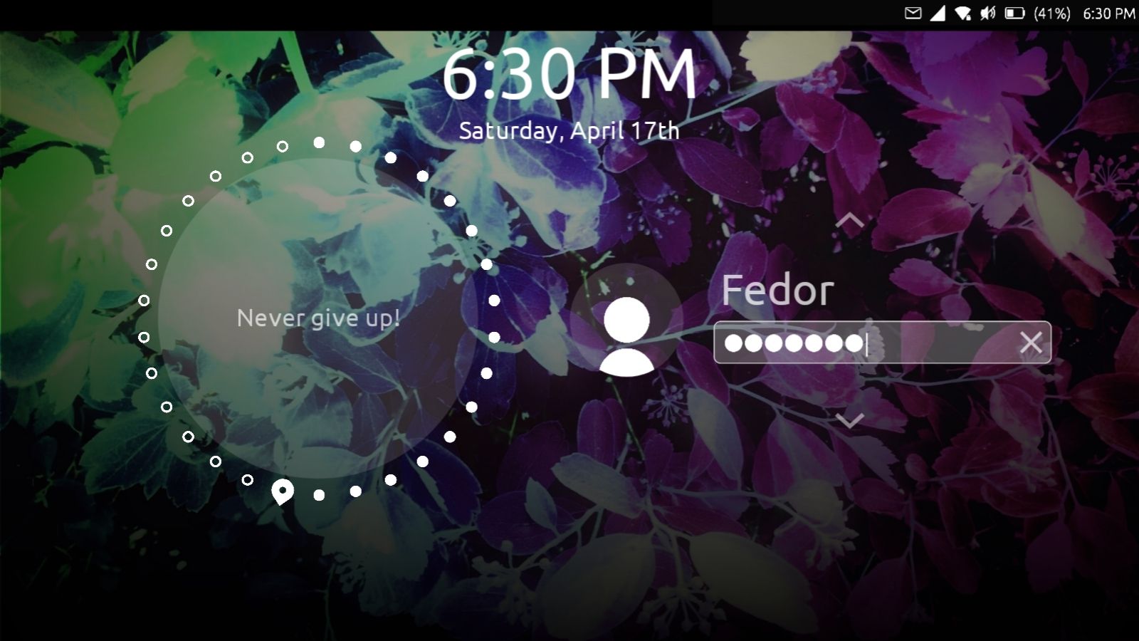
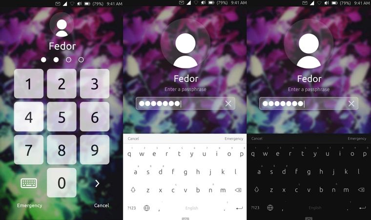
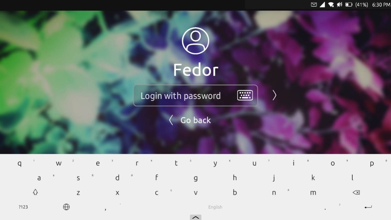
@capsia said in Login screen/Code input Design:
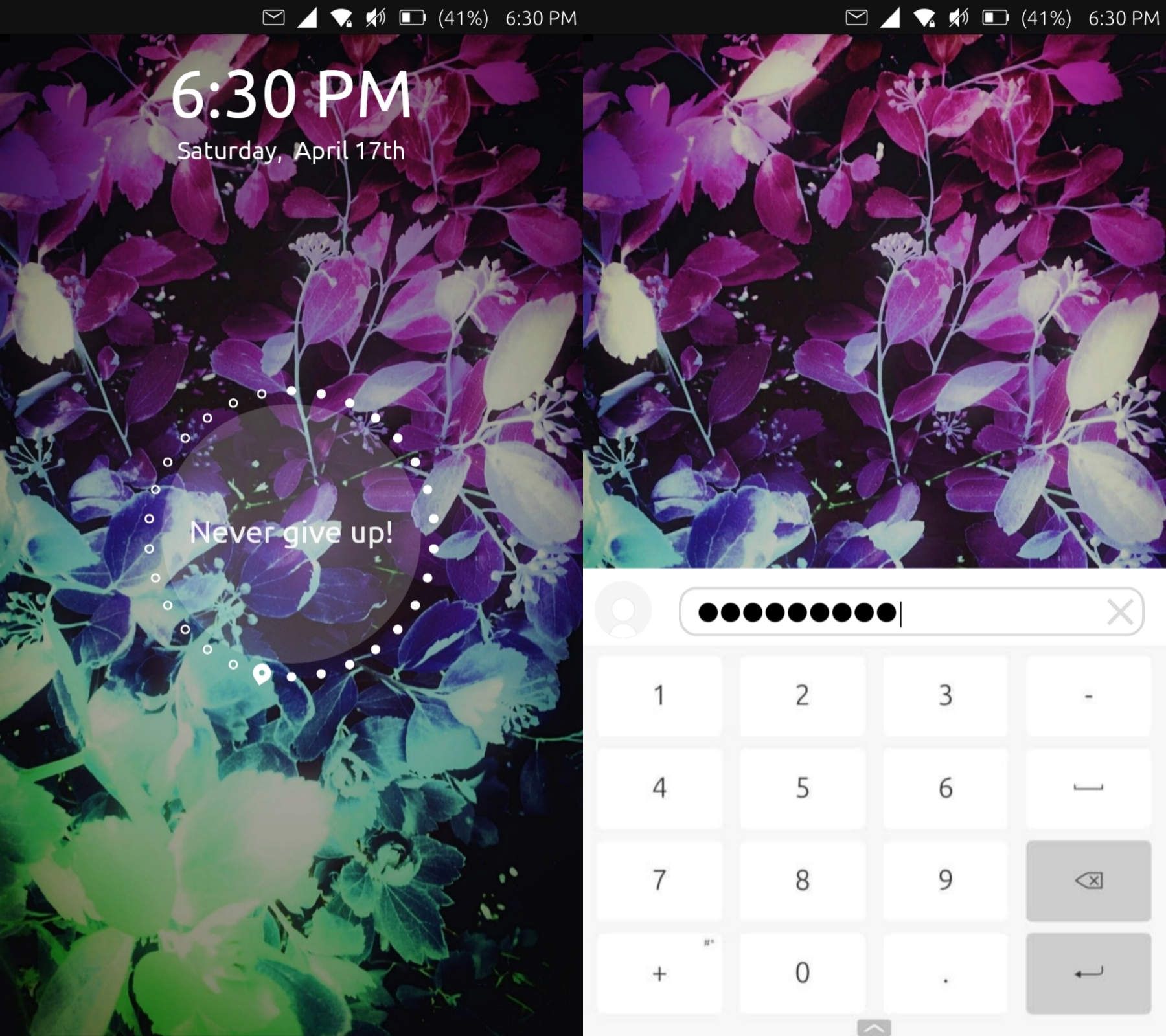
Hi, I have a few updates. I've managed to make the white text more visible on light backgrounds using a bit bigger text and I made a design for the emergency screen.
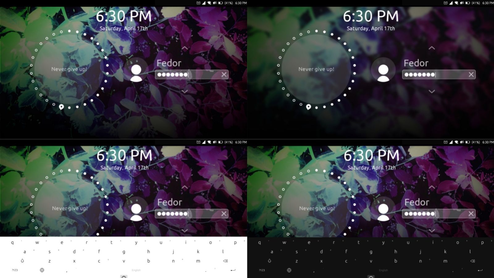
Looks so good! Also I really like the landscape mode. But I think we should scale the items differently. Ubuntu Touch supports convergence and gives us ability to use our smartphone like a computer. But this system is developed for mobile devices (smartphones, tablets) so it should be optimized primarily for them.
I mean we should make the items a little bit bigger.
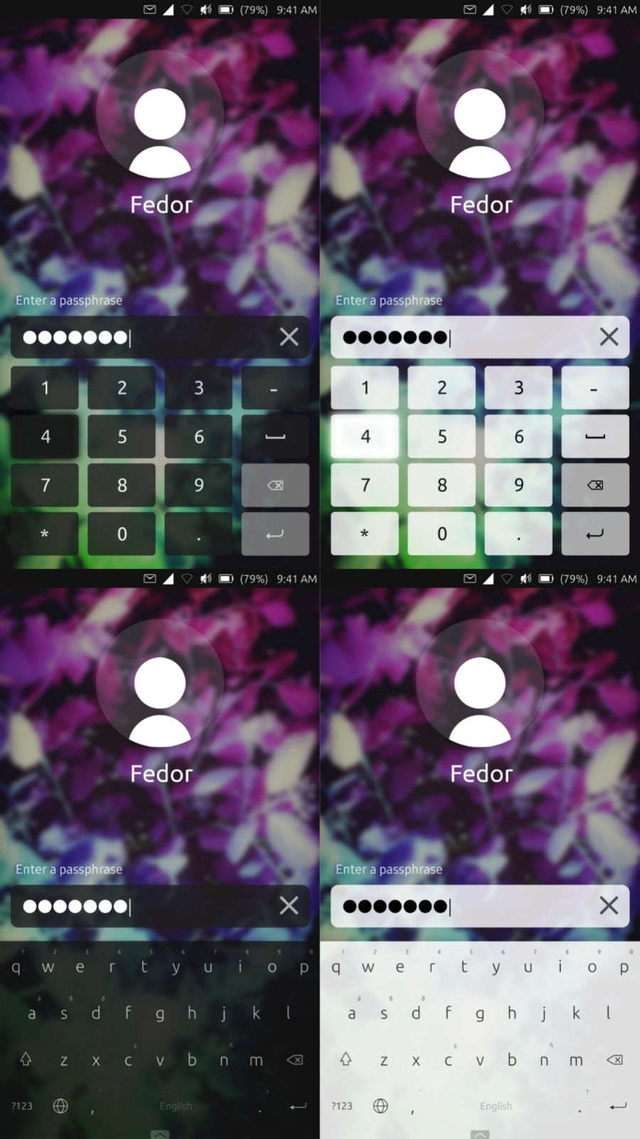
Hi, I apologize for not replying for long time.
I have tried to match all the needs in these mockups.
The problem is that emergency and unlock instructions make the screen look overdetailed. So I have tried to use Suru icons (system default icons). But some of them are made by me, so it would be cool if someone, who knows more in design, will make them. 
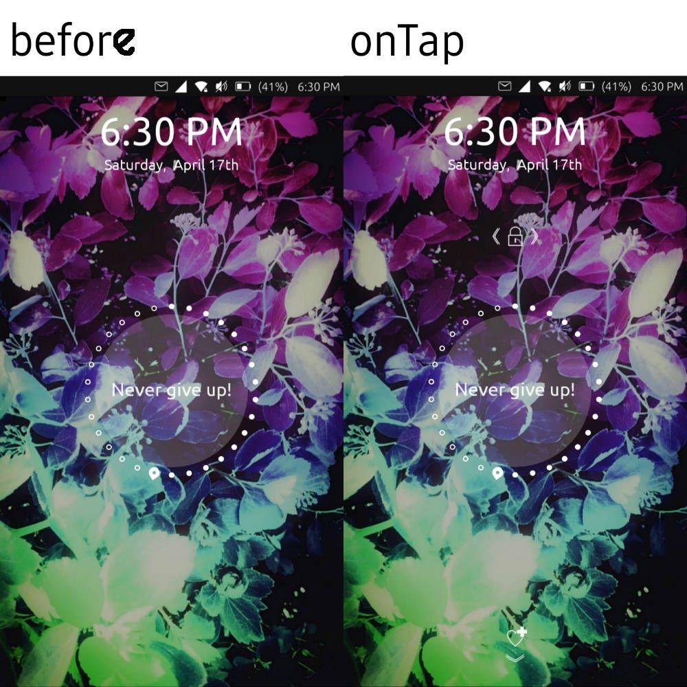
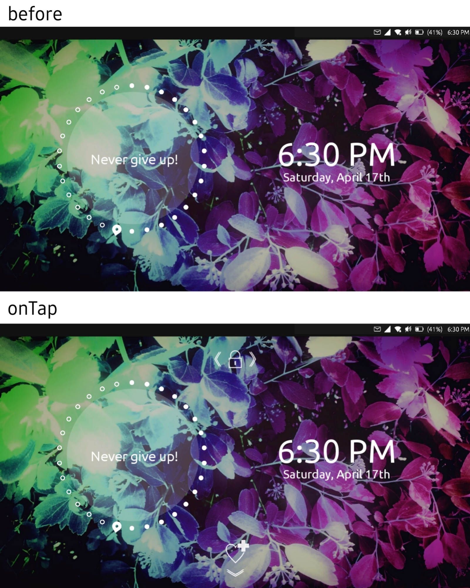
So basically when you turn on the screen you just see clocks and day showing widget. But when you tap, the unlock and emergency swipes instructions appear.
I have also an idea about the passphrase/pin section (screen):
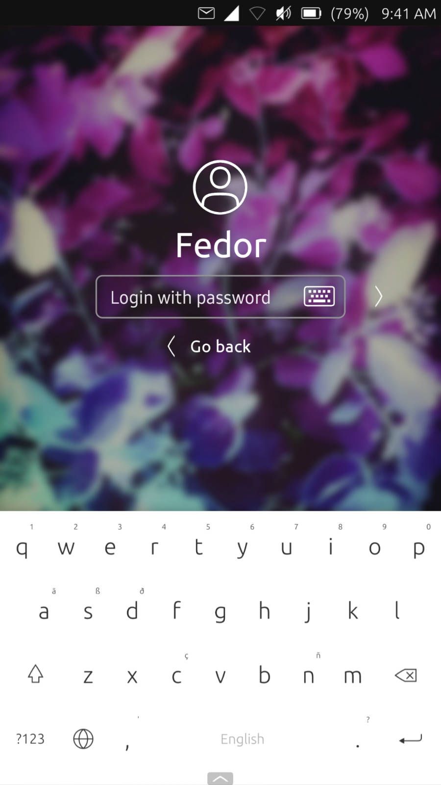
The size of text field should match the current one.