• If like this?

    7
    1
    4 Votes
    7 Posts
    767 Views
    PhoenixLandPiratP
    I think its a bit to much, but having 2 folds that line up with the wing would look fantastic in my po!!
  • Calling all developers to break down the new onboarding web page

    24
    1
    2 Votes
    24 Posts
    5k Views
    Aury88A
    @kaizen Amazig work! goood job! I really like it Can I suggest something from a non-technical POV? At the top of the sketch you have inserted a truly explanatory schematization (we need to add the app layer). I suggest to keep the same order for the component listed in the first "about the project" section. Also in the second "about the project" you have used new therms and this could be confusing for someone like me: where is the lomiri layer? what is this new midleware? is it the halium + core layer? A better way to keep all more intuitive as possible (but i don't know if it is possible) is to make all the information hidden unless we touch on the desired section: if you touch the "lomiri" layer on the top scheme it opens in the bottom the "Lomiri project" of the first "about the project" If you touch the "halium" layer on the top scheme it opens in the bottom the "halium project" of the first "about the project" with also the explanation you putted in the second "about the project" section and so on... also all element in the second "about the project" should be clickable (not the software ) with direct link to the doc or their github/lab page. my2cents. Aury
  • Alternate background image

    2
    3 Votes
    2 Posts
    479 Views
    KenedaK
    Agree but will not come first ^^ QT5.12 and Ubuntu 20.04 are the priority targets.
  • messaging-app: Stickers feature

    10
    3
    5 Votes
    10 Posts
    984 Views
    lduboeufL
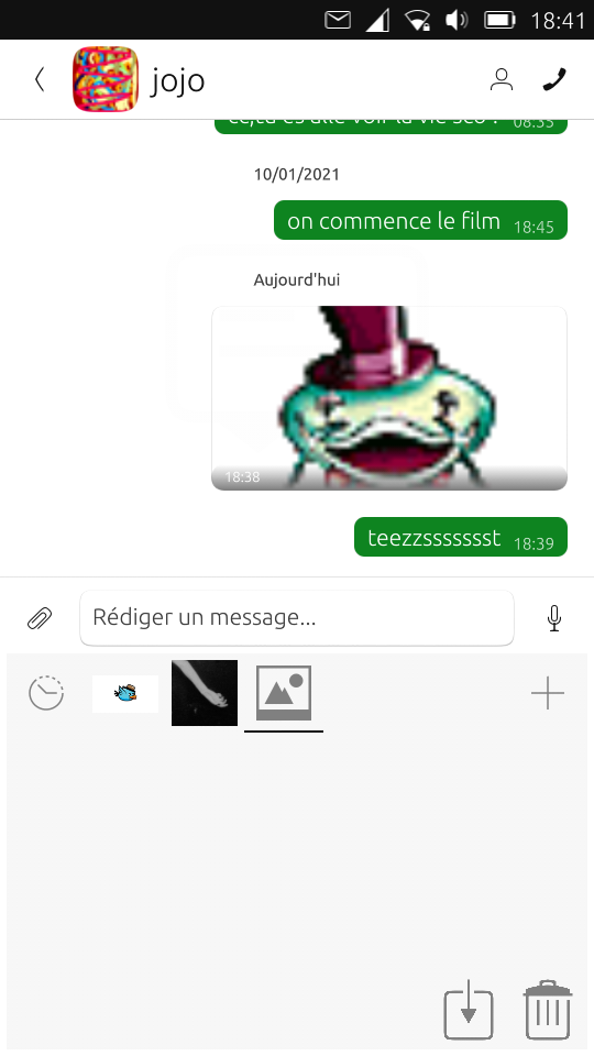
    So with the Sticker feature, you're able to send a picture or animated image in 3 user's action instead of minimum 6 with the content-hub. It can be reduced to 2 at minimum if i reuse the existing shortcut as it was previsously designed, see: [image: 1610641394166-quick_access_sticker.png] But as i said, the "emoticon" is harder to reach on small device, but makes the experience much faster, like other chat like apps. I will try again that one
  • Custom keyboard layout, and better language input [suggestion]

    9
    1
    0 Votes
    9 Posts
    810 Views
    CiberSheepC
    @rayko The code for the OSK is here: https://github.com/ubports/keyboard-component/tree/xenial/plugins/bg You can modify the qml to improve Bulgarian layout
  • Navigation Bar (suggestion)

    6
    1 Votes
    6 Posts
    733 Views
    E
    @marlboro50 interesting idea !!
  • dialer-app: "speed-dial" feature

    10
    1
    3 Votes
    10 Posts
    783 Views
    lduboeufL
    yes this could be something to consider, for now i'm just focusing on this feature [edit]: i mean not your new design proposal, just the contact search by dialpad feature with current design
  • Raise to wake

    5
    -1 Votes
    5 Posts
    515 Views
    AppLeeA
    @CiberSheep That's when you pick up the phone and the accelerometer wakes the screen. That's a feature I see on my friends iphones. I don't know about android.
  • UI for MMS errors

    19
    1
    0 Votes
    19 Posts
    2k Views
    FlaF
    I would propose the following text: "You received an MMS that could not be downloaded because your internet connection was disabled. Please activate it and ask the sender to try again". Also, about the design, can you please try to put the content of your last mock up (including the exclamation mark and the red border) inside the message bubble of the sender, and written in italic? That way it really shows that a message should have been received there.
  • App Template Mockup

    2
    2 Votes
    2 Posts
    554 Views
    CiberSheepC
    https://gitlab.com/cibersheep/mockup-templates Small update to the template: Added initial tablet view Rearranged layers Added Dialog small set [image: 1602625014544-18c5184a-afd6-4c75-bf62-a0e8996f1214-imatge.png]
  • Browser history export

    Unsolved
    8
    0 Votes
    8 Posts
    690 Views
    IsaacI
    @Keneda there is an option “restore previous session on startup”. That's not exactly what i had in mind. If u use multiple windows (not tabs) after closing one of them u can't restore it, exept if you close all browser windows at the same moment, s.a. restart browser, reboot the device e.t.c. Then session autorestoration works if being activated in settings before.
  • QML templates and codes

    6
    5 Votes
    6 Posts
    751 Views
    CiberSheepC
    @Irenicus said in QML templates and codes: I bet you if you added gifs more people would use it and also comment. It's a good idea. I should learn how to make them. For now, you can see it in action installing That Circle Game
  • Full Screen keyboard idea

    transparent inverted fullscreen scrolling keyboard
    4
    1 Votes
    4 Posts
    552 Views
    ?
    Hi, thanks for the comments, I will try to add some more detail: The keyboard would take up pretty much the whole screen, and even though it is faint and has a totally transparent background, it would have the entire focus of the area it occupied for all touches etc, -even the transparent parts. It could have one button assigned to manually shrink it to a corner, and then return it to view when it was pressed, so you could quickly get it away and back if needed. This might be needed to suppliment the normal keyboard automatic hiding/showing behaviour on occasion. Because it has the entire focus of the screen, it should capture all touch input, and when swiping motions are detected, it could relay them to the exact same coordinates of the screen underneath it, so those screens would scroll just is if the swiping/scrolling input had been on them. Perhaps this could be an optional feature. Also, in the original post, I suggested that a "long press" touch input could be relayed to the underlying screen, to reposition the cursor at that point etc, however, upon reflection, I suspect that most people would prefer to have any long presses on the keyboard be used to select an alternate character from the keyboard, eg. perhaps a capital letter, -so I suppose that, as mentioned above, a button on one side to shrink and then restore the keyboard might be the better option, when one needs to shift the focus from one text-input box to another on the underlying screen, so you would shrink the keyboard, touch the underlying screen to move the cursor to another text box, then expand the keyboard again in this circumstance. That's probably very quick anyway. A physical pc keyboard has 6 rows of keys (including the "F1-F12 keys"), but this fullscreen keyboard (landscape) could fit, for example, 8 rows of reasonable sized keys, or 6 rows of generous sized ones, allowing the flexibility of including a line of extra symbols on the main view for faster programming input, or other conveniences. A portrait mode should be very simple to implement as well, if each row of keys is simply split into two half-length rows, one above the other, when the phone is tilted to portrait mode (the number of rows would double, and the keys would be about the same size). Might look unusual, but it would work fine. Also, for customization purposes, the onscreen keyboard area might be divided programatically into labeled squares, and a user-editable table could be stored in a file which allowed each user to assign keys to each square, for further convenience of each person, so they can set it up just how they like it. The characters of the keyboard would need to be drawn in a very thin font, to not be overly distracting from what was being typed underneath, and once each user got really used to their chosen layout, they might find they can even further thin or reduce the size the font used on the overlayed keyboard, if this is adjustable, finding their best balance of unobtrusiveness and clarity. This keyboard might truthfully look a bit messy, especially for a start, and take some getting used to, but the incredible convenience and productivity increase might be very much worth it? -as it may achieve something that is very difficult, -having a large view of your work, and simultaneously a large keyboard on the same phone screen, and still being able to see everything you type. While the keyboard background would need to be totally transparent, with no key outlines etc, I think that for the actual symbols of the keys, inverted colours would work the best, as they could be much fainter and thinner and less obtrusive, and still be visible on anything that was on the underlying screen, whereas a fixed colour with with eg: 70% transparency would be too obtrusive in some places, and invisible if certain colours were underneath it. regards everyone!
  • UBports Website rebuilding

    71
    2 Votes
    71 Posts
    17k Views
    A
    Hello, I noticed that the current website shows a footer (on my mobile it looks part of the footer anyway) with Donate links. There is no mention there of donation via SEPA bank wire transfer. This option is mentioned only in the menu. If the site is redesigned, perhaps this option can be shown in a footer/more prominent, too. Donation via SEPA bank wire transfer is cheap and you don't need to make an account with a seperate payment service provider. King regards, Alter
  • Icon Library

    108
    1
    0 Votes
    108 Posts
    29k Views
    M
    @C0n57an71n not sure if this is even possible to get since as far as I understand the app icon is hard-coded once the app is compiled. But I'm not the best to tell you about the insight behind that. Instead, I think that since it seems the discussion is too quite and nobody voted so far on the different rendering of icons, I wish to give you my preferred guide lines to be followed to draw the best icon, in my humble opinion: I''m still preferring the look of the rendered ICON N.4, with the grid shown in transparency; maybe I'd provide the deep green color to the grid and more evidence to it (therefore less transparency), in order to look more "Matrix"ish; I like the dots at the bottom row, to ideally recall the days numbers; I don't really mind colors gradient for the columns, but they look like randomly set for each column (extent of the gradient): perhaps we could adjust that in order to have a consistent approach? On top of the last column, I still prefer having the rectangle more than the triangle shape, for it seems to me more discreet; Sure style with a fold-able side is perfect. Thank you. Matteo
  • New badge for Yumi?

    70
    1 Votes
    70 Posts
    21k Views
    ?
    @Kaizen Thanks for the words
  • Another Yumi

    1
    2
    8 Votes
    1 Posts
    300 Views
    No one has replied
  • I made a new boot screen image. (for nexus 5)

    24
    2 Votes
    24 Posts
    4k Views
    AppLeeA
    @Kaizen said in I made a new boot screen image. (for nexus 5): Not sure about the circle of friends tho, I need to check it again. IIRC the foundation is allowed to use the circle of friends by Canonical. But double checking doesn't hurt.
  • Clock Redesign Ideas

    53
    5 Votes
    53 Posts
    10k Views
    CiberSheepC
    @Kaizen Interesting. Thank you. I like the concept of the clock for the seconds.
  • [Request] Custom fonts

    request custom fonts design fonts
    2
    -1 Votes
    2 Posts
    423 Views
    AppLeeA
    @BigB Hi, I doubt customizing font is a possibility and even less choosing where it applies. But I guess you can try and replace the current font by the one of your choice. I have no clue where it is stored, but substituting the current font file with yours should be possible as a hack.