• Full Screen keyboard idea

    transparent inverted fullscreen scrolling keyboard
    4
    1 Votes
    4 Posts
    1k Views
    ?
    Hi, thanks for the comments, I will try to add some more detail: The keyboard would take up pretty much the whole screen, and even though it is faint and has a totally transparent background, it would have the entire focus of the area it occupied for all touches etc, -even the transparent parts. It could have one button assigned to manually shrink it to a corner, and then return it to view when it was pressed, so you could quickly get it away and back if needed. This might be needed to suppliment the normal keyboard automatic hiding/showing behaviour on occasion. Because it has the entire focus of the screen, it should capture all touch input, and when swiping motions are detected, it could relay them to the exact same coordinates of the screen underneath it, so those screens would scroll just is if the swiping/scrolling input had been on them. Perhaps this could be an optional feature. Also, in the original post, I suggested that a "long press" touch input could be relayed to the underlying screen, to reposition the cursor at that point etc, however, upon reflection, I suspect that most people would prefer to have any long presses on the keyboard be used to select an alternate character from the keyboard, eg. perhaps a capital letter, -so I suppose that, as mentioned above, a button on one side to shrink and then restore the keyboard might be the better option, when one needs to shift the focus from one text-input box to another on the underlying screen, so you would shrink the keyboard, touch the underlying screen to move the cursor to another text box, then expand the keyboard again in this circumstance. That's probably very quick anyway. A physical pc keyboard has 6 rows of keys (including the "F1-F12 keys"), but this fullscreen keyboard (landscape) could fit, for example, 8 rows of reasonable sized keys, or 6 rows of generous sized ones, allowing the flexibility of including a line of extra symbols on the main view for faster programming input, or other conveniences. A portrait mode should be very simple to implement as well, if each row of keys is simply split into two half-length rows, one above the other, when the phone is tilted to portrait mode (the number of rows would double, and the keys would be about the same size). Might look unusual, but it would work fine. Also, for customization purposes, the onscreen keyboard area might be divided programatically into labeled squares, and a user-editable table could be stored in a file which allowed each user to assign keys to each square, for further convenience of each person, so they can set it up just how they like it. The characters of the keyboard would need to be drawn in a very thin font, to not be overly distracting from what was being typed underneath, and once each user got really used to their chosen layout, they might find they can even further thin or reduce the size the font used on the overlayed keyboard, if this is adjustable, finding their best balance of unobtrusiveness and clarity. This keyboard might truthfully look a bit messy, especially for a start, and take some getting used to, but the incredible convenience and productivity increase might be very much worth it? -as it may achieve something that is very difficult, -having a large view of your work, and simultaneously a large keyboard on the same phone screen, and still being able to see everything you type. While the keyboard background would need to be totally transparent, with no key outlines etc, I think that for the actual symbols of the keys, inverted colours would work the best, as they could be much fainter and thinner and less obtrusive, and still be visible on anything that was on the underlying screen, whereas a fixed colour with with eg: 70% transparency would be too obtrusive in some places, and invisible if certain colours were underneath it. regards everyone!
  • UBports Website rebuilding

    71
    2 Votes
    71 Posts
    35k Views
    A
    Hello, I noticed that the current website shows a footer (on my mobile it looks part of the footer anyway) with Donate links. There is no mention there of donation via SEPA bank wire transfer. This option is mentioned only in the menu. If the site is redesigned, perhaps this option can be shown in a footer/more prominent, too. Donation via SEPA bank wire transfer is cheap and you don't need to make an account with a seperate payment service provider. King regards, Alter
  • Icon Library

    108
    1
    0 Votes
    108 Posts
    57k Views
    M
    @C0n57an71n not sure if this is even possible to get since as far as I understand the app icon is hard-coded once the app is compiled. But I'm not the best to tell you about the insight behind that. Instead, I think that since it seems the discussion is too quite and nobody voted so far on the different rendering of icons, I wish to give you my preferred guide lines to be followed to draw the best icon, in my humble opinion: I''m still preferring the look of the rendered ICON N.4, with the grid shown in transparency; maybe I'd provide the deep green color to the grid and more evidence to it (therefore less transparency), in order to look more "Matrix"ish; I like the dots at the bottom row, to ideally recall the days numbers; I don't really mind colors gradient for the columns, but they look like randomly set for each column (extent of the gradient): perhaps we could adjust that in order to have a consistent approach? On top of the last column, I still prefer having the rectangle more than the triangle shape, for it seems to me more discreet; Sure style with a fold-able side is perfect. Thank you. Matteo
  • New badge for Yumi?

    70
    1 Votes
    70 Posts
    36k Views
    ?
    @Kaizen Thanks for the words
  • Another Yumi

    1
    2
    8 Votes
    1 Posts
    453 Views
    No one has replied
  • I made a new boot screen image. (for nexus 5)

    24
    2 Votes
    24 Posts
    8k Views
    AppLeeA
    @Kaizen said in I made a new boot screen image. (for nexus 5): Not sure about the circle of friends tho, I need to check it again. IIRC the foundation is allowed to use the circle of friends by Canonical. But double checking doesn't hurt.
  • Clock Redesign Ideas

    53
    5 Votes
    53 Posts
    20k Views
    CiberSheepC
    @Kaizen Interesting. Thank you. I like the concept of the clock for the seconds.
  • [Request] Custom fonts

    request custom fonts design fonts
    2
    -1 Votes
    2 Posts
    833 Views
    AppLeeA
    @BigB Hi, I doubt customizing font is a possibility and even less choosing where it applies. But I guess you can try and replace the current font by the one of your choice. I have no clue where it is stored, but substituting the current font file with yours should be possible as a hack.
  • 3 Votes
    2 Posts
    991 Views
    KaizenK
    Agree. We need a truly professional product team to solve all this problems. But that's need a plan. I can deliver stuff but rather to build a team around Brian with other contributors. @Capsia
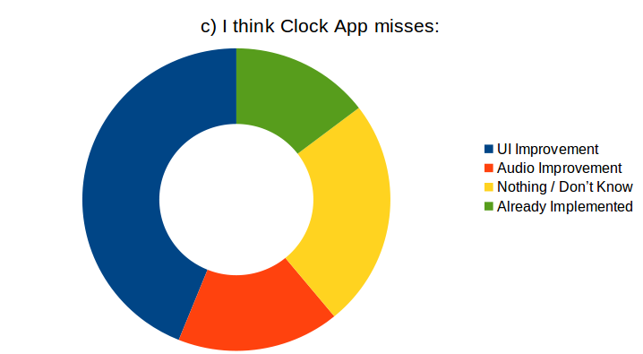
  • Clock App Survey Results

    5
    3
    1 Votes
    5 Posts
    916 Views
    CiberSheepC
    @Keneda said in Clock App Survey Results: Isn't there a mistake in "b)" graphic? Thanks. Edited
  • Clock App Survey

    Locked
    37
    5 Votes
    37 Posts
    11k Views
    CiberSheepC
    Thank you all. I'll lock now the thread as I'm counting. I'll open a new one were we can see the results and talk about design, redesign, etc. Weeeee
  • 3D Yumi

    4
    1
    8 Votes
    4 Posts
    944 Views
    T
    @Keneda I know haha, I didn't had the buttons that seems to be the ears ready, I tried to draw them in 2D, and did a little of clean up. I'll to fix serveral things in the next version
  • 9 Votes
    40 Posts
    15k Views
    P
    I had to adb push it, then it worked with twrp and install recovery.zip
  • Emoji Library

    Solved
    23
    0 Votes
    23 Posts
    7k Views
    ?
    @CiberSheep I think the thread opened by @AppLee will be a better option since we have the image posting option and right here on the forum where everybody can find, read and modify as they wish. We'll gather all this information with a simple copy/paste, edit it and then have it as a manual. And then maybe a video. We'll see. i think so is much faster, we can all talk on the same subject... The sooner, the better...
  • Bookmark folders in Morph browser

    Solved
    3
    0 Votes
    3 Posts
    681 Views
    U
    @BrisPete Thanks BrisPete. I should have found out by myself instead of starting a new thread... Sorry.
  • Morph Icon Proposal

    18
    3
    9 Votes
    18 Posts
    3k Views
    Josele13J
    Hi everyone, I love the logo presented by @Cibersheep, it's original and I think it would represent well the Morph Browser. I also agree with Lakotaubp's opinion and I have made a small modification to the logo. I hope you like it, greetings... [image: 1595536798652-captura-de-pantalla-2020-07-20-22-24-46.jpg] [image: 1595538308140-screenshot20200723_230022456.jpg]
  • This topic is deleted!

    1
    0 Votes
    1 Posts
    4 Views
    No one has replied
  • Mark as solved

    4
    0 Votes
    4 Posts
    768 Views
    MoemM
    I feel that the forum interface, while it looks very slick, is not easy to understand. For example, there are things that one needs 'reputation' for, or so I think... but that's not explained anywhere. Marking as resolved is indeed hard to find, and apparently (some? all?) posts can be tagged, or at least I sometimes see posts that have tags. But I have no idea how to do this, or whether or not I even can. It's not clear who the moderators are, either. There is a list, but I can't see it in the forum when they post. I'm basically flying blind here as a forum user. In other words, there's room for improvement.
  • My bucket list

    5
    2
    3 Votes
    5 Posts
    1k Views
    G
    Looking forward to seeing your initial release, great work.
  • dialer-app Quick call

    23
    1 Votes
    23 Posts
    6k Views
    R
    @lduboeuf Sorry for going off topic here. @CiberSheep Exactly. From the contact app you can reach the dailer app and the messaging app. From the dialer app you can reach the contact app and the messaging app. From the messaging app you can reach the contact app and the dialer app. When you are able to call/videocall people with Teleports, are there going to be an app for every form of communication? No, they will be integrated into one app. I think that we need to look at these old apps and start to integrate them in a new way. Like @lduboeuf wrote earlier, it will take a lot of work and I am not demanding anything, it's just my point of view/suggestion.