A summary of this thread:
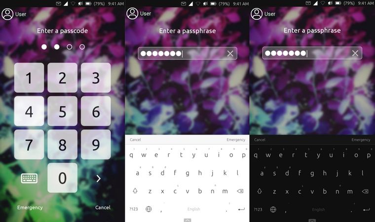
This thread discusses many different ways on how the design of the Login screen of UT screen could be improved. The whole conversation got pretty big thus, here is a small summary on Ideas, wishes and approaches.
What is to consider when redesigning the Login?
- The design needs to be convergent (usable in desktop and mobile mode)
- The design should look good in light and dark mode as there is no way to incorporate theming well.
- The design should not duplicate the look and feel of Android or iOS
- The design needs to be usable as good with a pin as with a passphrase
Which designs have been discussed so far?
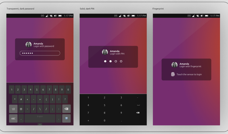
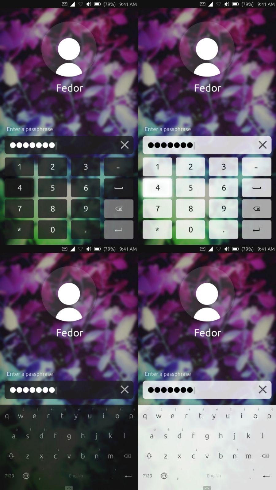
@purplevvay made many mock-ups for different design Ideas, and we borrowed some from the ICE thread as well:
1.

- close to the current design
- original Keyboard is used
- slight transparency
- Input field based on login method
- Emergency is missing
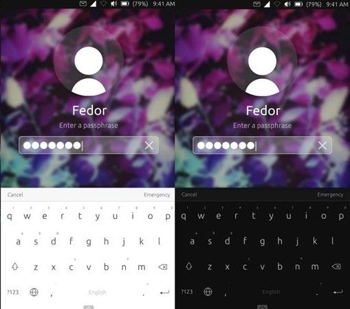
2.

(my personal favorite)

- repositioned input
- bigger user Icon above the text input
- Original keyboard is used
- No design changes based on Input method
- Very universal between light and dark mode
- transparency for default user and input
- blurred background
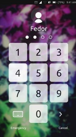
3.

- full screen pin pad
- extra click required for keyboard
- not very convergent
- modern
- a mobile experience people are used to
I created a click dummy for this design:
https://aaron.place:8018/index.php/s/ot9SEG5FWfH2nJE
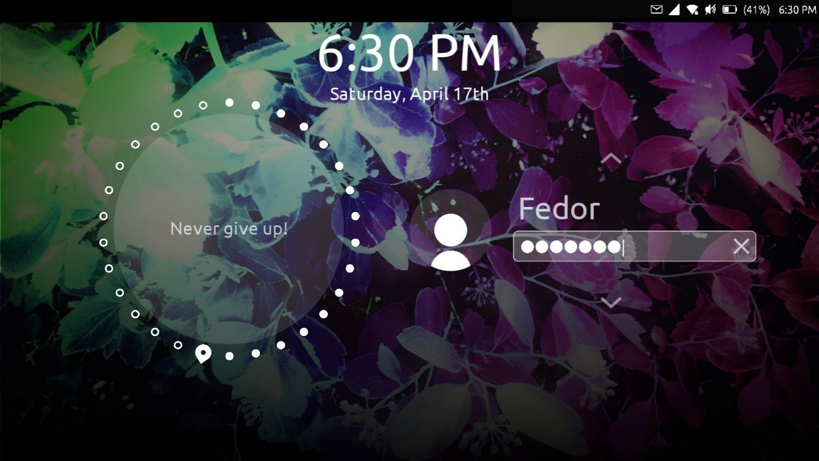
4.

These designs are more or less a variation of the designs in 2. but uses a custom version of the keyboard.
How far have we come to implement this our selves?
I have been able to tweak unity/lomiri to my liking, but we are not really close to anything that could be proposed in a pull request.
To @CiberSheep and the rest of the design team:
What do you think of our Ideas and mock-ups? Do you think this is something that should be added to UT? How could we further help you to turn this into reality? Do you have other thoughts?
To anyone:
If you are interested in turning this into reality, I would be happy to give you a small gift card as a thank-you 


 .
.