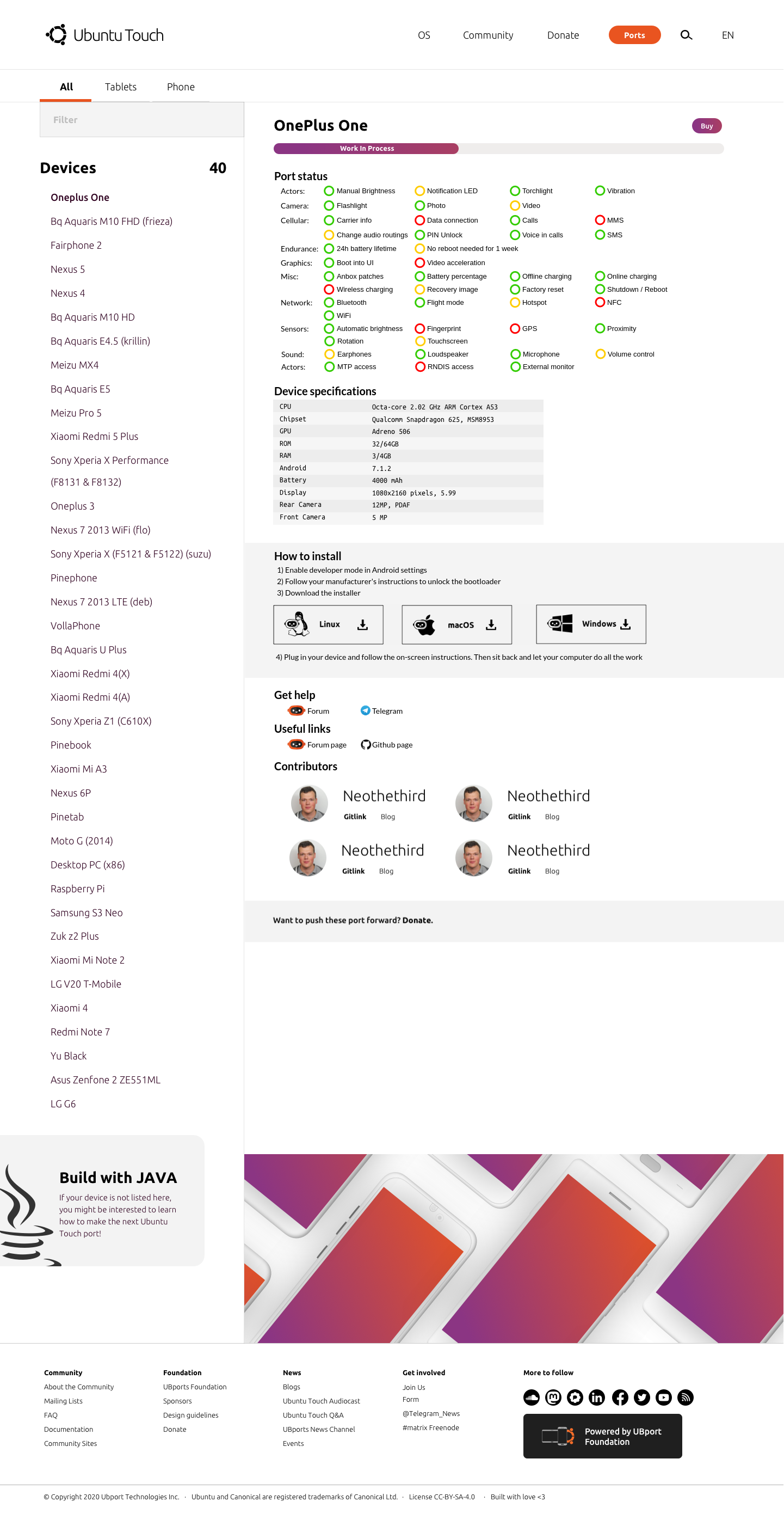
Hi everyone! I'm Capsia, from the websites team. We're currently working on completely remaking our websites, and we want you to be a part of it! Our goal is to make things easier and more intuitive, so we're looking for your ideas, feedback, and suggestions. In the past few weeks I've been working on wireframes that I'd like to share with you.
For ubports.com, ubuntu-touch.io and lomiri.com
https://www.figma.com/file/n0dfchXYczDbjRgAfJkRss/UBports-website
For installer.ubports.com (has a different link, since it was built before):
https://www.figma.com/file/VMtvSUnGjKUiCLHyMuQ6QC/Installer-Site
The goals, in general:
- Easier and intuitive
- Simplified ( less pages )
- Giving information for new contributors
- Remove outdated information
- Promote other projects like Lomiri, Halium, Ayatana and the installer
- Facilitate adoption of these projects by other distros
Community goals:
- Easy to access information about installation and troubleshooting groups
- Give indications about where the community meets and talks
- Spotlight valuable contributors
Contribution and project coordination:
- Share ongoing projects and let contributors share updates about those on the website
- Give information about the contact person to get involved in a project
- Give basic process and structure information on projects
- Give links to documentation and project resources
What needs to be done:
Check all the text- Add content to project pages and hot topics pages
Update devices shown on ubuntu-touch.io homepage- Complete Lomiri page
Redesign donate pageAdd a page for manufacturersRedesign and update page for promoted devices- Where and how to move FAQ, idea: since faq on telegram are updated and on the website are not, we could link (or embed) Telegram
How can you help?
- Sharing feedback and ideas
- Building documentation on projects and processes
- Making assets and images for the pages
- Checking and improving content
Question: For contributors, would you like to give updates on your projects on a static website using git or on a website builder given credentials?
Credits:
To @Kaizen for his original designs this project is based upon (see: https://forums.ubports.com/post/33598). To @Lga for providing awesome looking images of devices (see: https://forums.ubports.com/topic/10106/phone-and-tablet-models-for-ubuntu-touch, more on how these will be used will be shared soon). To Bram, Kiek and Jeroen for Odoo implementation, project organization and documentation.


 .
.